Key takeaways
- Separate your models and reports: Treat the semantic model as a reusable asset rather than building everything inside one report file.
- Don't use more data than you need: Avoid loading too much data at once, and take simple steps to check and reduce model size.
- Invest in the data model, not just reports: Underinvesting in the model while overinvesting in report visuals is a common and costly mistake.
- Learn the common patterns: Know the existing options and approaches for common problems, and avoid over-relying on tables and matrixes or doing too much heavy lifting in DAX and Power Query.
- Stay humble as you grow: Early successes can lead you to underestimate Power BI and Fabric, so keep learning.
This summary is produced by the author, and not by AI.
Creating your first Power BI report is an exhilarating, empowering exercise. If you’re new to Power BI and you’ve gone through this exercise recently, then you should definitely take a minute to acknowledge and feel proud of what you’ve done! For many, this “5 minutes to wow” experience ignites a vibrant passion for working with data that blooms into a wonderful and rewarding journey. This could be a journey for you in your team, your organization, or a new career path, entirely!

That said, this journey is certainly not an easy one! Power BI is a complex tool that is one part of a very large and complex data platform: Microsoft Fabric. When you first start to learn Power BI, it’s normal for it to feel overwhelming, and it’s normal to make mistakes. A lot of mistakes!
We’ve all made this journey, and we’ve all gone through these mistakes before! However, the earlier you can recognize and avoid these mistakes, the more value you’re going to get from your data, models, and reports. Better yet, this will help you make further progress along your Power BI journey.
In this article, we go through some (not all!) common mistakes that beginners tend to make in semantic models, reports, and Power BI. This article might be for beginners, but it is also for intermediates and experts who can help beginners avoid these mistakes (or who still make them, themselves).
What is a beginner?
Without being pedantic, a beginner is typically either someone new to Power BI (that is, they’ve only been using it for a short time) or someone who hasn’t yet invested any time to professionalize their skills and abilities with the tool. A beginner might’ve already made a few reports or models, or they might be working on their first one now.

Beginners can also be from both technical and non-technical backgrounds. Oftentimes, there’s a misconception that beginners are typically business users or students, but they can also be IT professionals very familiar with technical or data tools and programming languages, but who haven’t used Power BI, before. This includes individuals who’ve used similar tools like Qlik or Tableau and are now transitioning to Power BI (willingly or not). It’s a common mistake of these IT professionals that Power BI is “easy” or “simple”. This misconception arises because Power BI is marketed as a “low-code” tool where significant development happens with a user interface. These technical profiles can even overestimate how relevant or transferable their IT or technical skills are for having success in Power BI projects.
A ”beginner” can also apply in more subtle and nuanced ways. Someone can be very proficient in report design, but a complete novice in data modelling, and vice-versa. This isn’t limited to models and reports, but also areas of Power BI like distribution and governance, administration, Power BI embedded, and so forth. This scale unto itself is a challenge for beginners, intermediates, and experts alike!
Beginner mistakes to avoid
To be clear, mistakes that beginners make are normal and should be fully expected. These mistakes are a good thing; a sign of effort and an opportunity for learning. In general, mistakes from beginners are typically from ignorance, rather than neglect or malicious intent.
Before we get into the “list of mistakes”, it’s important to clarify that these mistakes generally apply in the context of a scenario where the beginner creates and distributes models and reports for use by other people. If you are just exploring data or creating a proof-of-concept, then some of these mistakes might not apply. This list is also subjective, so feel free to disagree with it if you like.
Below we list some of these mistakes that we’ve made as beginners, or that we see among beginners in the market and community. These are listed in no particular order.
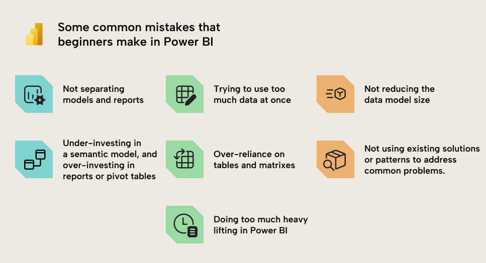
1. Not separating models and reports
It’s normal for beginners to work in Power BI Desktop and create everything in one file. This is simple and straightforward, and easy for them to maintain. However, once you want to make multiple reports, or you need to make changes to only the report or only the model, then you might run into challenges such as:
- Duplicating calculations and data, leading to extra effort when changes or fixes happen, and heightening the risk of mistakes.
- Unintentional changes to a report when changing the model, or changes to a model when the intent is to alter the report.
In Power BI Desktop, a file contains information for both a model (tables, columns, relationships, DAX measures, and so forth), and a report (interactive visuals). You can develop one model for each report (i.e., work in one file), but this isn’t ideal. Instead, you can separate the model and report development by managing the model in a separate file, and then create reports that connect to the model using a live connection.
With this approach, you can more easily reuse semantic models, while mitigating issues of duplicating logic and data. Reports will always remain up-to-date with any changes to the data or calculations. There are other, practical advantages, discussed in this Microsoft Learn article.
2. Trying to use too much data at once
Another common mistake is when beginners try to use too much data, both in models and reports. It’s common to favour more over less, because “what if we need this?”. This just in case logic might seem like a safe bet, but it actually hurts more than it helps.
- For models, including more data increases the size of your model. The larger your model, typically, the more performance woes you can have, and the slower your reports might get. One of the easiest things you can do to optimize in Power BI is to reduce size, and the simplest way to do this is to only keep what you really need. This applies to:
- Tables, so you only load the ones you will use.
- Columns, so you remove the ones you don’t need.
- Rows, so you group tables to the level of detail that you’ll report on. If your report is about customer key accounts and product types, then why do you need Customer Sold-To and Material number in your data?
- For reports, trying to show too much information at once leads to cognitive overload in users. Your reports become overwhelming and inefficient; it takes people too long to find what they need, and they’ll be more likely not to use the report, or export it to Excel to do it themselves. Instead, you want to try to define the exact purpose and questions your report page is trying to address, and work with users to design and curate visuals that address that purpose and those questions as efficiently as possible. Ideally, people are spending as little time on your report as possible… it’s not their job to look at Power BI all day, after all, right?
To make models and reports better, don’t ask what you need to add; rather, ask what you can remove. Simplicity and conciseness are key to efficiency.
3. Not taking simple actions to check or reduce model size
As mentioned in the previous point, reducing your model size is one of the easiest and first steps to optimize a Power BI semantic model (and usually also reports). Larger models require more time during queries to process, and you might also have size limits in your capacity that you must remain under.
You can check the model size by using the VertiPaq Analyzer in DAX Studio or Tabular Editor 3. If you can’t use external tools but you have Fabric, then you can use the Memory Analyzer, which works similarly. If you don’t have Fabric and can’t use external tools, then you can try to use the DAX query view, but unfortunately, this can be too complex for beginners, since it involves writing or handling a lot of code.
To avoid this, here are some simple things you can do to reduce model size:
- Remove tables and columns you don’t need: You can always add these later. We discussed this above, but to elaborate, consider removing tables or columns if:
- You won’t use it.
- You can disable load for the table without it impacting models and reports.
- You will compute it in a measure (and it doesn’t need to be in memory). An example is that if you can efficiently compute Sales Value by multiplying Quantity and Price, then you don’t need a third Value column.
- Avoid redundancy: This can happen when you work with multiple tables, where similar or identical fields occur multiple times. For instance, the Ship Date might be in both the Invoices and the Orders table; but does it need to be in both? Can you use it in just one?
- Filter rows that you don’t need: Ensure that you limit tables to only the data that you will report on. A common mistake is to include a lot of historical data just in case, or to support a niche use-case for a few people. For beginners, this can be especially challenging because the alternative approaches to deal with this scenario (like incremental refresh, hybrid tables, and dealing with aggregations or other storage modes) can be quite complex. If these approaches are too complex, beginners might want to consider solutions like separate, static models (that don’t refresh) for these niche scenarios.
- Group rows that you don’t need: Try to group (or aggregate) data as much as possible. Try to really limit data to the details you need in reports and analyses, and think critically about whether some columns are adding extra detail without really contributing to your report. Common examples are document or document line item numbers and codes.
- Disable Auto Date/Time: By default, Power BI will include a “hidden” date table for each date field in your model. These tables create the “date hierarchies” for these fields, and they can be very convenient for beginners, since they don’t need to create and use a date table. However, if you have a lot of date fields – especially ones that have wide ranges – then these hidden “auto date/time” tables can take up a lot of space. Disabling auto date/time will remove these tables, but you then need to create your own Date table, instead. Generally, the latter is recommended for most scenarios.
- Reduce decimal precision: In Power BI, model size is determined not by the number of rows, but by the sum of sizes for columns, relationships, and other in-memory objects. Column size, for instance, is largely determined by the number of unique values in that column. Therefore, the more decimal precision you have (the more numbers behind a decimal), the more unique values, and the larger the column. Thus, rounding these fields can reduce the column size dramatically, especially if there are many rows.
- Separate date and time fields: Related to the previous points, if you have time data, then you should really think hard about whether you really need it. Most of the time, you don’t. But if you do, you should strongly consider splitting the date and time fields into two columns. This will reduce the size of the model because it reduces the total number of unique values (cardinality) between these two columns.
- Disable the property
IsAvailableInMdxfor columns if you won’t use Excel on your model: This tip is admittedly already more advanced; however, it is still worth mentioning. If you will not query your model using MDX (which happens when you use pivot tables in Excel with a Power BI data model) then you can disable the column propertyIsAvailableInMdx. This will reduce the size of columns, because they don’t need to create a dictionary. - Use integer or numerical data types for numbers (and not text/string): If your column is a number and you save it as text, it will take up more space than if you save it as an integer. An example might be the Billing Document Number column. Note that this will not always work, such as when the column is used in a relationship or when the number has a lot of inconsistent ranges. That’s because of how the model compresses data.
So, the next time you have a model that’s slow or too big, checking the above points can be a great (and easy) way to start optimizing a semantic model in Power BI.
4. Underinvesting time in the data model, while overinvesting in reports
Typically, if you are using Power BI, then the end goal for you or your team is to make one or more reports. Reports are where the business typically interface with the data, and how they use this data to inform decisions and actions; they’re important. However, it’s a common mistake to over-focus on reports, and underinvest in models.
Having beautiful reports that show everything that the business wants to see is certainly important. However, the model behind it is the engine that drives that car. How you set up the model and the DAX determines what you can do in a report, and the results that you will get.
Some examples of symptoms of underinvesting in your models are as follows:
- Slow reports because of suboptimal model design or DAX measures.
- Mistakes in reports because of incorrect or flawed models and data.
- A lack of ability to meet specific requirements, such as certain calculations or functionalities, including data modelling features like timely refreshes or row-level security, as well as reporting features like getting numbers or visuals to display in a particular way.
- Spending more time on fixes and small changes rather than supporting strategically important business objectives.
- Changes and fixes take a long time to design and implement because the model and DAX have gotten too complex or messy.
To avoid these, you can take some steps to invest further in your data models, like the following:
- Taking the time to learn common data modelling best practices from trusted sources like Microsoft guidance documentation, community experts, and courses. AI tools like Chat-GPT can be helpful, but be warned that they often provide erroneous or incomplete answers that might not apply to your scenario or are factually incorrect.
- Using proper naming conventions for model fields, organizing columns and measures into display folders, and formatting DAX code so it’s easier to read and understand.
- Considering how external tools can help you to address certain problems, or improve your productivity.
- Separating model and report development.
5. Overreliance on tables and matrixes in reports
Beginners who first start using Power BI don’t typically have much experience with using or creating data visualizations. This can be a complex topic that uses creative muscles you might not regularly (or ever) train. Most people coming to Power BI have experience with Excel, though, and are both familiar and comfortable with using tables and matrixes to visualize and represent their data.
Tables and matrixes are a great tool that are especially useful for certain reporting scenarios and for delivering users’ details-on-demand. However, for aggregate data, tables and matrixes can be inefficient compared to alternative and more visual ways to show information:
Some beginners (and even intermediates and experts) can be dismissive of visualization and design, discounting these areas as “fancy” or esoteric disciplines that are less important than the technical or code elements of a tool or solution. This is a big mistake! Visualization and design are paramount to ensuring that you make the right thing, and that people can implicitly read and understand information in an intuitive and efficient way.
Again, tables, matrixes, and text (including AI-generated text by Copilot or a Fabric Data Agent) can be effective in the right scenarios, but not all scenarios. Decades of research show how we can communicate information – and data – more clearly, concisely, and overall effectively by leveraging human visual perception and design.
6. Not knowing about the common options, patterns, or approaches that exist for common problems
Many beginners who start with Power BI will face common challenges. Some of these challenges might be related to a specific functionality that they are trying to implement, while others could be related to a specific analysis or business area:
- How do I calculate sales for a subset of customers?
- How do I implement dynamic currency conversion?
- How can I do a Pareto analysis?
- Is it possible to let users choose what measures and dimensions are used in a visual axis?
- How do I create a Bill of Material report?
- What is the best way to show Sales versus multiple targets at once, like Budget, Forecast, and Sales PY?
These are just a few examples. However, many (most) of these challenges have been faced dozens – if not hundreds – of times by other professionals, many of whom have shared their solutions online in videos, blog posts, and even books or courses. Chances are that if you have a problem in Power BI, someone out there has had that same problem and has come up with a decent solution.
Instead of reinventing the wheel, you can always try to first understand and articulate your problem, then search online for possible solutions. Often, articulating the problem is one of the first hurdles to overcome; sometimes, we know what we want to do, but we can’t quite find the words or terminology to explain it. To help, you can use AI tools like Copilot or Chat-GPT to explain what you want to do and get a better handle on the terminology and context to describe it.
Then, you can use traditional search engines to find solutions and guides on trusted sites. LLMs with web search can help here, too, but you just need to be wary of errors, either by omission or hallucination.
7. Doing too much heavy lifting in Power BI (DAX or Power Query)
As beginners become more familiar with Power BI, they often settle into patterns of behaviour where they rely on certain features or tools to do what they need. They transform a lot of data in Power Query, and they write (or copy from Chat-GPT) very verbose DAX to get the result that they need. If it works, it’s fine! However, these approaches – while functional and comfortable – don’t tend to scale very well with higher data volumes and complexity.
As you deal with more data and complex scenarios, you will need to put more effort into a good, sustainable model design (referring to an earlier point). In general, a better model design will result in lighter (and less complex) DAX code. Furthermore, it will also lead to better results when both humans and AI consume your model for their own analyses. Note that this isn't always the case; rarer calculations (like dynamic statistical testing) and scenarios (like SVG visuals) might still require complex DAX, even with the most elegant model.
With regard to data transformations, Power Query can be a very robust and sophisticated tool to do most of the things that you need. However, that doesn't mean it’s the correct or appropriate tool to use in every scenario. It might be better to use other tools, some of which might require you to write and use code. Before you turn to these tools, it’s always a good idea to make sure that you first optimize your Power Query; squeeze the most out of what you have available.
(Bonus) Underestimating Power BI and Fabric after some successful experiences
We alluded to this point earlier in the article, but Power BI and Fabric can be incredibly large and complex. After making a few reports and feeling comfortable with the basics of DAX and data models, beginners (and also intermediates and experts) can sometimes overestimate their handle of Power BI, in general. This is particularly true when individuals stay in a single environment facing similar challenges for a long time.
Then, when these individuals go elsewhere (new teams, departments, organizations, or markets), they face new scenarios with things they’ve never heard of or considered before. This revelation is almost a rite-of-passage for Power BI professionals as they transition from beginners to intermediates and experts… yet even experts fall into this trap:
- Working with on-premises data and needing to set up or use a data gateway for the first time.
- Distributing Power BI reports by embedding them in internal or external applications, or distributing reports to external guest users.
- Needing to change, use, or create custom visuals.
- Using different storage modes like DirectQuery, Direct Lake (on SQL or on OneLake), or composite models that have different considerations.
- Using advanced properties like perspectives, translations (or cultures), and others.
- Consuming models in new ways or with new items, like paginated reports or notebooks, or other client tools like Excel or Tableau.
Many individuals – even organizations – underestimate the scale and complexity that Power BI can have in certain scenarios. To mitigate this, it is important to stay up-to-date with the monthly Power BI and Fabric updates, and to expose yourself to new approaches and tools to solve old problems.
Honourable mentions
In no particular order, here are a few other examples of common beginner mistakes that we chose not to focus on in this article, but which you can investigate elsewhere:
- Reports: Common mistakes include things like:
- Using inefficient layouts rather than following the 3-30-300 rule.
- Using too many colours, or using colours ineffectively (like too much red, using sentiment colours for categories, etc.)
- Making charts too information-dense with too many labels, titles, and lines or bars.
- Using too many dark and “hard” colours and shades rather than softer ones.
- Using fonts and styles that make charts difficult to read and interpret.
- Not spacing elements equally on a page.
- Inappropriate chart type choices.
- Using complex or custom visuals that are unnecessary.
- Spending too much time on low-value formatting or design tasks and not enough time testing or improving meaningful parts of the report.
- Looking for shortcuts, templates, and tools to solve a problem, rather than investing time in understanding and solving the problem.
- Not training users to use a report.
- Models: Common mistakes include things like:
- Overreliance on local files, Google Drive, SharePoint, and OneDrive once data volume and complexity become sufficiently large to scale to more mature options.
- Disabling or over-encouraging Export-to-Excel.
- Using remove duplicates in Power Query and getting unexpected results due to unexpected filtering of data (for a variety of reasons).
- Using heavy operations on data sources that don’t support query folding, like joins, unions, and sorting.
- Trying to join all data into one big table when it’s too slow or inefficient to do so.
- Overreliance on implicit measures beyond use-cases like exploring data or conducting an analysis for yourself.
- Having blank or duplicate values in key fields.
- Not evaluating data quality and completeness before starting to build a data model or analyse that data.
- Overestimating the capabilities of generative AI tools with regard to both model development and model consumption.
- Using bi-directional or many-to-many relationships without understanding the implications for the data model.
For further reading
- Power BI for intermediates: 7 mistakes you don't want to make (Tabular Editor). Continues the mistakes series with the bigger-picture and people-focused mistakes that emerge after mastering the basics covered here.
- What is a semantic model in Power BI: Simple guide (Tabular Editor). A plain-language introduction to the semantic model that explains the foundational data layer beginners often underinvest in.
- Separate reports from models (Microsoft Learn). The official guidance explaining the practical benefits of decoupling the report from the semantic model, directly addressing beginner mistake #1.
- Introducing the 3-30-300 rule for better reports (SQLBI). A practical framework for designing reports that communicate efficiently, countering the layout and cognitive-overload issues in the honourable mentions.
In conclusion
Power BI is an empowering tool that has had a transformative impact on the lives and careers of many individuals. Beginners who start their Power BI journey with their first models and reports will inevitably make mistakes, but these mistakes are great learning opportunities to progress their careers and capabilities. That said, some mistakes – like the ones we list here – can be mitigated, or avoided altogether. By doing so, you can help accelerate your Power BI journey and increase the value you get from your data.
Build better Power BI habits early with Tabular Editor 3.
Give Tabular Editor a spin