
Key takeaways
- Format the new button slicer simply: This article shows step-by-step techniques to make better slicers without custom SVGs, custom visuals, or code.
- Use conditional formatting: Conditional formatting makes the buttons more helpful for users, and you can optionally add data labels or icons.
- Sample files are available: Download a Power BI Project (PBIP) in PBIR format from the repository, plus a C# script to add the visual automatically.
This summary is produced by the author, and not by AI.
How to improve a month slicer
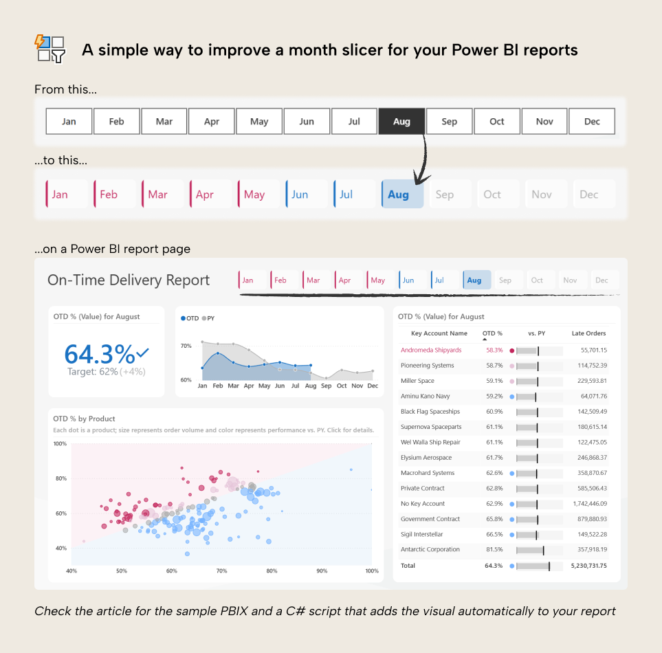
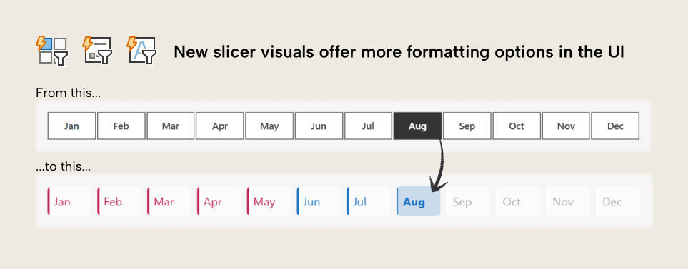
Many reports include a month slicer, giving the user to filter their data to one or more months. Since the slicer is so important to the context of the report, it’s typically shown as tiles that work like buttons, present as a single row or column on the report page. However, the default slicer is too dark and has very limited formatting options. With the new button slicer and a few formatting changes, you can get much better results:
In this article, we show you step-by-step how to make a simple yet elegant button slicer for your Power BI report without custom visuals or complex hacks that are hard to maintain.
Slicer alternatives in Power BI
It’s very common in Power BI reports to include slicers excessively. Many reports can have their top section completely full of slicers, taking up valuable real estate that is better used by cards, KPIs, or just empty space for readability. Before you add your monthly slicer, you should also consider some alternatives, too:
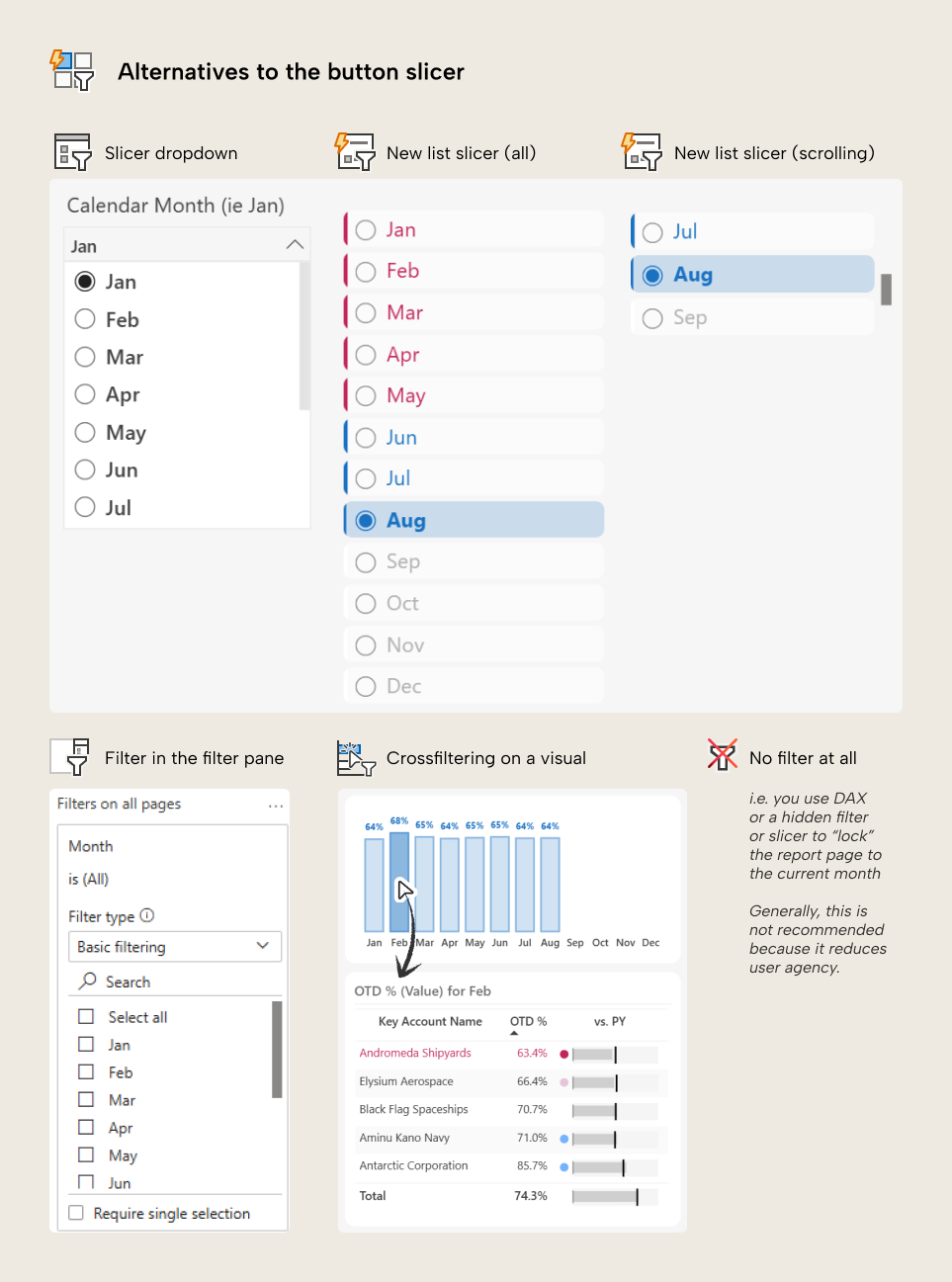
These alternatives include:
- A dropdown slicer, which can be more space-efficient and result in a cleaner design over tiles. As of October 2025, the dropdown slicer can only be made with the Slicer visual, which is pragmatic, but has very limited options for formatting.
- A list slicer, which works similar to the button slicer. You can also arrange lists or buttons to scroll for a more compact look (although not as compact as a dropdown).
- A filter in the filter pane. This is simpler, but you have less options for customization. However, if your report has multiple pages, it’s easier to have a report-level filter than trying to sync slicers that have bespoke formatting.
- Cross-filtering on a visual. This is less reliable as a primary filter technique, but good to start with an annual “big picture” view, before a user zooms to look at a particular month. This approach requires good user training and enablement about the report to be effective at all.
- No filter at all, which might involve you using a page-level filter, hidden slicer, or DAX calculations to fix the report to only show a specific month (like the current month). This is generally not recommended, because it negatively impacts the agency of your users; it takes away a key decision that they should make.
In this scenario, though, a slicer might be preferable because:
- It is a common element in other user interfaces for applications on mobile or desktop devices, so people are familiar with it.
- It could be the most common or used interaction on the report page. A button slicer requires the least number of clicks while still being visually appealing and informative.
- It will be included on report screenshots, subscriptions, and exports, clearly stating what month it is.
We’ll proceed with the month slicer for now, but it’s important to know that alternatives may exist, and might be better for your situation.
Design objectives and intent
The purpose of the slicer is to filter to a particular month (obviously). However, this particular design provides additional information to inform month selection. The intent isn't to “make the slicer look nice”, but to make selection more convenient:
- A conditionally formatted accent bar draws attention to months that are on- or off-target.
- A label indicates sales volume for each month.
- Card formatting draws attention away from future months (which have no sales) without hiding them, completely.
The formatted provide some visual cues to better inform month selection. Without the formatting, the user selects a month based on either implicit guesswork or explicit information they get from other sources. You can see the improvement by comparing the difference, below:
The following section explains how to build this slicer. Please feel free to exclude or alter any of the formatting in any step, as you see fit.
How to format the slicer step-by-step in Power BI Desktop
To make this slicer, follow the below steps:
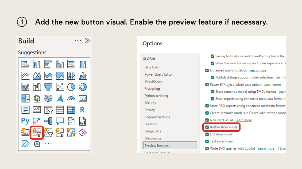
Step 1. Add a new button filter visual to the report page. If you don’t have the visual type available, update Power BI Desktop and confirm the visual is enabled in your environment.
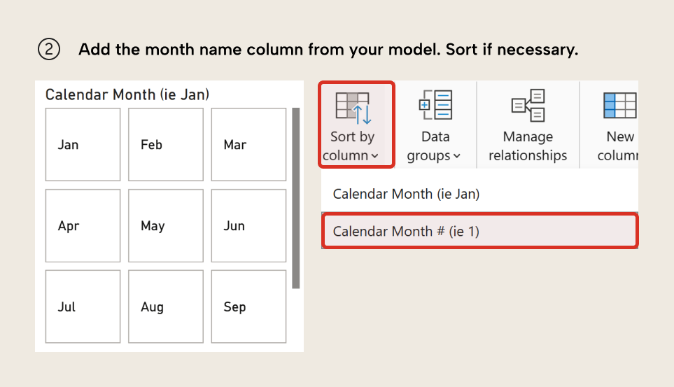
Step 2. Add the month name field from your model. You might want to add an abbreviated version of month name (such as Jan instead of January) for readability. To sort the month name by month number, you have to use the Sort By… property in Power BI Desktop or Tabular Editor to sort the month name column by month number. Ensure that the month number column is an integer.
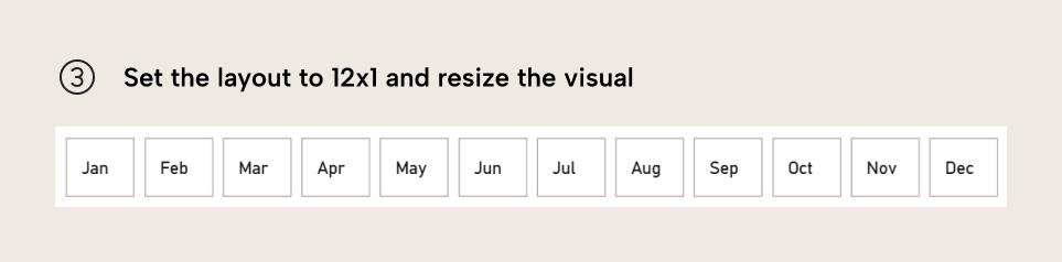
Step 3. Under Layout, set the layout of a grid to 1 row of 12 columns. Resize the visual to the appropriate space.
Step 4. Apply a theme if you have one to set any container or specific formatting. If you’d rather not apply the theme, you can make the below formatting changes to match our example. Feel free to deviate and experiment, as you want.
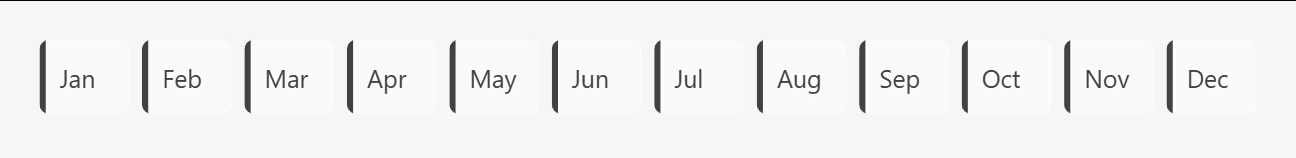
- Under Size & Style, disable the background, visual border, and shadow.
- Disable Title.
- Under Callout Values, set the Values to Bold for the Selected button state.
- Under Buttons, set the Shape to Rounded Rectangle with 6px rounding. For all button states, set fill to
#FFFFFF(white) and 50% transparency, and disable the border. Enable the accent bar and set it to 4px. - Under Buttons, for the Selected button state, disable the accent bar. For the Hover state, increase the accent bar to 6px. For the Pressed state, reduce the accent bar to 5px. This provides a little simple visual feedback for the buttons. You can already appreciate the difference from the starting point below, even without conditional formatting.
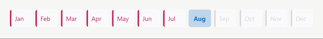
Step 5. Apply conditional formatting.
- Under Buttons, for all button states, format the accent bar using a color that compares an actual to a target. Ideally, this comes from a thin report measure that references theme colors like “good” and “bad”. Ensure that the measure handles future months, which should return a light grey (like
#DADADA). Again, try to use theme colors, likemidColor. For more information about using theme colors in DAX and why this saves you time and headache, read this article. - Under Buttons, for the Selected button state, format the button fill with the same measure.
- Under Callout Values, for all button states, format the font color using the same measure as the accent bar. For the Selected button state, you will need to set this separately, again. The result is a conditionally formatted button slicer, helping users see what months are on- or off-target, visually.
NOTE
The reason we use a measure rather than format with the user interface is because if we want to change the colors, we can do so in the theme. Also, if we want to change the formatting logic, we can do so in the measure. These are more efficient approaches that save us time in the future when we want to make a change. For instance, in this example, we use the same measure in four different places of the visual. It’s much faster to change one measure than going insane clicking through Power BI’s billion bloody menus to change the formatting, manually. Feel free to deviate from this, though, if you prefer.Also, remember that conditional formatting increases the query complexity of your visual. Basically, more conditional formatting will result in slower visuals. Only format what you need to; keep it simple! Especially for larger data.
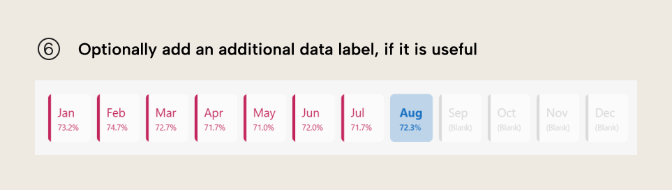
Step 6. Optionally, we can optionally add a Callout Value Label. This could be the actual value, or the comparison in percentage. Unfortunately, we have limited formatting options for this value, but we can at least ensure that it is appropriately rounded and sized so it is readable without providing too much cognitive overload. This produces the final visual. Note that in this example future months show (Blank); you might want to handle that case in a new conditional formatting measure if you want:
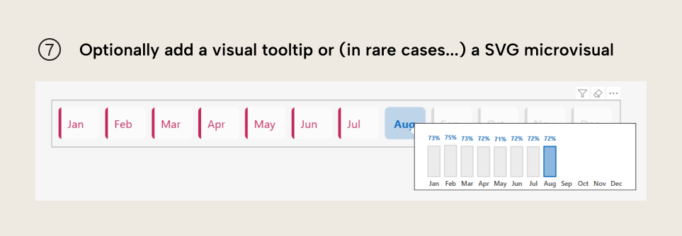
Step 7. Optionally, you can specify an SVG in a DAX measure to provide a small visualization or a custom icon. However, for a month slicer, we don’t recommend this. For most cases, it makes the report harder to maintain and change over time. Instead, you might consider something like a custom report page tooltip that shows the trend for the entire year.
Button slicer tips for your Power BI reports
When adjusting this design for your own purposes, consider the following:
- Avoid making the visual too busy or complicated. For instance, the label might provide excessive cognitive load; you might instead want to keep only the formatting.
- Avoid over-formatting visuals. Too much formatting also can make your visuals harder to read and interpret. Keep it simple and use muted colors. This is also true with slicers.
- Leverage your theme as much as possible. Bespoke formatting is quick to implement, but a pain in the ass to change. Instead, do it once, then set it up in a
theme.jsonfile. This will ensure that all your future button slicers look the same, which is convenient. - Get user feedback. What you find looks nice might not be the same as what users find useful. Consider showing a few options and then letting them pick their favourite.
For further reading
- Data Visualization Best Practices for Power BI reports (Tabular Editor). A broader design guide covering layout, color, and interaction principles that inform the formatting decisions shown in this article.
- Make better tables and matrixes in Power BI reports (Tabular Editor). Covers conditional formatting and cell-level customization in tables and matrixes, which use the same formatting mechanics as the button slicer.
- Slicers in Power BI (Microsoft). Microsoft's guide to slicer types, including button slicers, with instructions for configuring style, selection, and responsive layout options.
In conclusion
It’s a common pattern to include a month slicer on your report. You don’t need to include a month slicer; in fact, some scenarios might be better without it entirely. If you do need it, then you can consider applying some conditional formatting to make it more useful and convenient for your users.
Improve report slicers with cleaner model support from Tabular Editor 3.
Give Tabular Editor a spin