Key takeaways
- Good visualization speeds understanding: Design rules alone won't guarantee useful reports; you need to know what questions to answer and deliver those answers without ambiguity.
- Requirements are the hard part: Building charts is easy, but effective reports require thoughtful decisions about what to show, how, and for whom.
- Quality starts in the model: Consistent naming, clear definitions, and sound model design enable trustworthy, maintainable reports that scale.
This summary is produced by the author, and not by AI.
Good data visualization in simple terms
Good data visualization makes information understandable at-a-glance. You can stare at a spreadsheet and try to spot a trend, or see that trend immediately in a line chart. Data visualization helps people answer questions faster and with more confidence. In Power BI reports, good visualization means someone can look at a page and quickly understand: “What's the key message here? Is this good or bad? Do I need to act?”
The best reports don't require users to decode what they're looking at; the design speaks for itself.
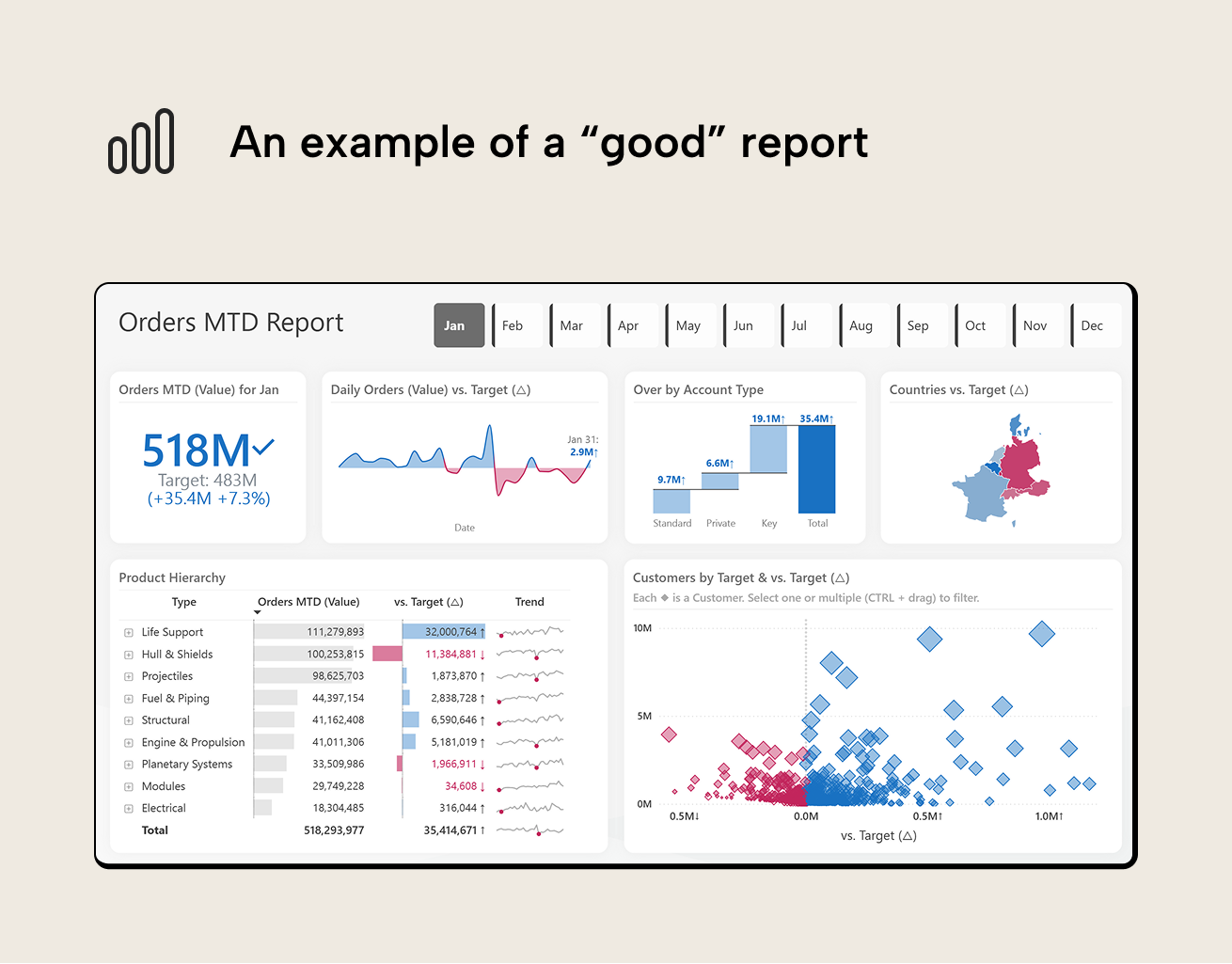
This "Orders MTD Report" attempts to answer the question: "How are we performing against our January orders target, and where should we focus attention?". If we frame this report in the context of the 3-30-300 rule (paraphrasing the visual information-seeking mantra):
- In 3 seconds, we see that we're overachieving vs. the target.
- In the next 30 seconds, we see that:
- We just had a period of underachievement and daily performance can be quite volatile.
- Key customer accounts contributed most to overachieving.
- Southeastern regions are doing worse than the northwestern regions.
- In the next 300 seconds, we could either drill into specific outlier customers in the scatterplot or specific products and types in the table with sparklines giving a general idea of product trends and dips.
Some best practices to follow
A good starting point for creating good reports is following some “best practices”:
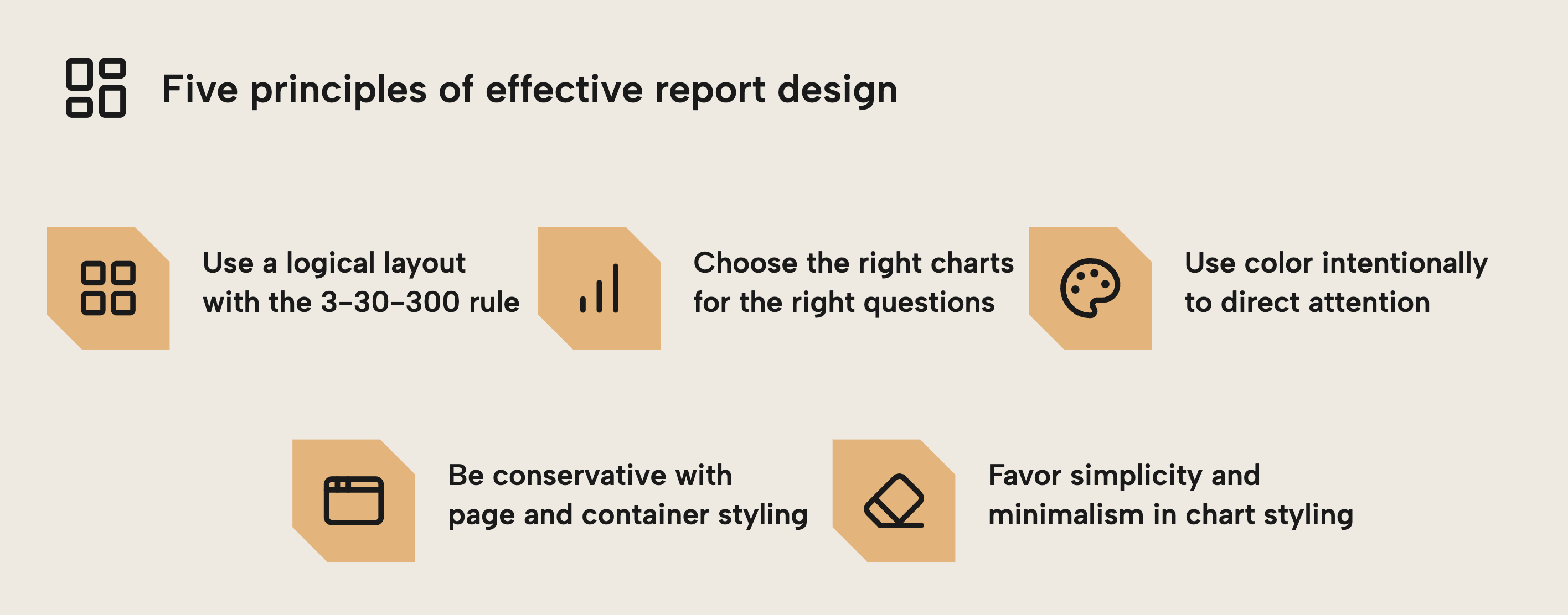
- Use a logical layout of your charts, putting the most important information in the top-left and the most detailed information in the bottom-right. This is called the 3-30-300 rule for the layout of your reports, as shown in the Orders MTD Report. You should also ensure equal spacing between charts and elements. Power BI’s grid and alignment actions can help.
- Choose the right charts for the right questions. An example of a wrong choice is using pie charts to compare magnitude between categories, since pie charts show proportionality when you want to compare parts of a whole.
- Use color intentionally to direct attention. An example could be using brighter colors to highlight actionable information, or using implicit associations like reds to color actionable negative information (in Western culture).
- Make conservative choices about page and container styling. An example could be having a light grey background, white chart backgrounds for contrast, and rounded corners. This is simple to obtain with some standard Power BI themes. Avoid eccentric or excessively decorated styles, and favour user preferences over your own.
- Favour simplicity and minimalism for chart styling. This helps to avoid cognitive overload in users. This involves using subtler, lighter colors, and thinking about what you can remove to make the chart simpler, not what you can add to make it “nicer”. An example that’s very common is tables that contain heavy dark fonts and black borders.
These are just a few examples. However, just because you follow these “best practices” doesn't guarantee that people will find your report useful.
Characteristics of “good” reports
A Power BI report is “good” when it helps someone come to a correct understanding or insight quickly and without ambiguity. This may sound obvious, but let’s be explicit about what we’re trying to achieve with a report:
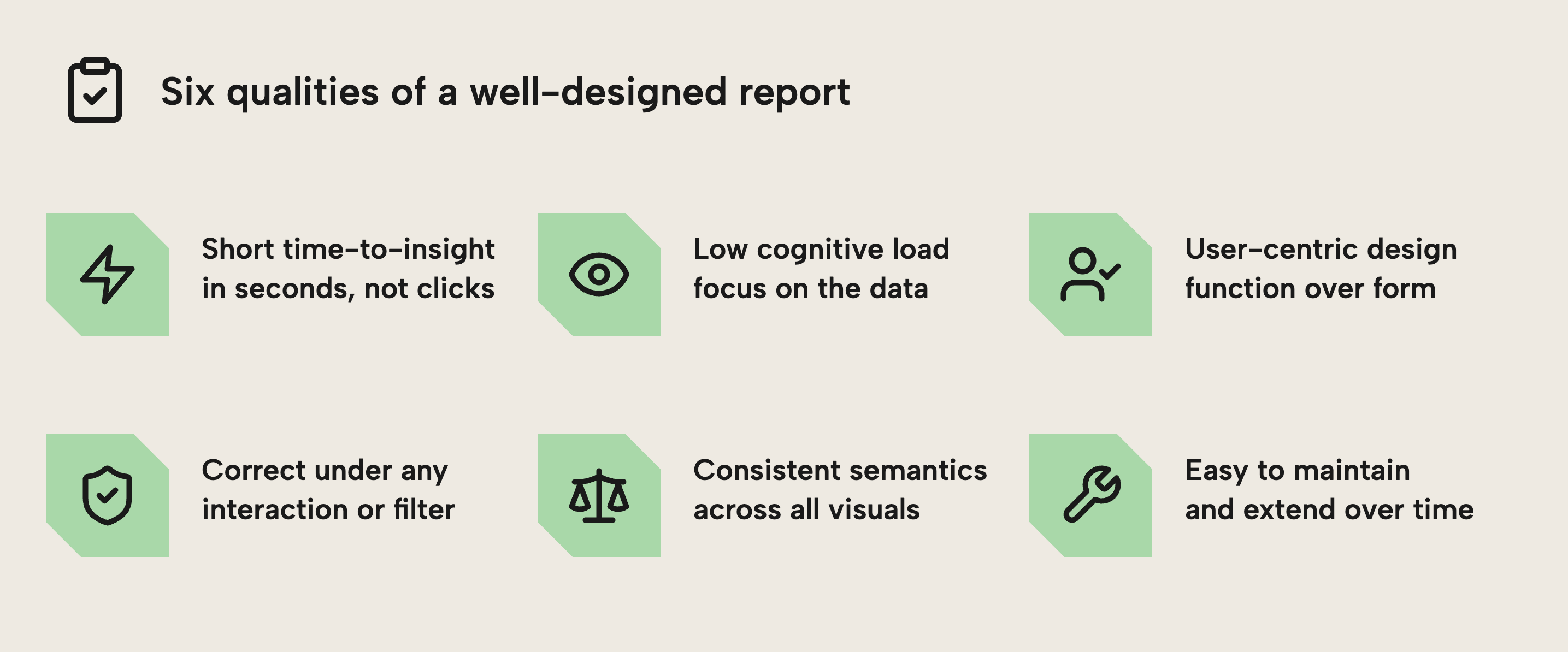
- A short time-to-insight. The intended message should be visible and interpretable in seconds, not after a dozen clicks.
- Low cognitive load. Users can focus on the data, not on deciphering which of the twelve visuals, six slicers and three legends to look at first.
- User-centric. Charts are made with users in mind rather than fixating on aesthetic decoration with superfluous formatting that doesn’t lead to a more useful or effective end-result.
- Correctness under any interaction. Charts must be trustworthy and deliver the results that business users expect from their data. Totals and breakdowns still make sense after being cross-filtered or drilled. If you show an
On-Time Delivery %KPI on a page that also contains a Yes/No slicer forIs Delivery On Time, the KPI will jump to 0% or 100% depending on the selection. It’s technically correct but also self-fulfilling; the metric is filtered by its own outcome; irrelevant. - Consistent semantics. A metric means the same thing everywhere it appears, e.g.
Revenuedoesn’t mean gross revenue in one visual and net revenue in another. - Maintainability. Expanding the report with a new segment, time period or business rule doesn’t require revisiting and checking substantial parts of it again.
Some examples that go against these goals include:
- Metrics without context. A card showing "Orders MTD: 518M" tells you nothing without a target, variance, or trend. Is this good news or bad?
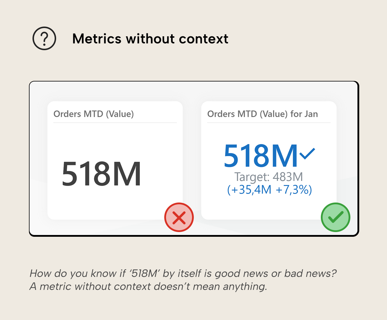
NOTE
You can create much more impressive and complex KPI cards in Power BI visuals. While these are popular in content, we try not to include them anymore because their cost to create and maintain is disproportionately high.
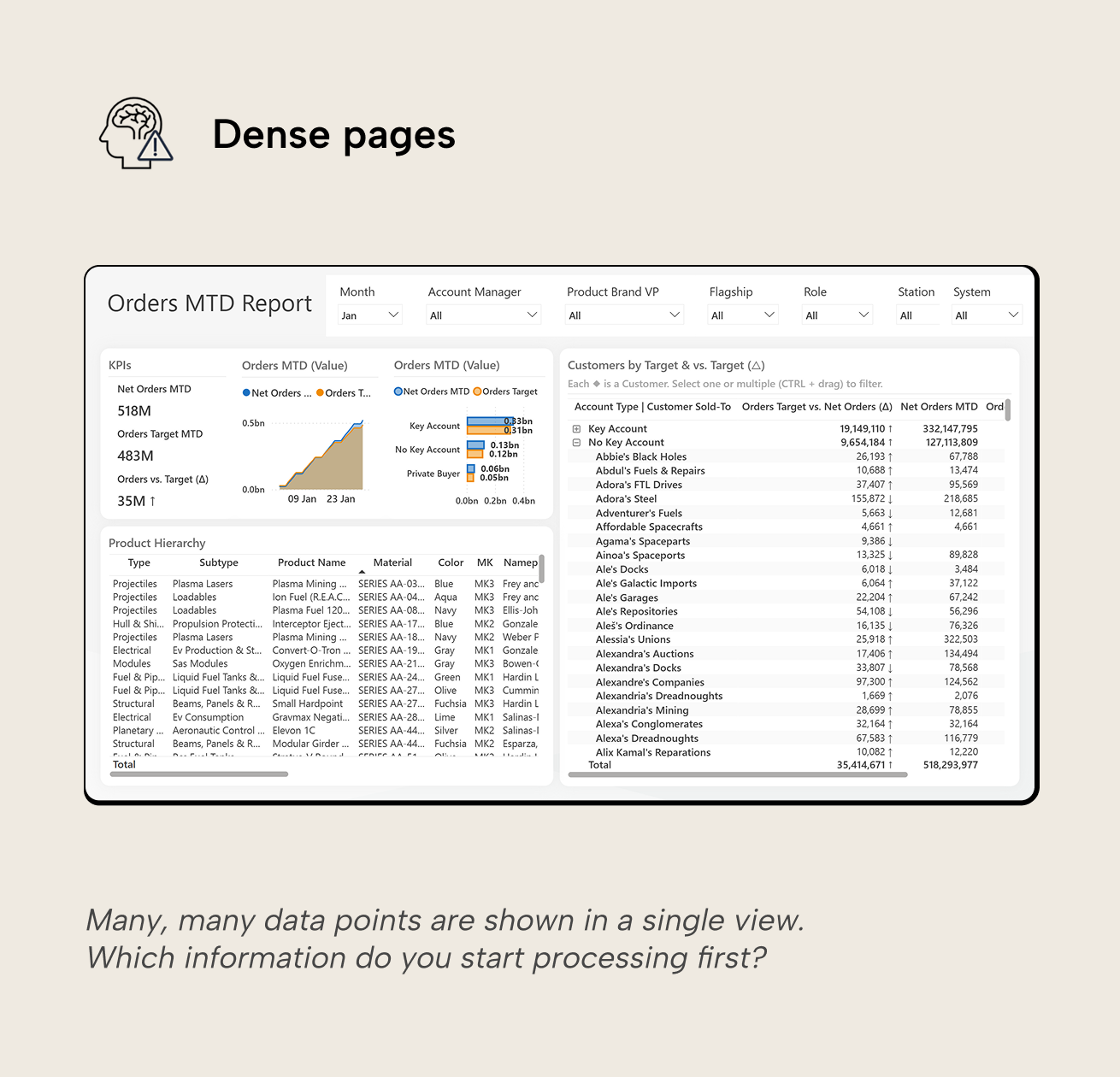
- Dense pages. As mentioned, the human brain just doesn’t handle large amounts of information presented simultaneously very well, and report performance suffers for every additional element on the page.
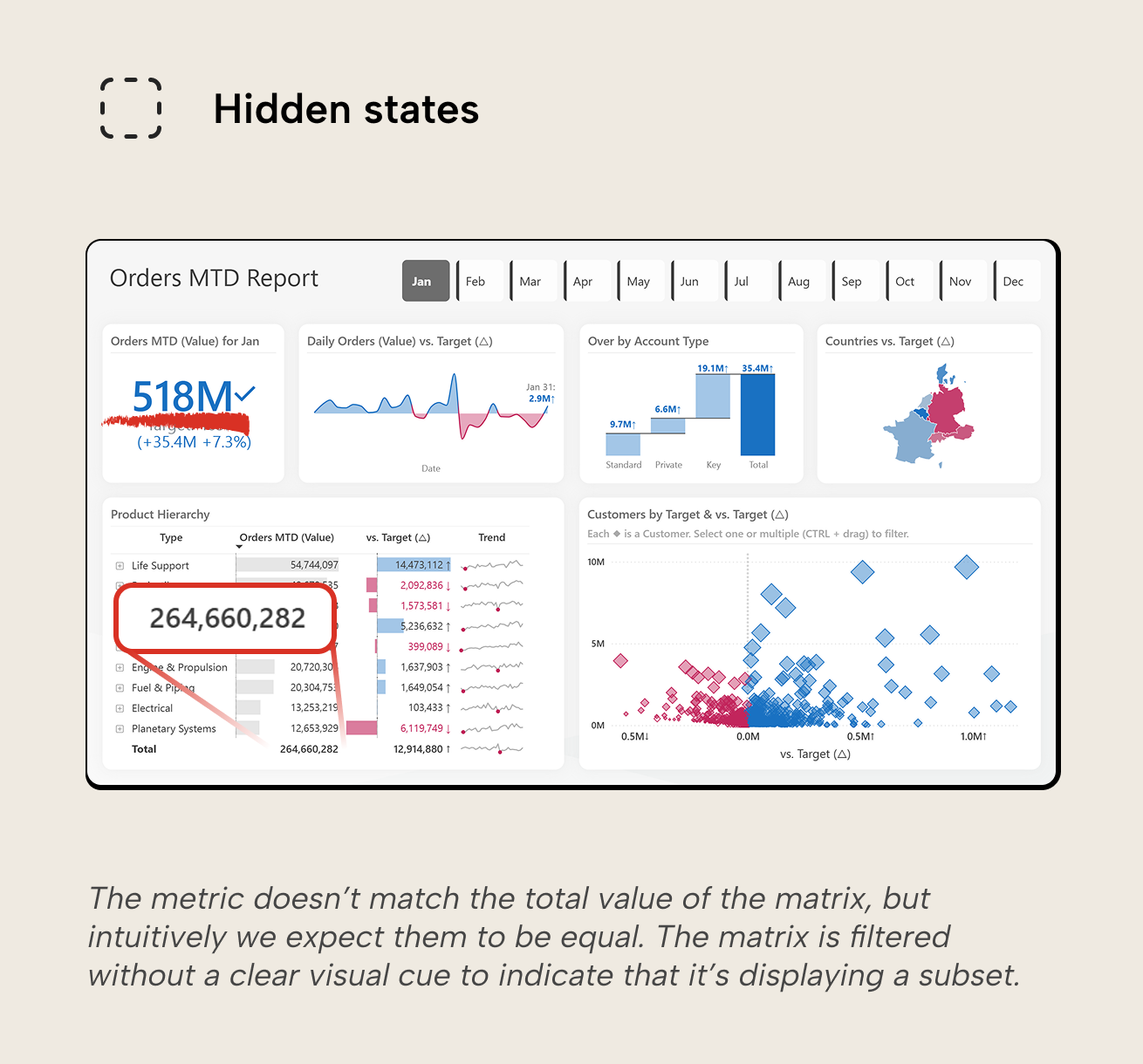
- Hidden states. If users can’t easily tell what’s filtered or affected by interactions, they must decode how the report works first, slowing them down and planting the seeds of distrust. Common examples include:
- Visual-level filters on visuals: users must hover the ‘filter’ icon to know which filters are affecting the visual.
- Cross-highlighting and cross-filtering visuals on the same page without context on their different behavior; cross-highlighted visuals still show the unfiltered data with selected data highlighted. It’s not hard to mistake the unfiltered from filtered data, especially if other visuals are cross-filtered, showing only filtered data.
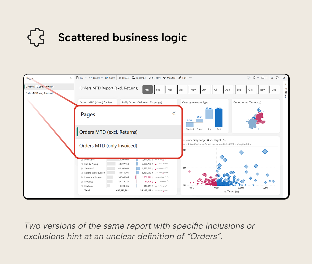
- Scattered business logic. If you need complex DAX inside visuals, weird hacks, or page-specific logic everywhere, you're compensating for semantic model gaps in the wrong layer. An "Orders MTD Report (exclude returns)" with individual visuals titled "(invoiced only)" signals that the model doesn't clearly define what "Orders" means. Business logic scattered across visuals is harder to govern, test, and maintain than logic expressed once in the semantic model.
NOTE
Some common and useful features (like conditional formatting, dynamic titles and tooltips, etc.) just do require specific DAX measures or visual-level calculations. Their use can be totally legitimate. The antipattern is overuse: business logic scattered across visuals is harder to govern, test and maintain than logic expressed once in the semantic model.
Good reports optimize for three things:
- Efficiency; this means performance of visuals and interactions but also how quickly users get their questions answered.
- Truthfulness; the report isn’t just accurate, but it also doesn’t accidentally (or intentionally!) mislead… even when users slice, drill and click around.
- Evolution; the report can easily (or even automatically) update as the business changes, which is expected, and occurs frequently throughout the year.
If either one is consistently ignored, it will rear its head later in the form of frustration (“this is unusable, visuals take forever to load”), distrust (“these numbers are off when filtered for product”), or development paralysis (“we can’t change this without breaking this and this”). Optimizing for efficient human understanding involves designing for how the human brain operates. The 3-30-300 rule is an excellent heuristic to design reports for human consumption. We refer to the SQLBI article for the details, but borrow some of its ideas for the next section about how to start designing, before building.
Start with the question instead of the canvas
Power BI makes it very easy to jump in and start building reports; open the report template with organizational theme, connect to a semantic model, drop in some visuals and a slicer or two, and voila, you have a report. Starting from the canvas often produces a result that’s visually fine but conceptually vague, i.e. not anchored to business questions that need answering.
NOTE
Report templates and organizational themes are great to reduce time spent formatting and ensure changes to the corporate identity are applied uniformly. They can also help self-service users avoid common design pitfalls by giving them examples to start from, like grid layouts and pre-formatted interaction elements like buttons and tooltips.
A better approach is to turn it around and start by asking yourself, the designer:
- Which question will this page answer? Example: “For any month, are we meeting our orders target, and which account types, products, or regions are driving over- or underachievement?”
- Which decision will the user make based on the answer? Example: “Do we need to adjust our strategy or focus sales efforts? If we’re over target, do we maintain or reallocate resources? If under target, do we focus on underperforming products or at-risk customers?”
- How would the decision change if the numbers change? Example: “If orders MTD is above target with key accounts driving most of the over-target result, we monitor and maintain strategy. If orders MTD falls below target or daily volatility increases, we investigate the products and large customers furthest below target.”
Force yourself to write the page question as a single sentence. If that’s hard, the page may be trying to do too much, your metrics may still have undefined semantics, or you don’t have a clear view on what the users need, yet. Go talk to them.
TIP
This is especially valuable now as agents emerge as a useful development tool. With agents, technical barriers and costs are getting lower; nontechnical people with a good understanding of business processes and domains can create quite sophisticated and useful visualizations, BI solutions, or custom software (not all of which need to be reports or dashboards, by the way!).
If you have good design and requirements gathering skills, you’re set to come out ahead in this new era!
When these requirements are clear, choice of chart becomes less subjective. The Orders MTD Report uses just seven chart types, and these same charts can handle roughly 95% of business reporting scenarios:
- Card/Big Number visual with context: target, variance, trend indicator
- Bar or column chart for comparing categories
- Line chart for trends over time
- Table for detailed breakdowns and precise values
- Scatterplot for exploring relationships between two metrics
- Map for geographic comparisons
- Waterfall chart for showing change between two points
- Donut or pie chart for simple composition (2-3 categories maximum). This isn't featured in the Orders MTD Report, but could replace the 'Over by Account Type' waterfall if the question was "Which account type dominates the surplus?" rather than "How much is each type contributing?" The donut would immediately show Key accounts as more than half, while the waterfall shows precise values for comparison.
NOTE
The use of pie and donut charts is a debated topic. Some think the world is better without them, others have a more nuanced stance. We think using them isn't the end of the world. If there are only a few categories (3 or less), they can succeed in their goal of showing that one category dwarfs the others.
If you're unsure which chart fits your question, frameworks like the chart chooser by Dr. Andrew Abela can guide you. The key is to match the chart to the most important question to answer: for monthly sales over a year, do you use a line or column chart? A line emphasizes the overall trend, while columns make each month feel like a distinct period to compare. If trends are more important than month-wise comparisons, go for the line chart, and vice versa.
For further reading
- Table and matrix design guide (Tabular Editor). Applies the principles from this article to tabular visuals, covering conditional formatting, sparklines, and hierarchy.
- KPI design guide (Tabular Editor). Covers KPI card and scoreboard designs that put the visualization principles in this article to work in performance-monitoring contexts.
- Report layout framework (SQLBI). A complementary framework for designing reports at three levels of engagement, directly applicable to layout and visual hierarchy.
In conclusion
Good data visualization starts with answering the right questions clearly, quickly, and consistently. Layout, chart choice, and intentional color all help, but they only work when they serve a well-defined user need and are grounded in a trustworthy semantic model. That is why requirements, semantics, and design intent matter more than any single visual.
Make Power BI visuals easier to trust with better Tabular Editor 3 models.
Give Tabular Editor a spin