
Key takeaways
Good design means better models, not just reports: A strong dashboard design helps you plan and build your semantic model and gives users a clearer picture of what to do with the data.
Plan your model around its users: Work backwards from the final report design, because a technically flawless model can still miss what the business actually needs.
Design both shapes and reflects behavior: A good design encourages the user behaviors that make a tool easy to use and valuable.
This summary is produced by the author, and not by AI.
When you hear the term design in the context of data and analytics, you probably think about data visualization; dashboards and reports. However, design is relevant to your entire data pipeline… especially semantic models. Furthermore, a good dashboard design can help you plan and build better semantic models, with a clearer picture of what people want to do with that data.
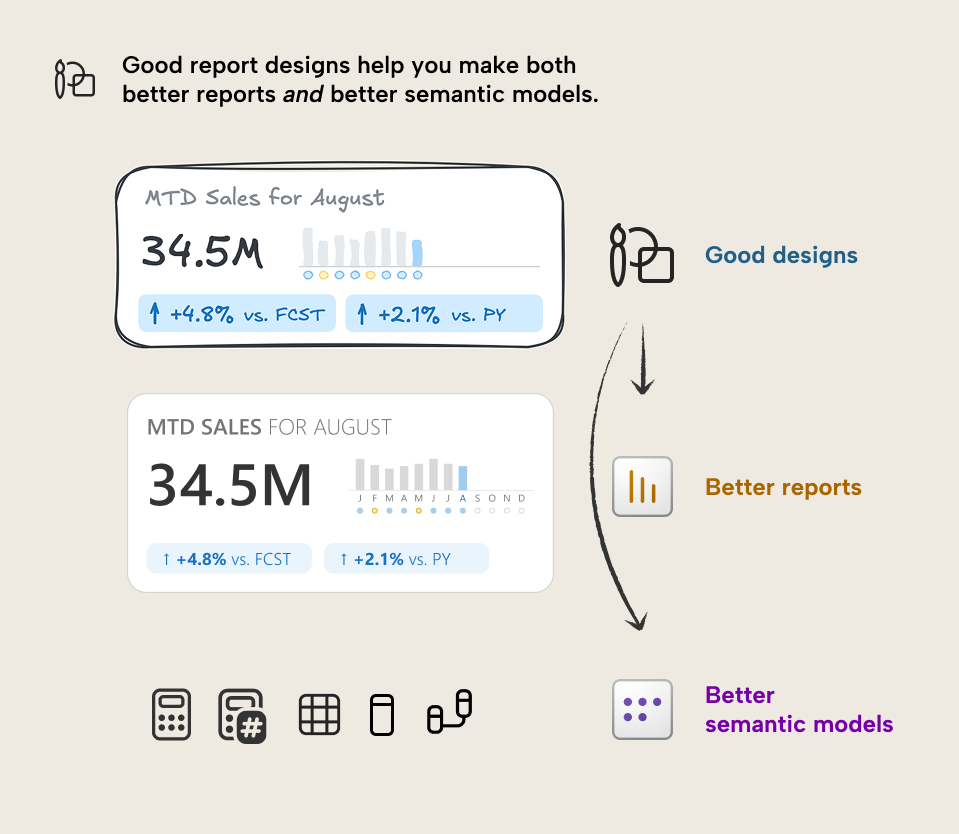
In this article, we argue that better design results in not only better reports, but also better semantic models. Therefore, it is worth your time to invest more in the requirements gathering process, and take a design-thinking approach, because this will improve not only your reports, but potentially all the interconnected elements of your data project.
Why:
- Good designs are a product of quality, human-centric requirements gathering and documentation. Model developers thus get a clearer and more practical understanding of the business process that the model should represent.
- Design documents like mock-ups, wireframes, and prototypes give a clear understanding of what data and functionality are needed. Better designs will ensure the model can better suit the business needs.
How:
- Model developers should be involved in the report design process when planning Power BI projects. They need to have the same understanding of the designs as users and report developers.
- While a report design might be the main focus and output of requirements gathering for Power BI, teams should design not only the visualizations at this stage, but also design the semantic model, and check the available data.
Plan your semantic model based on how it will be used
A mistake that people often make is to plan their semantic models focusing only on the data and technical requirements. They focus on making a technically good semantic model, rather than a useful semantic model. This might include following a star schema design or writing good DAX code. One might also focus on the data itself, creating logically organized tables and verifying data quality. These things are important, yes… however, they are not more important than what the business will actually do with that data.
It can happen that you design a semantic model which, on paper, is flawless. Perfectly executed star schema, immaculately optimized DAX, and all the data and calculations return the expected results… on paper. However, the business might expect something else. Maybe… the business wants dynamic currency conversion… flexibility to show sales for some regions but shipments for others… incorporation of other flat files like forecasts, alternative customer mappings, and point-of-sale data…
At a fundamental level, a semantic model represents an underlying business process. However, the business rarely, if ever, queries the semantic model directly. Instead, they usually query it from interfaces like dashboards, reports, pivot tables, and now natural language using Copilot and other AI tools.
For this reason, you should consider planning your semantic model working backwards, starting with the design of the final reports. Basically, you should try to talk with users and plan the layout, chart types, and interactions of your report (among other things) before you make it, and involve model developers in this process. The output of this should be a design for your reports and models.
Design in software and data is about behavior
When you design something, you make a plan for how it should look and work. Form follows function; it usually should look and work that way to solve a particular problem. However, when you design something that’s used by other people (like a report or dashboard, another data product, or a lot of software, generally) then purpose of design isn't just to solve problems, but to facilitate an effective and elegant user experience.
In this context, design is fundamentally about behavior. A good design aligns with who users are and what they do. Practically speaking, this means a good design encourages and promotes user behaviors, which help them to more easily use a tool and get value from it.
In Power BI dashboard design, you also communicate user behavior; where a user should look, and what they should click on. We’ll connect this to semantic models in a moment. First, consider a few examples:
- When you show big numbers like cards or KPIs, you’re implicitly communicating to a user: “these are important; you should look here”.
- When you use conditional formatting to highlight numbers or chart elements as red or orange, you are communicating to a user: “this is bad, you should pay attention to this and click or hover on it for more information”.
- When you use slicers on a page that say Click to filter the data, you are implicitly communicating to a user: “this report is exploratory, you might have to filter it yourself to find what you need or explore new insights.”
Poor designs result when report creators do not know or understand who the users are, or how they will use reports. These designs do not promote user behaviors that make reports more useful. In fact, they could do the opposite; they could promote behaviors that turn reports into obstacles.
- When you include the data in large tables or matrixes with many columns or measures, you are implicitly communicating to users: “you have to scroll and search through this sea of numbers to find the data that you need.”
- When you include a page in your report called “export” with tables, matrixes, and field parameters to export data, you are implicitly encouraging users to export the report data to Excel rather than view it in the report.
- When you overcomplicate your report with decorated numbers and charts that users find difficult to read, or which lack proper content or context for the data context, then you are implicitly communicating to users that they need to look elsewhere for details, or that the aesthetics are more important than the insights.
- When you show big numbers without context or targets, you are communicating to users “Here’s the number; it’s up to you to figure out what it means and whether it is good or bad.”
In contrast, good designs enhance reports and promote behaviors that make these reports more useful:
- When you use a scatterplot that highlights outliers, you might use a subtitle with explicit instructions like “Each data point is a customer. Click a customer to see its details”. This design communicates that users should look at the scatterplot to quickly understand “what customers should I pay attention to?” and then click on the data points to quickly get more details for a customer. It’s specific, and effective.
- When you choose for a less common or more complex chart type, you might include a question mark button or tooltip that explains it to users. This design communicates “This visual is a bit more complicated, and you should click this button if you are confused or you need help to use it”.
In summary, design informs and is informed by user behavior. In a dashboard, this behavior is where people should look, and what they should click on. When you have a good design, you direct their attention and actions in ways that help them to understand and interpret the data. However, the clicks and charts are translated to queries of your semantic model; you can only realize a design when your semantic model supports it.
Connecting dashboard design to model design
So, what does this have to do with semantic models? you might be thinking. Well, a report is often the way that users to interact with the model. Any information about how users will use a report inherently tells you how they will use the underlying model. You need to understand this so that you can plan and implement a model that supports all the needed functionality.
There are two main ways that report design helps you make semantic models:
- Designs: The outputs which help depict the expected result and what model functionality is required to get there.
- The design process: since a good report design requires a good understanding of the underlying business process or problem.
Designs themselves inform data modelling decisions
Designs for a dashboard or report contain helpful information for your semantic models.
When done right, a dashboard design provides an accurate depiction of the business requirements; it’s very useful in the requirements gathering process. This design, which typically takes the form of design documents like wireframes, mock-ups, and prototypes, provides a blueprint for what to make, what users expect to receive, and how it ought to work.
The final design (together with other, supplemental documentation) is useful to inform and derive the technical requirements for the model and even data artifacts or ETL. The following is a simple example of how report developer captures a user need in their design, and the model developer translates that to model functionality:
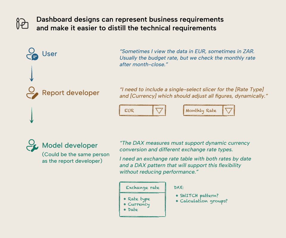
Here’s some more examples:
- Big numbers can tell model developers what DAX measures are most important and should be prioritized for development and testing.
- From designs, model developers can understand how to display numbers with format strings. For instance, this is useful when you need to make dynamic format strings.
- Model developers can use designs to proactively plan and create test queries. This can be particularly helpful for uncommon designs or functionality, like atypical handling of certain filter conditions or calculations.
To get these benefits, model developers must receive the designs and sufficiently understand them. If different people will make your Power BI reports as will make the semantic models, then they must very closely collaborate together during the end-to-end process: from design to delivery.
- Model developers need to work with report designers to translate visual requirements to technical requirements in the model.
- Model designers should create wireframes, mock-ups, and prototypes of the model to accompany the report design. We have an article and video about how you can do this in Tabular Editor, since you don’t need to have data to create and set up a model. In general:
- For wireframes, set up the conceptual model first to depict the high-level business concepts and relationships between them. Next, add details for a logical model where you depict semantic entities and how they exist. Drawing your model on a whiteboard or paper is often an easy way to do this.
- For mockups, depict the full set of objects you need and how they relate to one another. You should do this either in Power BI with mock data, or in Tabular Editor as we described, above. At this stage, you should also define the calculations for important fields that will be used in the report, and their upstream dependencies.
- Prototypes are fully functional and not always necessary. They depict a full, working model that contains the necessary parts and pieces for the design, but typically use a subset of the data or mock data.
However, we’re talking about the chicken before we talk about the egg; for all this to happen, you of course need a good design process.
Design-driven planning can better inform data modelling decisions
A good design results from a good design process. In essence: you’ve gotta get the requirements gathering right. This will help you better understand the users, the business, and the data.
A good design proposes an effective and elegant plan, form, and function to address a problem. To arrive at a good design, you need to understand that “problem space” very well, including the processes and people involved. Basically, this is requirements gathering… and if you have done it before, then you know that it’s not an easy task.
When you take a design-driven approach to requirements gathering, you can get a better understanding of who users are and what they do. This human-centric approach can lead to a deeper and more accurate understanding of the underlying business process. The understanding you get during this requirements gathering is valuable agnostic of whatever artifact you are making… be it a report, a model, or ETL pipelines.
To get these benefits, you need to ensure that your design process doesn't focus on visualization and report design, alone:
- Model developers must participate in the design process and talk with users.
- Validate assumptions about the data and actively challenge design or functionality requests by discussing with model developers (or investigating yourself) whether it’s actually achievable in Power BI.
- Document whether functionality or designs require complex approaches or techniques. Everybody’s gangster until the SVG measure has 600 lines of uncommented DAX, the consultant who made it is MIA, and an executive wants a change or noticed a bug.
- Ensure that your design process has enough time and resources to succeed. A rushed process won’t result in a better design, and thus won’t lead to a return of investment.
In summary, you should consider a design-driven approach to your Power BI projects. When planning designs, think not just about reports, but also semantic models. Involve semantic model developers, and ensure that you plan both reports and models.
So far this has only focused on reports, but you can imagine this extends also to paginated reports, dashboards, pivot tables… but what about Copilot, data agents, and MCP servers? What about conversational BI?
Does this still apply with AI… even if there’s no dashboard?
With respect to AI, you can consider this from two angles:
- For agentic model development, good dashboard design is valuable context for an agent to understand the desired end result. An agent can view and use the dashboard design to improve outputs and enhance various points of the agentic development workflow. Thus, the value of good design increases because it means that it benefits not only human users and developers, but also AI agents.
- For conversational BI, a dashboard might not necessarily even be necessary. While most semantic models in production today likely have at least one report, it is possible that in the future, some models might be consumed solely via AI tools with natural language. However, you can still use a design-thinking approach to requirements gathering in this scenario. You can meet with users and discuss data and existing reports to try and understand the types of questions they ask, and visually represent how they’d like those questions answered. These fragmented results might not necessarily crystallize into a single wireframe or mock-up; however, they can be valuable context for model AI instructions or agents that facilitate answering data questions.
Together with SQLBI, we are actively preparing larger bodies of content which will explain and walk through these scenarios more deeply with examples. If you want more information, keep an eye out at sqlbi.com.
For further reading
- Data Visualization Best Practices for Power BI reports (Tabular Editor). The companion for the report design side of the equation, covering how to turn well-designed requirements into effective charts and layouts.
- Power BI semantic model checklist (Tabular Editor). A practical checklist that translates design-informed modelling decisions into a concrete review of your model's structure and quality.
- Introducing the 3-30-300 rule for better reports (SQLBI). A layout framework for structuring reports so KPIs are easy to scan in three seconds, with direct implications for which measures deserve top-level visibility.
In conclusion
Taking a design-thinking approach to your Power BI projects can help you make better reports. If you consider your semantic models during the design, and actively involve model developers the right way, then you can also make better data models, too.
This is relevant both with and without AI, since designs can inform better outputs and approaches in scenarios across the spectrum of AI adoption and integration.
Turn dashboard needs into better model design with Tabular Editor 3.
Give Tabular Editor a spin