Key takeaways
- Interactivity lets readers explore on their terms: A static image answers only the questions the designer anticipated, while an interactive chart lets readers click an outlier and drill from region to customer.
- Power BI interactivity does more than is often realized: Cross-filtering, drilldown, and tooltips turn a single bar chart into both an answer and an entry point for follow-up questions.
- A wall of slicers is a query builder in disguise: Each slicer is a question the designer chose not to answer through layout; chart-driven interactions let readers start from what they see instead.
- Design starting from the reader's question: Every interaction should help explore a follow-up question and not just expose model fields; doing this well is hard, which is why slicers are an easy default we see often.
The interactive default
Charts on a Power BI report page are interactive by default. If you click a bar in a chart, the rest of the page responds. Hover over the bar and a tooltip shows context. Then drill into a hierarchy and you step through the details underneath. You don't need to do anything for these features; they're just how the platform works.
That default is easy to take for granted, but it’s doing something important. A static chart answers the questions the designer chose to show. An interactive chart lets the reader follow up: “That bar looks off–what’s behind it?” They click, and the page responds. The reader doesn’t type a query or pick from a dropdown; they follow their curiosity one click at a time. Interactive data visualization, in the Power BI sense, is exactly this: visuals that respond to clicks, hovers, selections, and drills to reveal layers of data the designer didn’t have to anticipate.
Earlier in this series we argued that good reports start with a question. Interactivity is where you find out whether you did. If the page question is clear, the reader’s clicks follow a natural path through the data. If it isn’t, interactivity gives them more ways to get lost.
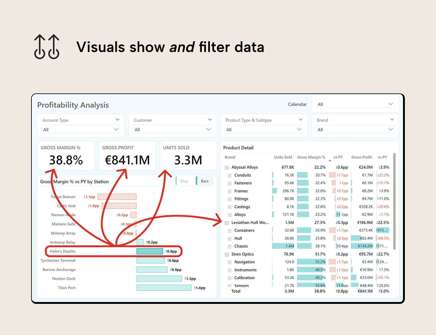
A chart that filters the page is pulling double duty. A bar chart with ten regions is simultaneously a comparison of ten data points and a ten-option filter control. It answers a question and opens the door to the next one.
So, if the charts already handle the filtering, what are all the slicers for?
Slicers un-solve interactivity
Open a typical report in most organizations and you’ll find a row of slicers across the top of the page: region, product category, customer segment, date range, and some other usual suspects. They’re important to most aspects of the business so they’ve always been there. Below them are three or four charts squeezed into whatever space is left. The default slicers persistently lay their claim on precious canvas space.
Pages like these are query builders in a dashboard costume. The slicers ask the reader to formulate their question–pick a region, category, time frame, etc.–before they’ve even looked at the data. Some selections produce empty visuals or nonsensical cross-sections; didn’t you know this combination was empty before selecting it?
The pattern repeats, partly because slicers are one of the first interactive elements most people learn in Power BI. You drop a slicer on the canvas, pick a field, and you’re done. Another reason for slicer walls is that slicers are the path of least resistance for everyone involved. The stakeholder asks “Can we filter by X?” and the developer adds a slicer, because it’s quick, the requirement is met, and nobody needs to have the harder conversation about what the page is actually supposed to answer.
Let’s be honest: we’ve been on the delivering side of that dynamic more often than we’d like to admit. If the stakeholder knows exactly which slicers they want, life can be easy: you deliver what’s asked and check another box. It takes more effort to push back and to sketch a page that answers the question through chart interactions instead of controls. The slicer wall persists because committing to a design (one that guides the reader) is harder than deferring to whatever the stakeholder requests.
What interactivity actually looks like
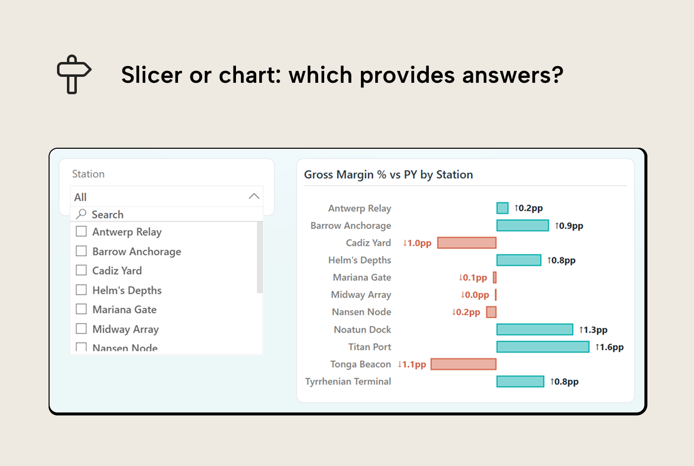
Every slicer you put on the page is a chart you didn’t build. Think about a region slicer next to a bar chart of gross margin by station. The slicer shows eleven labels: Antwerp Relay, Barrow Anchorage, and so on. The bar chart shows the same stations, but also shows which ones are profitable and which ones are bleeding margin. Click a bar and the page filters to that region. Exactly what the slicer would have done. The slicer can’t show you which bar is worth clicking in the first place.
So what does chart-driven interactivity look like in practice? Each of Power BI’s interaction patterns serves a different kind of follow-up question:
Cross-filtering. Clicking a bar in one visual narrows other visuals on the page to that category. The reader goes from “How are we doing overall?” to “How are we doing in this segment?” in a single click. The question path is natural: something in the overview caught your eye, now you want the detail behind it.
Cross-highlighting. Same click, but instead of filtering out everything else, the other visuals show the selection in context of the whole. The selected portion is emphasized and the full distribution stays visible; the unselected portion dims rather than disappearing. This is the right choice when the reader needs to compare the part to the whole (a brand’s share of total revenue, for instance) rather than isolate it.
Drilldown and drillthrough. Drilldown moves from summary to detail within a hierarchy. Year to quarter to month; brand to category to product, and so on. Drillthrough navigates to a separate page filtered to whatever the reader clicked. Both work when the detail answers the obvious follow-up. They fail when the destination is an unrelated view or a granularity the reader didn’t ask for.
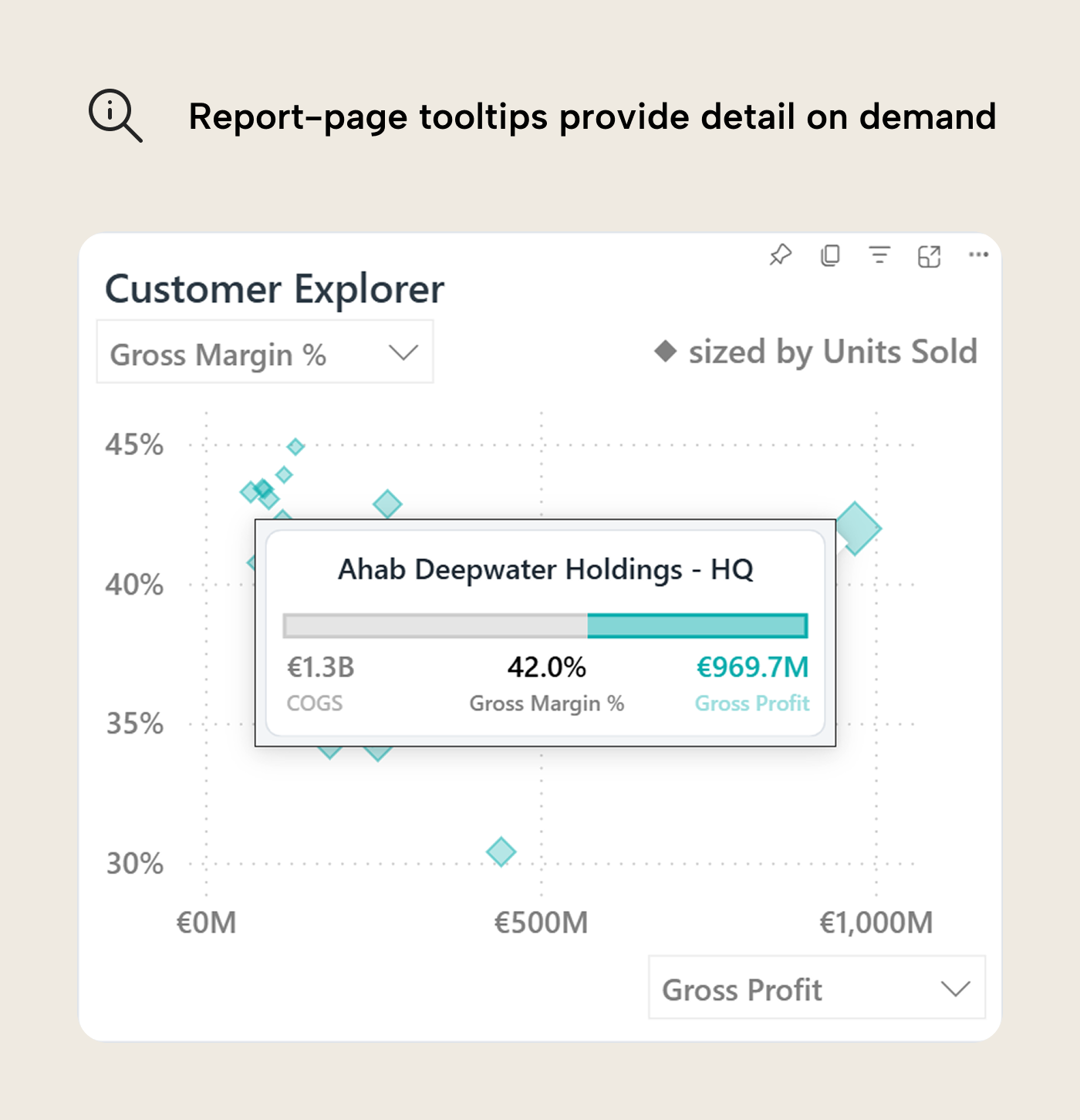
Tooltips. Hover a data point to view compact information that helps the reader understand a data point without leaving the current view. Report-page tooltips in Power BI can show richer content (KPIs, small charts, breakdowns) filtered to whatever is hovered. A constraint worth remembering is that a report-page tooltip is a dead end that can’t be interacted with further, unlike regular tooltips that enable drill actions. Since the reader can’t click or drill inside it, the content should inform the next action on the main page–context that helps the reader decide whether to click, drillthrough, or move on.
Beyond these core patterns, two features take interactivity further by changing what the reader sees, not just which slice they see:
Decomposition tree. The reader picks a measure and chooses which dimension to split by at each level. No predefined drill path, just follow the data wherever it leads. Power BI will even find the highest or lowest value in the subsets for you.
Field parameters and calculation groups. Field parameters let the reader change what a chart displays: toggle the y-axis from Revenue to Gross Profit, or switch the breakdown from Region to Brand. This isn't just simple interaction but a visual reconfiguration. Calculation groups do something similar for how measures are calculated: the reader picks YTD from a slicer and every measure on the page shifts to year-to-date figures. Both features use slicers as their delivery mechanism, but they control the reader’s perspective, not the filter context.
All of these give agency to the reader’s eyes instead of demanding inputs from their brain (“Which region was mentioned in that mail again?”). If something catches their attention, they are free to click or hover, and the page responds with the next piece of the answer.
The makeover
Let’s make this concrete with the DeepReach dataset, a fictional deep-sea logistics company with shipment data across ocean-floor stations, four product brands, and a bunch of crustacean customers. The page question is: “Where are we profitable, and where are margins under pressure?”
Before: the slicer wall
Here’s what that page looks like when every dimension gets a slicer: system, territory, station, brand, account type, customer, product type & subtype, and calendar year & month. Eight slicers across the top. Below them, a margin percentage card, a gross profit card, a units sold card, a cramped bar chart of margin by territory, and a stuffed table. Most of the page is input controls; the data is an afterthought.
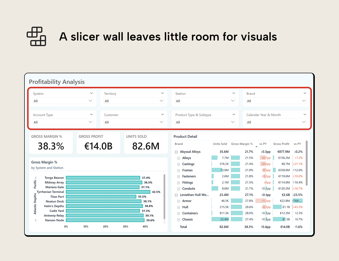
The reader arrives, sees eight dropdowns, and has to decide what to filter before seeing what’s worth filtering to. Most people leave the defaults and scroll past. The report is interactive but lacks direction.
Step 1: Name the page question
“Where are we profitable, and where are margins under pressure?”
Asking this question tells you what belongs on the page: margins vary across stations (the geographic "Where"). The brand Siren Optics sits comfortably 52% gross margin while Abyssal Alloys runs a tighter 22%. Margins also shift over time, so the reader will need a temporal frame of reference. Account type is only a secondary concern; we can just remove that slicer. This is the start with the question principle applied to interactions.
Step 2: Replace geography slicers with a bar chart
Three slicers–system, territory, station–become one bar chart showing gross margin % by station, with variance to prior period. The chart supports drilldown through the full hierarchy: click a region to see its territories, click a territory to see its stations. The reader spots underperformance and investigates it in the same visual.
A bookmark toggle next to the bar chart switches to a shape map. Three systems, colored by margin performance. The map shows geographic patterns the bar chart can’t and anchors the page in physical reality. The bar chart stays the default because it shows precise values and supports drilldown; the map is an alternative lens for readers who want the spatial view.
Three controls removed, one chart gained (with a map behind a toggle), and the page shows more information with the same filtering power.
Step 3: Replace category slicers with charts
The brand slicer becomes a column chart showing gross profit by brand, with prior year comparison. The reader sees which brands carry the profit and how each is trending. Click a bar to cross-filter the page to that brand.
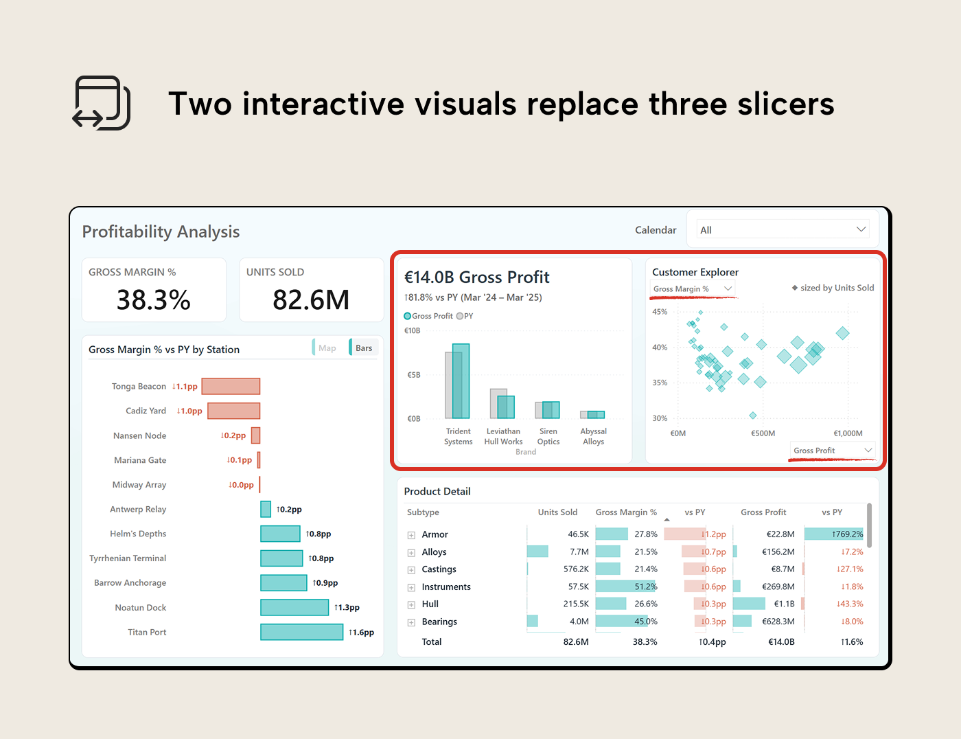
The product section and customer slicers go. In their place, a scatter chart plots customers by gross margin % against gross profit, sized by units sold. Field parameter dropdowns let the reader swap the axes: toggle from gross margin % to revenue, or from gross profit to units sold–whatever comparison matters in the moment. The scatter doesn’t just replace one slicer; it replaces a different slicer for every combination of measures the reader wants to compare. For customer-level detail beyond what the scatter shows, the matrix in the bottom right provides that path, and the exploration page shows the full breakdown.
Step 4: Audit what’s left
Zero slicers. The date range–which most makeovers would keep as the last justified slicer–is handled by the KPI line chart in the top left. It shows the last thirteen months of gross margin % with a dynamic title and comparison to the prior equivalent period. The time window is baked into the design; the reader doesn’t need to set it.
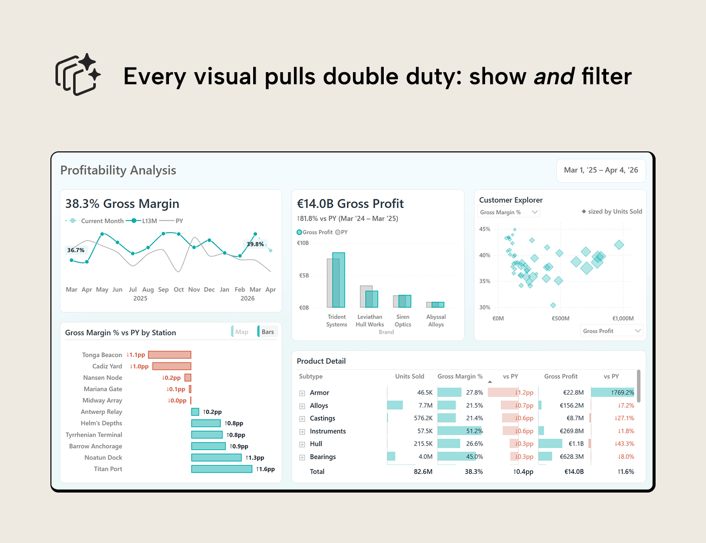
More data is visible in a cleaner layout, and every interaction is chart-driven.
Beyond the main page
The main page answers “Where are we profitable?” Two supporting elements extend the exploration.
Exploration page. Right-click any data point on the main page–a station, a brand, a customer, a month–and drill through to an exploration page. A decomposition tree on top, a detail table below. The drillthrough lands the reader with context: the station or brand they clicked is already filtered, and a dynamic title confirms where they are. A field parameter dropdown lets the reader switch the measure the tree analyzes without losing the exploration path they’ve built.
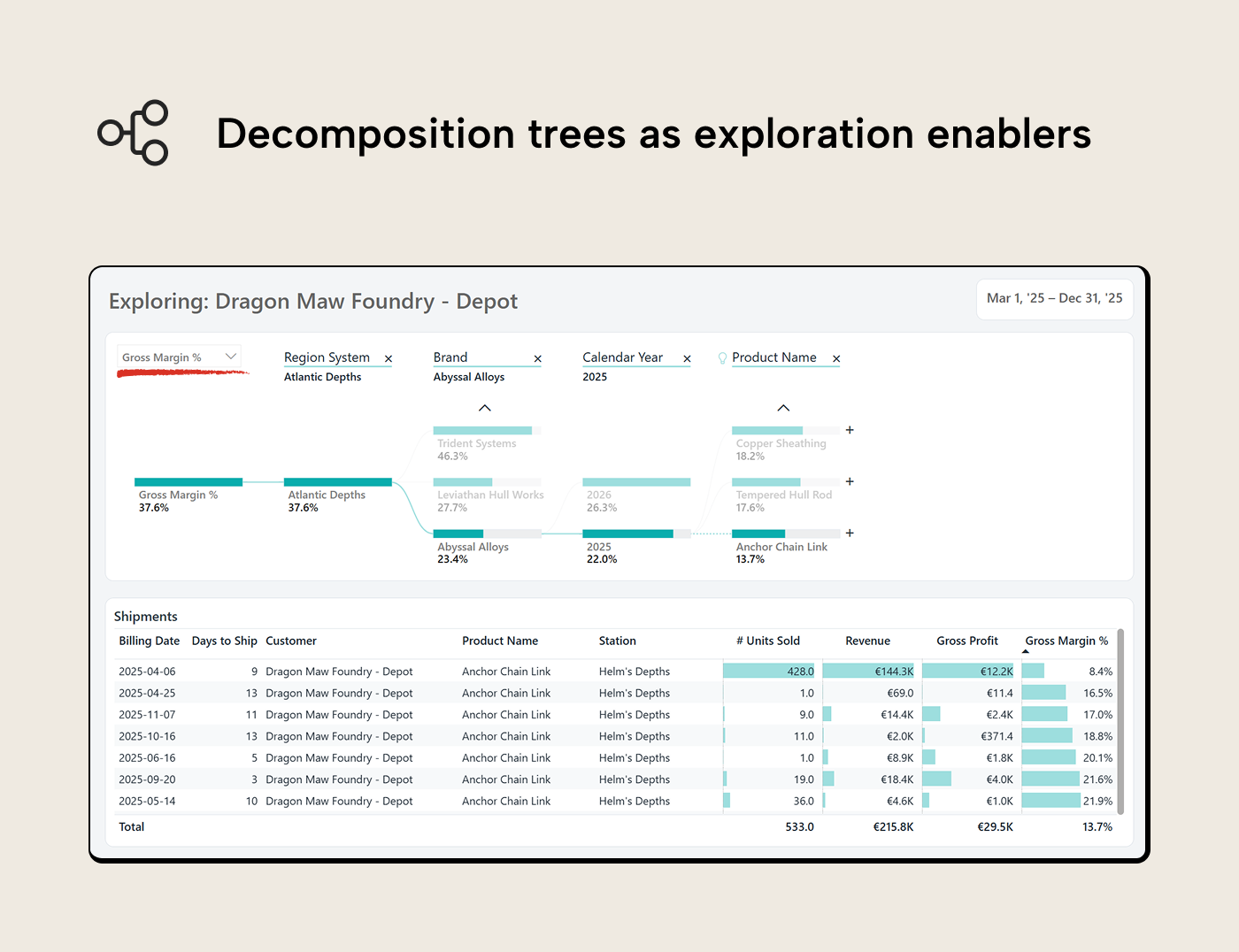
The table cross-filters to display the detail behind whatever node is selected. The reader can also navigate to this page directly from the tab bar and start from scratch, without any drillthrough filter. One page, two entry points: guided when the reader has a specific follow-up, open-ended when they arrive with their own question.
Report-page tooltip. Hover over any data point on the main page and a tooltip surfaces compact context: the key numbers and a cost-profit composition bar, scoped to whatever the reader is hovering. Enough to judge performance at a glance and decide the next action: click to cross-filter, right-click to drillthrough, or move on. Since a tooltip is a dead end (the reader can’t click or drill inside it), the content stays focused on informing that next click.
When slicers earn their place
A dropdown is always visible; cross-interactions aren't -- they're action-driven. If you remove slicers, you're betting/hoping that users will "get" the intended interaction flow through the page layout. They only will if the page is focused on the questions it was designed to answer (and not two that were tacked on later) and your users aren't yet married to the walls-of-slicers designs.
In some cases you genuinely need a slicer:
- A known parameter. A date range selector, a scenario toggle (actuals vs. budget, current year vs. prior year), a currency selector in a multi-currency model. This is where the reader arrives with a parameter they need to set and not a question to explore. Most reports benefit from an explicit date control, even if a rolling KPI can sometimes design it away.
- Too many values to fit in a visual. A dimension with hundreds of entries doesn’t work as a bar chart. When there’s no meaningful way to display the values visually, a slicer or search box is the functional choice.
- Lookup fields. Serial numbers, quotation IDs, customer codes, etc. Values the reader has just copied from another application and needs to filter by pasting in.
- Users who aren’t there yet. Weaning a team off slicer walls is a change management effort, not only a design strategy. If your users are just getting comfortable with Power BI, replacing familiar controls with chart-driven interactions can make a report feel broken rather than improved. This is a real risk that can make them cling to slicers even harder; triple-check your designed interactions for intuitiveness in this phase.
We’re not telling you slicers are bad and you should stop using them. We do want to point out that they can stand in the way of good report UX when they're overused: when every stakeholder request becomes another dropdown and the original question that inspired the page design is lost in the fog of tacked on changes.
What doesn’t earn its place are filters the reader can’t see or undo. Visual-level filters, page-level filters, and leftover slicer selections can leave the reader unsure what they’re looking at. Interactivity must be transparent; the reader should always know what’s filtered. A “Clear all filters” button can help but is a band-aid for a design problem that should have avoided opaque filters in the first place.
Bookmark sprawl falls in the same category. Three or four bookmarks toggling chart types or KPI views can work but twenty bookmarks pretending to be website navigation are a maze for both reader and developer.
The model must keep up
Semantic models tend to become simpler when interactions replace slicer models. Cross-filtering through a well-structured star schema plays to VertiPaq’s strengths because filter propagation along existing relationships is fast and predictable.
However, the conditional formatting DAX that's required to make interactive design work (e.g. dynamic colors and titles, KPI indicators, visuals that respond meaningfully to selections) tacks on filter context complexity that makes queries harder to understand and debug. In some cases the trade-off can be so expensive that you're tempted to trade them in again for simple slicers.
NOTE
Field parameters add DAX-defined tables to the model; lightweight, but they need to be managed for self-service consumers and documented for future developers. Calculation groups introduce precedence rules: when multiple groups interact, the evaluation order matters and can produce unanticipated results. Weigh the interactivity gain against the modeling overhead before adding them, especially if it's a pattern your userbase hasn't seen before.
For further reading
- Data Visualization Best Practices for Power BI reports (tabulareditor.com). The foundational principles this series builds on, including the question-first approach that determines which interactions belong on a page.
- Building better line and trend charts in Power BI reports (tabulareditor.com). Covers small multiples and multi-series patterns that extend naturally into the interactive designs shown in this article.
- IBCS Standards 1.2 (IBCS). Practical notation conventions for business charts that reduce cognitive load and improve comparability across a report's interactive pages.
In conclusion
Power BI’s interactive features are more powerful than is often realized. With cross-filtering, drillthrough, field parameters, decomposition trees and report-page tooltips, the reader can follow their curiosity through the report without typing queries or navigating drop-down menus.
To get started, open one of your recent reports and look for dimensions that are used in slicers and visuals. Can you just delete the slicer and rely on the visual's cross-interaction? If so, you can declutter the report and give the reader's working memory some breathing room, or answer another relevant question on the same page.
Give interactive Power BI reports stronger model foundations in Tabular Editor 3.
Give Tabular Editor a spin