Key takeaways
- Bar charts just work: Length on a common baseline is the most accurate encoding for magnitude, and the format is widely familiar; that perceptual strength is the chart's visual budget.
- Every addition spends the budget: More categories, series, colors, and labels each cost something, so each addition should be deliberate.
- There's a path from "works" to "doesn't": A readable bar chart becomes a kaleidoscope when additions compound and the perceptual strengths stop functioning.
- Color is the most expensive channel: Highlighting the longest bar just repeats what length already shows; color earns its place when it encodes something length can't.
- Sometimes a bar chart isn't the answer: When the budget runs out, a different chart, a table, or several simple visuals may serve better.
Why bar charts work
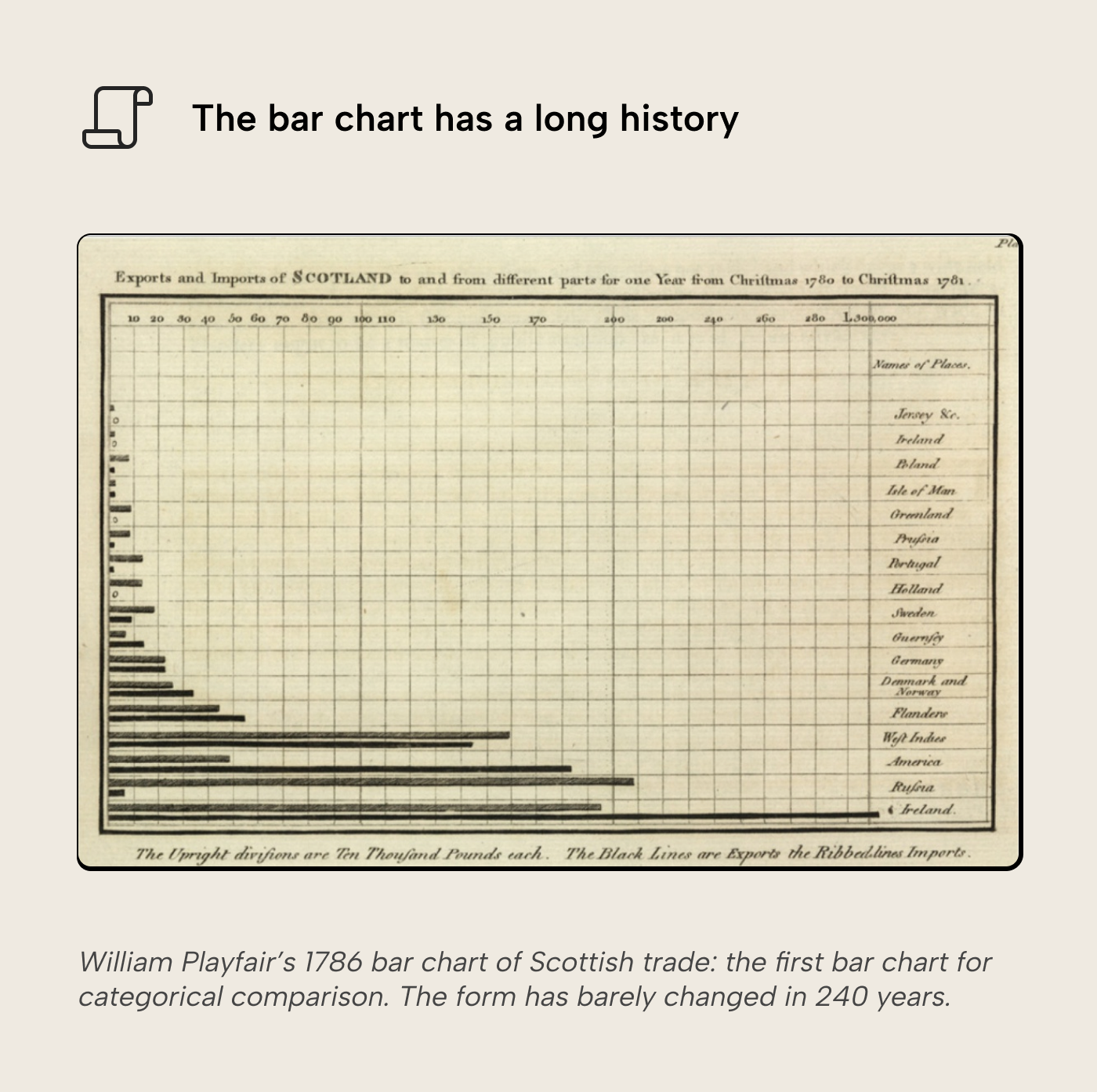
The bar chart is one of the oldest statistical graphics we have. William Playfair published the first bar chart for categorical comparison in 1786: a horizontal bar chart of Scotland’s imports and exports with trading partners. Two and a half centuries later, it’s a familiar sight wherever numbers are shown visually: news stories, research reports, business dashboards; bar charts are everywhere. Most people have seen one before and instinctively know how to read them.
Familiarity is just one of the bar chart’s strengths. It is perceptually powerful in specific ways worth understanding, because those strengths break when the chart gets overloaded.
The longest bar is instantly visible. Before even reading a label or tracing to the axis, your visual system automatically picks out the longest bar. This is pre-attentive processing: it resolves before conscious effort begins and it works regardless of how the bars are sorted. You can shuffle the order randomly and the longest/shortest bars will still be found near-instantly.
A common baseline does the math for the reader. All bars start from zero, so the gap between two bars is itself a visible length. This is what makes bars superior to pie charts for comparison: angle and area encoding have no shared reference point, so the reader has to mentally reconstruct a comparison.
WARNING
Bars should always start from 0, or the minimum value in case of diverging bar charts. Yang et al. (2021) showed that truncating a bar chart’s axis persistently misleads viewers, even when they are told it is truncated. There is no honest use case for truncating bars.
Rank and magnitude are shown together. A sorted bar chart shows both the ordering and the proportional distance between values in one glance. A ranked list gives you position (first, second, etc.) but hides proportion (difference between first and second). A table of numbers gives you precision but forces digit-by-digit comparison. Bars can do both at once, which is why they remain the default for categorical comparison across every visualization platform, not just Power BI.
These three strengths are what put bar charts at the top of Cleveland & McGill’s perceptual accuracy hierarchy. This is the ordering of how precisely the eye reads each visual encoding. Additions tend to nudge the chart toward less accurate encodings further down.
The simple bar chart
Drag a category onto the axis and a measure onto the values. Power BI gives you a column chart, default sorted descending, one theme color, axis starting at zero. It takes just a few seconds to build and it works: value sort shows the ranking, single color keeps the comparison on length alone, the zero baseline keeps the encoding honest. Every strength from the previous section is preserved, and the visual budget is fully intact. It only starts to erode when the designer starts adding complexity.
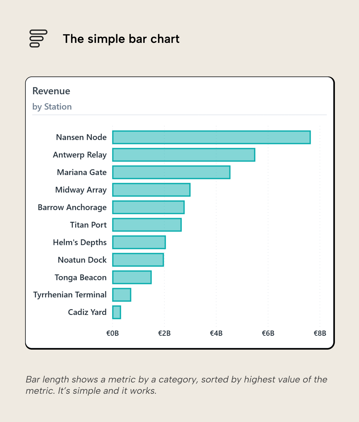
The one setting worth overriding up front is the sort. Value sort is right for ranking questions, but when categories have a natural order (pipeline stages, priority tiers, process steps) it scrambles the progression. A sort-by-column in the model encodes the intended sequence once, so charts built on that field inherit it.
NOTE
Even at this simple stage, formatting choices can trade form for function.
- Rounded corners soften the visual and are increasingly popular in modern themes. They’re not (yet) a native formatting option in Power BI but can be achieved through a workaround. The more you round the bars’ corners, the smaller the comparison points (bar ends) become, nerfing the core strength of the chart. A few px is usually fine.
- Spacing between bars affects whether the reader sees individual magnitudes (wider bars, tighter gaps) or an overall pattern (narrower bars, more spacing); Power BI’s inner padding setting controls this. For a ranking chart, keep bars wide so length comparison stays the focus; looser spacing suits a chart where the overall silhouette matters more than individual values. Zero spacing should be reserved for histograms, where touching bars correctly signal continuous bins.
- Borders around bars are mostly decorative on a single-series chart, but become functional in stacked layouts where adjacent segments share similar hues. A thin border separates them without forcing a heavier palette change.
- 3D effects distort the perceived height of the bars. Small multiples or a heatmap then show the same data more reliably.
Each of these is a small trade on its own. Stack enough of them, and the bar chart’s core advantage, precise length comparison, starts to erode.
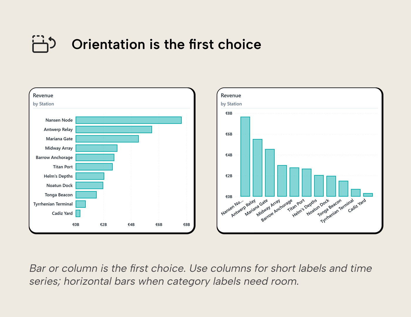
Columns or bars?
The first choice is whether you want rectangles lying down (i.e. bars) or standing up (i.e. columns). The data and encoding are identical; the only difference is orientation.
- Vertical columns work well when the category axis has short values (dates, codes, etc.). They’re also good at displaying temporal categories (years, months, etc.) because time naturally follows reading direction (left to right in Western cultures).
- Horizontal bars work better when category labels are longer. Column charts have to truncate or angle long labels, requiring readers to either guess what was truncated or tilt their heads to read angled labels. Horizontal bars are also more forgiving to display many categories; the Y-axis labels sit aligned under each other so they’re scannable, and when categories grow too numerous to display at once, vertical scrolling is still acceptable and natural to most readers.
We’ll default to calling the rectangles “bars” for the rest of the article.
Too many categories
This is the first way the budget gets spent. With a handful of bars, the reader takes in the ranking at a glance. If you add more, the task slowly morphs into scanning bar by bar. The length encoding still works; the longest bar still pops, outliers are still visible, and the rough ranking is still faster to read than a column of numbers. But the chart has lost some of its speed advantage: the at-a-glance comparison that worked with eight bars takes more effort with forty. There is no universal cutoff; in practice, once a chart pushes past a dozen or so categories, it stops being fast, which was the whole reason to use it instead of a table.
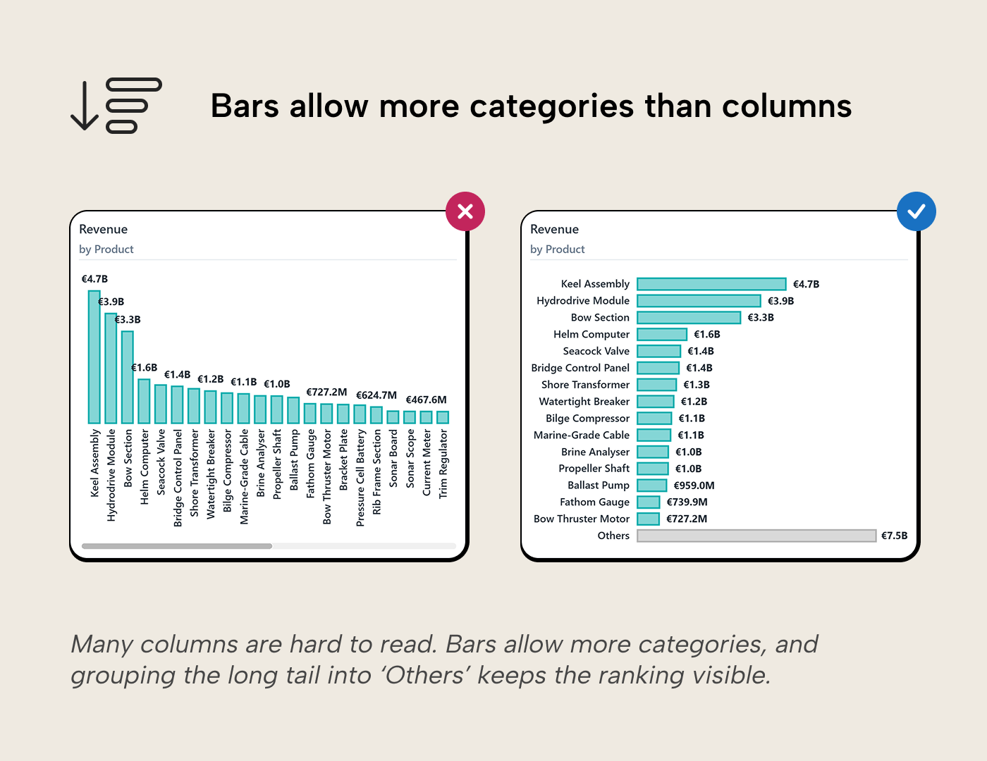
Flipping to horizontal bars buys more room but doesn’t change the fundamental problem: the reader is still scanning a long list. Filtering to the top performers and rolling the rest into an “Others” bucket can be a better fix. The reader then sees the ranking clearly and the relative size of the long tail in one view.
NOTE
Power BI’s Top N filter is native. The “Others” bucket isn’t. It requires a deliberate DAX pattern that must be tested against every interaction the report supports before shipping.
Shrinking the font, angling the labels, or stretching the canvas wider all treat the symptom: more categories than the chart can show at a glance. If the reader genuinely needs every category, a table with conditional formatting is the honest answer. It handles density better because it was designed for sequential reading. The honest question isn’t “how do I fit more categories into the chart” but “does the reader want the ranking, or every number?”
Adding a second series
This is the second way the budget gets spent, and the most consequential. You had a readable bar chart. Then someone asks, “Can we see that broken down by brand?” and a field is added to the legend. The chart is now stacked or clustered, and the question has changed.
Each way to add a series buys something, but each one costs a specific perceptual strength.
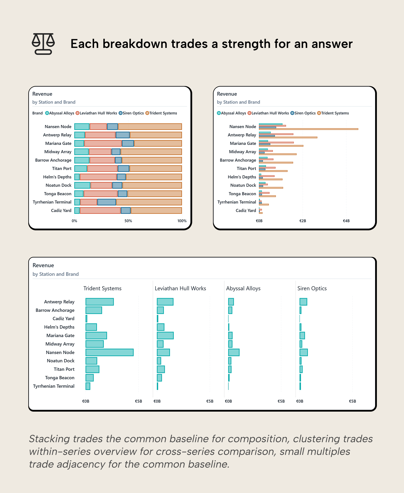
Stacking costs the common baseline. Only the bottom segment keeps the baseline; every segment above it floats at a different height per bar. The breakdown, the reason you added the series, loses the exact advantage that made bars better than pie charts. Segment comparison across bars becomes estimation, not measurement. Talbot et al. (2014) support what the visual system already registers: stacked bars perform significantly worse than aligned bars for precise comparison. Stacked bars work with two or three segments, with the most important segment on the baseline. In Power BI, legend order controls which segment lands on the baseline. The Sort By Column property of the legend column is the model-level fix.
Clustering costs within-series overview. Each category becomes a group of thin bars. The reader can compare brands directly for the same station, but tracking one brand across all stations means jumping between groups. The sort serves the station ranking but hides the brand ranking. It answers one question but conceals the other. Clustered bars scale poorly beyond two or three sub-categories.
Power BI’s Overlap series layout (in the Columns or Bars section of the format pane) lets series overlap each other instead of placing them side by side. It’s a good fit for two-series comparisons like actual vs. prior period, where clustering doubles the visual width for what is really a one-to-one comparison. Set the fill transparency on the front series so the series behind stays visible, and add a thin border if the two colors are close.
Small multiples trade adjacency for baseline. Power BI can share the scale across panels, so the baseline is preserved within and across every panel. What’s lost is direct side-by-side comparison: the reader carries bar heights visually across panels instead of seeing them adjacent. This is often a good trade (the baseline is the more valuable perceptual asset), but it is still a cost.
100% stacked trades magnitude for composition. Absolute size disappears; the reader sees how the mix varies across categories. Gridlines at quarter-marks help because estimation improves near recognizable anchors (Bailey & Gleicher, 2025). Use 100% stacked bars when the question is about share, not size.
Combo charts swap the second series for a second encoding. A clustered bar chart with a line overlaid (revenue as bars, margin % as a line) is a common sight in business reports and one of the most expensive on the visual budget. The reader compares bar lengths against the left axis and line position against the right axis, using two different encodings at two different scales. The relationship between the bar and line values isn't visually apparent; the reader must infer it by mentally switching between the axes. The Pareto chart (sorted bars plus a cumulative percentage line) is a notable exception: the line answers a question the bars structurally cannot (“which categories account for 80% of the total?”), and the two encodings serve a single unified question rather than competing for attention.
The color channel gets saturated. A single-series bar needs no legend. Adding a series adds a legend and a lookup cost on every glance. Two colors remain pre-attentive; five require conscious effort per bar. The color channel degrades from instant signal to sequential decode.
Adding a second series should add a question. Stacked asks “What is the total, and what explains it?” Clustered asks “How do sub-categories compare across groups?” 100% stacked asks “How does the mix shift?” If the designer can’t name the question the second series answers, it probably shouldn’t be there. Xiong et al. (2021) showed that visual arrangement changes what comparisons people naturally make. Picking the layout is picking the analytical statement.
The kaleidoscope
A bar chart often starts with one measure and one category. Clean and fast. The designer adds more categories to be comprehensive. Then a second series to show the breakdown, or a conditional color to flag the outliers. Then, data labels so the reader doesn’t have to guess. Then, a reference line for context.
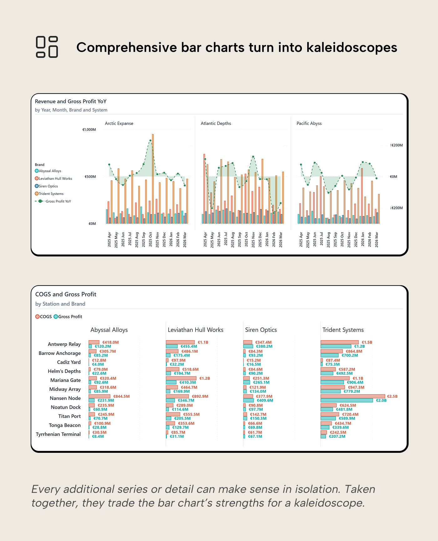
Each addition can make sense in isolation, but together they produce a chart with narrow stacked bars in many colors, labels that need to be read, a line cutting through the middle, and a legend that eats up much of the chart. The visual budget is spent:
- The longest bar is no longer instantly visible; bars are too narrow for pre-attentive length comparison.
- The common baseline no longer helps if segments float at different heights.
- Color is saturated by encoding a category identity and a conditional logic simultaneously; the reader decodes each bar against two different legends.
- The sort serves one ranking and hides two others; one series ranking is visible, but the others are buried.
- Reference lines cut through colored regions at different heights. They were designed for a clean chart; laying it over an already complex chart defeats it.
Data labels are another illustration that additions are not unconditionally good or bad. With five bars, labels add precision on top of comparison. The bars do the ranking and the labels provide the number. With thirty bars, labels become the primary information channel and compete with the bars themselves. The reader is now reading numbers instead of comparing lengths. The bar chart has devolved into a quasi-table without the benefits of a table. Power BI’s native labels are all-or-nothing per series, which makes selective labeling harder than it should be. The workaround is a companion series driven by a DAX measure that returns BLANK() for bars you want unlabeled; Power BI suppresses blank labels, so labels appear only where the measure is non-blank.
The accumulation is usually reactive. The designer adds a field to the legend to stack them, then switches to clustered because stacked looked wrong. They add labels because someone wants numbers, and someone else wants the outliers highlighted. Then reference lines to compare. No single step was wrong, but the compound result is a kaleidoscope that has traded all the bar chart’s strengths for more breakdowns and details.
The fix isn't better formatting but fewer questions per chart. A visual that tries to show the ranking, the breakdown, the outliers, and the trend in one view should probably be three or four visuals on the same page, each answering one question with its full visual budget intact.
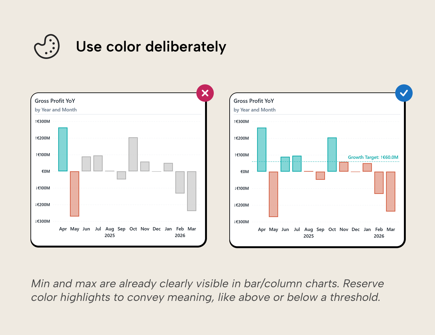
Reference points and variance
A sorted bar chart shows which category is largest. It doesn't say whether largest is good. Reference points supply the judgment that the ranking alone cannot, and this is where color finally earns its place by encoding something length can’t show: above or below a threshold, a category distinction in a multi-series chart, a change direction.
Every design choice on a bar chart should add a dimension of information, not repeat one the bars already provide. When an addition repeats what the chart already shows, it wastes the visual budget. When it answers a new question the audience is asking, it earns its place.
So why not just highlight the longest bar? If the chart’s core strength is that the longest and shortest bars already pop, then highlighting the max in a different color spends the most powerful remaining channel to repeat information the chart communicates for free. It’s like bolding the largest number in a sorted column. The sort already told you.
Target lines. Add a target and the ranking becomes a pass/fail view: categories above the line in one color, categories below in another. The conditional color here isn't decorative; it encodes a judgment that length can’t show, exactly the principle above, applied. This is the bar-chart version of the same lesson from the KPI cards article: numbers without context tell you nothing. Pair conditional color with the reference line itself. Prakash et al. (2024) found that low-vision users invest significant effort counteracting blurring and contrast effects when reading charts. A visual anchor ensures readers who can’t reliably distinguish the hues still get the message.
Prior-period markers. A dot or thin bar showing last year’s value next to this year’s gives the reader both position and movement in the same chart, without switching to a line.
Variance bars. When the reader already knows the baseline, the most useful chart may not show the absolute value at all. Show the deviation instead. Each bar extends left (under target) or right (over target) from a zero line. The reader sees direction and magnitude without mental subtraction. Sort by variance magnitude and color by direction, and the chart delivers three signals at once.
A note on reference lines under stacking. A target line on a single-series chart is instantly readable: the reader follows the horizontal line and sees which bars cross it. On a stacked chart with four segments, the line cuts through colored regions at different heights and becomes noise. Reference lines work best on charts whose visual budget is still intact.
For variants that work when a regular bar doesn’t, dumbbell, bullet, lollipop, Kurt’s bar chart variants article covers the implementation and the model-health trade-offs of report-specific measures.
When to stop using a bar chart
A bar chart’s strength is categorical comparison by magnitude. When the question moves away from that, a different chart type usually answers it better.
Too many categories, too close in value. When the bars are nearly equal height and the reader squints at sub-pixel differences, a table with conditional formatting shows the exact numbers and the relative position through data bars or color scales. The table gives up the instant visual impact but gains precision, and it handles density better than a bar chart ever will.
The question is about relationships, not rankings. A scatterplot shows how two measures relate across categories: margin % vs. revenue, cost vs. volume. Bars can only show one measure at a time on the value axis.
The question is about direction, not magnitude. Twelve monthly bars are readable; thirty-six monthly bars are a wall. A line treats time as a continuous axis and delivers the trend shape at a glance; bars force the reader to compare individual heights. Bars are position-independent (shuffle the order and the longest still pops); a line chart’s meaning lives in the shape, so chronological order matters. When the reader’s question is about direction rather than which period was largest, switch. The line and trend charts article covers the line chart side of this choice in depth.
The question is about distribution. A histogram looks like a bar chart but answers a fundamentally different question: not “how do named categories compare?” but “how are values distributed across bins?” The visual resemblance masks a conceptual gap.
The page is all bars. A single bar chart on a page commands attention. Ten bar charts create uniform visual weight and nothing signals where the reader should look first. If every visual is a bar, the page has too many ranking questions and not enough trend, relationship, or status questions. Visual variety should follow question variety, not the other way around.
Recognizing when to stop is the hardest design skill this article can teach. The instinct to make the bar chart handle one more question is the path to the kaleidoscope.
For further reading
- Data Visualization Best Practices for Power BI reports (tabulareditor.com). The series foundation covering why chart choice should always start from the reader's question and the data's nature.
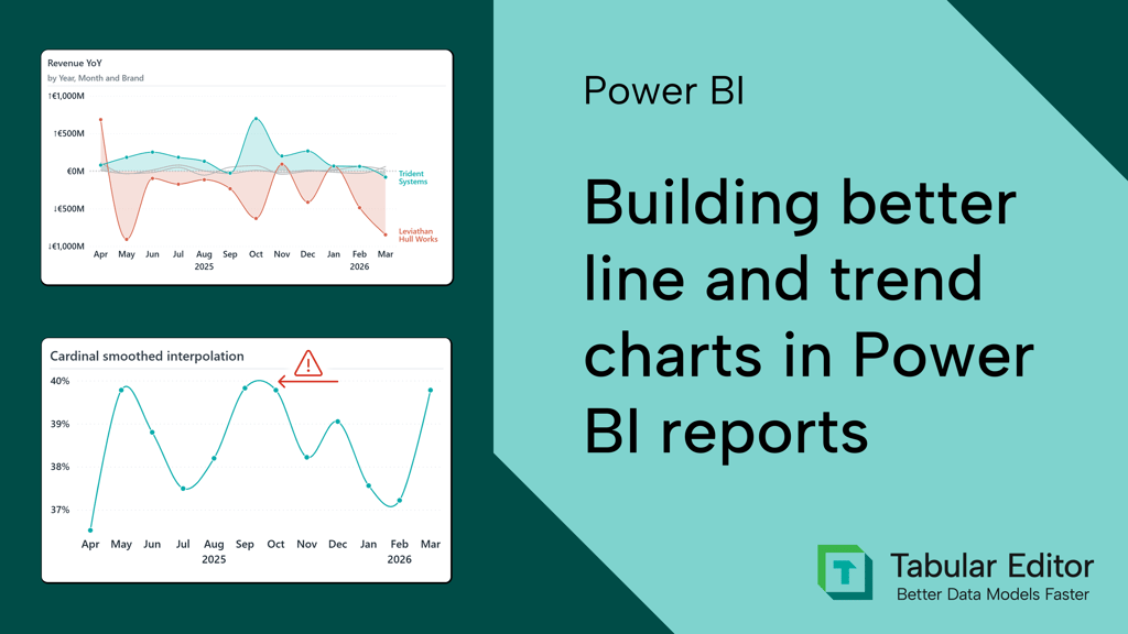
- Building better line and trend charts in Power BI reports (tabulareditor.com). When to switch from bars to lines, with axis and multi-series context that complements this article's guidance on when to stop using a bar chart.
- The case against diverging stacked bars (Datawrapper). A pointed argument for why 100% stacked bars outperform diverging stacked variants, directly relevant to the stacking trade-offs covered here.
- The Chartmaker Directory (Visualising Data). A matrix of chart types and tools for grounding bar-chart alternatives in a systematic, platform-agnostic comparison.
In conclusion
A bar chart starts with a big visual budget: universal familiarity, length on a common baseline, pre-attentive comparison, rank and magnitude in one glance. Every addition spends some of it. The design skill is knowing which additions buy something length alone can’t show and which ones just add noise. When the budget runs out, the answer isn't a more elaborate bar chart. It is a different chart, a table, or a page with three simple visuals instead of one complicated one.
Make bar charts more reliable with model logic from Tabular Editor 3.
Give Tabular Editor a spin