June 3, 2026 Fabric Apps explained: Visualization as code in a data app dashboard Semantic Model Data Visualization Fabric Apps Data Apps Key takeaways Fabric natively supports visualization libraries: You can create and share visuals built with Vega, Vega-Lite, and D3.js... Read more
May 12, 2026 Building better scatterplots in Power BI reports Power BI Data Visualization Power BI Report
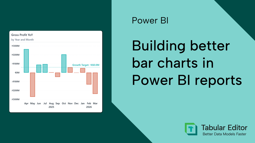
April 28, 2026 Building better bar charts in Power BI reports: a comprehensive guide Power BI Dashboard Design Data Visualization Power BI Report
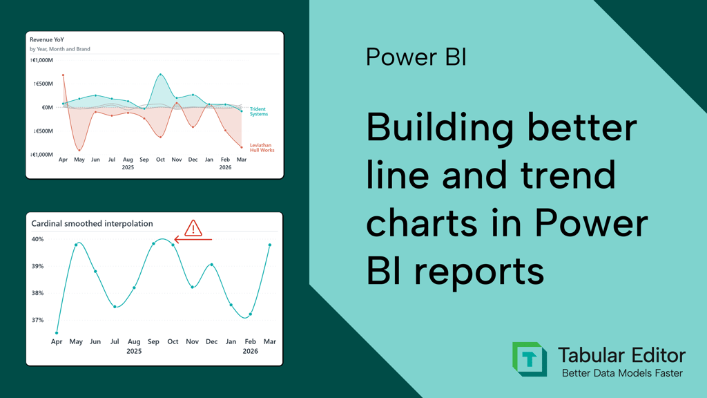
April 14, 2026 Building better line and trend charts in Power BI reports Power BI Dashboard Design Data Visualization Power BI Report
March 31, 2026 Interactive data visualization in Power BI reports Power BI Dashboard Design Data Visualization Power BI Report
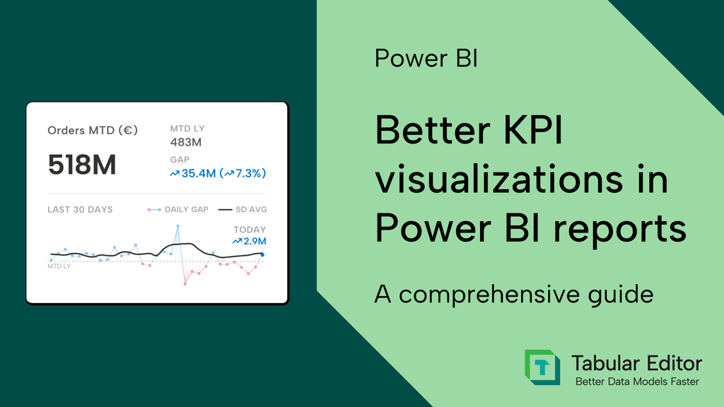
March 10, 2026 Better KPI visualizations in Power BI reports: a comprehensive guide Power BI Data Visualization
October 21, 2025 How to improve a month slicer for your Power BI reports Power BI DAX Dashboard Design Data Visualization