Key takeaways
- KPIs are the most influential visual: They're the first thing readers see and should convey the most important information at a glance.
- Fewer, action-focused KPIs win: Limit a page to five or fewer metrics that drive decisions; a wall of bare numbers overwhelms the reader.
- A number needs context: Showing "518M" without a target, trend, or baseline forces readers to guess; targets, gaps, and trends make a metric actionable.
- Every formatting choice should earn its place: Size hierarchy, conditional color, and rounding all guide the reader, so cut anything that doesn't help them understand faster.
- Implementation affects longevity: SVG cards make impressive demos but are fragile; Deneb, certified custom visuals, and the built-in KPI visual are more practical to support.
Interactive abstract
Short on time? Here's an interactive summary of the article. Click the dots or buttons to walk through
The KPI: first thing you see
In this article we’ll explain how to design better cards and KPI visuals for reports and dashboards. This article focuses more on the design decisions to help you design what works for your users... it's not a tutorial for UI tweaks and modifications to get a prescribed template result. The following image shows you an example of one such improvement with the default card on the left (with minor font styling) and the improved version on the right:
Why show big numbers on a report or dashboard?
A big number or KPI in a dashboard is the first thing a reader’s eyes land on. A big number at the top of the page sets the tone for everything underneath. If the number says you’re behind target, you read the rest of the report with a different mindset than if you’re ahead. That’s a lot of influence for a single visual. It’s often also the visual that teams spend the least time designing. Drop a card on a canvas, pick a measure, and done. While the number is technically correct, it’s not enough.
Consider the following example of a number without context, both in the default and new card visual:
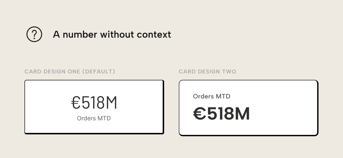
“518M”. Is that good? Bad? Has it been getting better, or worse? Should someone act or is it business as usual? The number alone can’t answer any of these questions; the reader has to fill in the context from memory or whatever else is on the page. For most people across most metrics, that context is prone to slightly different interpretations. For the visual that exerts most influence over the page, that’s bad.
This is a well-documented limitation of human cognition, the same one we discussed in our guide for better tables: the brain judges magnitude through comparison. Without a benchmark to compare to, a target, an average, or a prior period, the number sits in a vacuum devoid of meaning. The vacuum is then filled with assumptions, grounded or not.
Fixing this isn’t technically hard. The hard part, as with tables, is making the judgment calls: which numbers deserve to be on the page, what context they need, and how to format them so the reader gets the message without having to think too much.
Limit KPIs for more focus
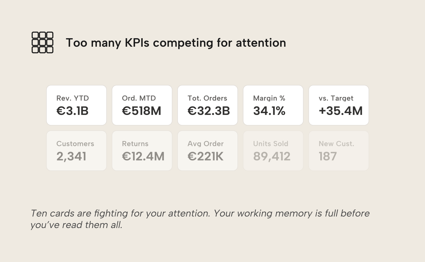
Before improving any individual KPI, address the most common problem: too many of them. In reports with eight, ten or twelve cards across the top, each one competes for attention. The reader’s working memory is full before they’ve read them all.
The constraint on working memory isn't arbitrary. Working memory only holds roughly three to four chunks of information. A page with four KPIs lets the reader hold the full picture; a page with twelve forces them to scan, forget and re-scan. The cognitive cost compounds: by the time the reader has processed the sixth card, the first has already faded. Five is a practical ceiling for pages that need to cover one extra angle.
The hard part is choosing the right KPIs. Making that choice requires knowing the reader’s primary question for the page, the same “start with the question” principle from our guide on data visualization best practices. If the page should answer “how are we performing against our monthly orders target?”, the KPIs should directly serve that question and its most likely follow-up questions. Everything else is noise, however interesting it might be in isolation. If a metric doesn’t help answer the page’s central question, it doesn’t belong on the page.
Choose metrics that drive action
Not all metrics are equally useful. Some describe activity without pointing to a decision, like Total Orders. It only ever goes up, hopefully; it doesn’t tell you much about the current state of the business. It would be better to show a comparative metric, like Orders vs. PY:
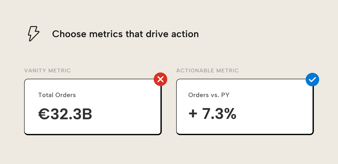
A useful heuristic is: for each KPI on the page, ask “if this number changed by 20%, should someone do something different?”. If the answer is no, the metric could be interesting but it’s ultimately inert. It doesn’t earn its spot on the page.
This is a key difference between a vanity metric and an actionable one. Vanity metrics feel informative, they go up or they go down, but they don’t change what the reader should do next. Actionable metrics create a fork for the reader: if the number is above some threshold, do X; if below, do Y. We can make a metric like Total Orders or Orders MTD actionable, though. Of course, to do that, you have to communicate some kind of target or threshold, either by showing a target or visually with conditional formatting.
Provide context with targets and gaps
Once the right metrics are on the page, give the reader a benchmark to judge them against. A target turns a number into a verdict: ahead or behind:
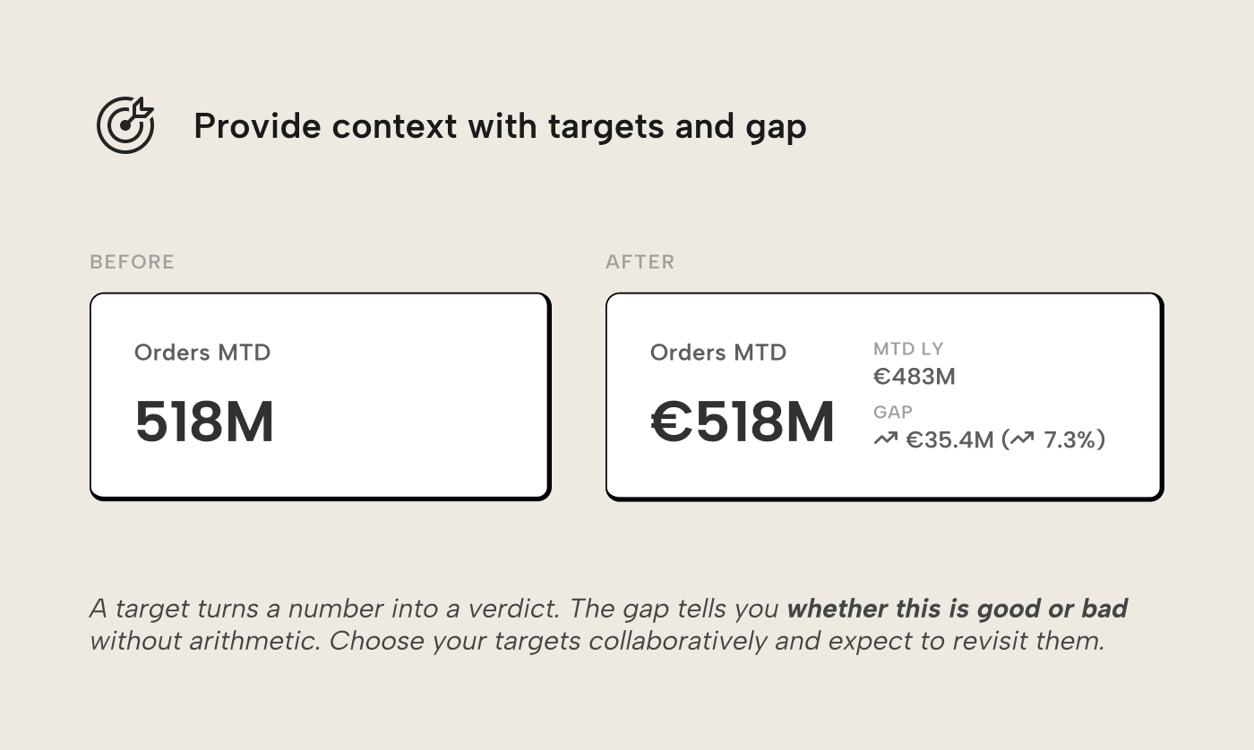
Choose your target collaboratively. Too easy and nobody stretches. Too ambitious and it loses credibility. Good targets come from the people who own the metric; they know what’s realistic and what’s nuts. Expect to revisit the number once actual performance comes in.
Show three things: the actual value, the target, and the gap between them. The gap is the most important element because it answers “is this good or bad?” without requiring the reader to perform calculations. Without the gap, the reader must compute 518 minus 483 and decide whether 35M is a lot. That depends on the base, which is already forgotten because there are six other KPIs competing for attention.
Express the gap in both absolute and percentage terms because different readers have different intuitions for scale. The absolute tells you the magnitude of the over- or underperformance; the percentage tells you whether that magnitude matters relative to the target.
Add trends and baselines
A target tells you where you stand now but gives you no sense of direction; a trend tells you where you’re heading. Both are needed for a decision: above target but on a declining trend is a different situation from above target and accelerating. A baseline like a median or a representative prior period gives a sense of what is “normal”. The sparkline shows the direction and together they answer: “is this typical, or is something changing?”
Consider the Orders MTD card once we add the trendline as context:
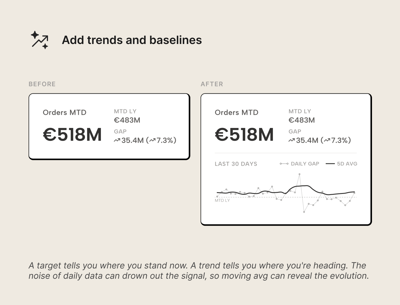
The trend shows the daily gap, with the target. We could have also chosen to show the Orders MTD vs Target MTD as two separate series, but cumulative metrics typically don't render well on a horizontal container (if we're honest...). Now, in addition to the daily gap, we also have a moving trend. That's because outliers can make the line swing into spikes or dips which make it hard to see the evolution. A moving average smooths out the noise, and reveals the evolution more clearly.
This is where the KPI starts earning its place on the page. The number alone was kinda useless... with a target it became more useful; a verdict. So, in summary, targets and trends give a reader helpful context to understand the sentiment, and therefore inform action. You can make this even better with some conditional formatting.
Format with intent
The final step is formatting, but formatting as communication. Every visual choice should reinforce the KPI’s message. Consider the before and after when we just add color to implicitly communicate what good (blue) and bad (red) is:
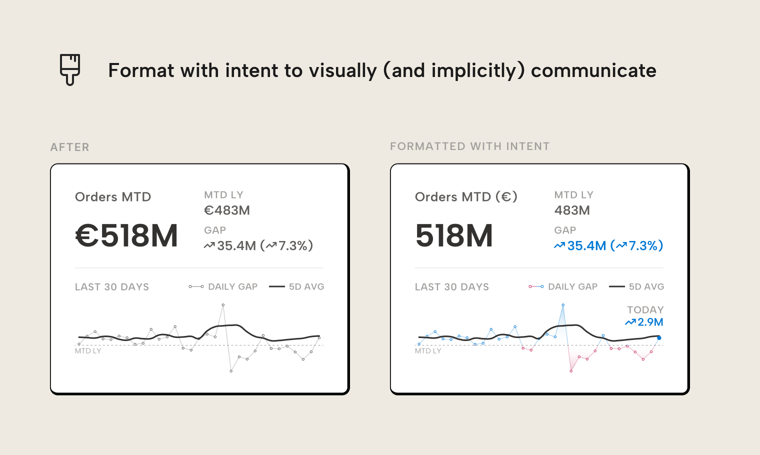
When you apply formatting, consider things like the following:
- Size hierarchy. The primary value is the largest element. Target and gap are smaller. A trend should be compact. When read, the eye falls on the number first, then on the verdict, and then on the context.
- Conditional color and symbols. Color signals above/below target at a glance. Pair it with a directional symbol so the signal doesn’t depend on color alone. Apply both to the gap, not the primary value; the gap is the judgment. The primary value tells you how big; the gap tells you how good or bad.
- Number formatting. Round where possible. “518M” beats “517,893,412” because precision doesn’t help at the KPI level. It belongs in the detail table underneath. Use consistent decimal places and units across all KPIs on the page.
- Labels and titles. Keep them short but meaningful. Use “Orders MTD” over “Month-to-Date Order Value (EUR, excl. returns)”. If a metric needs that much qualification, the definition in the semantic model likely isn’t clear enough.
WARNING
Design conditional formatting color palettes with your audience in mind. Some people have difficulty distinguishing green from red. Using just green/red colors to indicate good/bad leaves them guessing, exactly what we want to avoid. Blue/orange is a common accessible alternative, and pairing color with a secondary cue like arrow symbols ensures the signal survives regardless of how the reader perceives color. Cultural context matters too: red signals danger or loss in most Western cultures, but prosperity and good fortune in many East Asian cultures. If your audience spans both, pick a palette that doesn’t depend on either association.
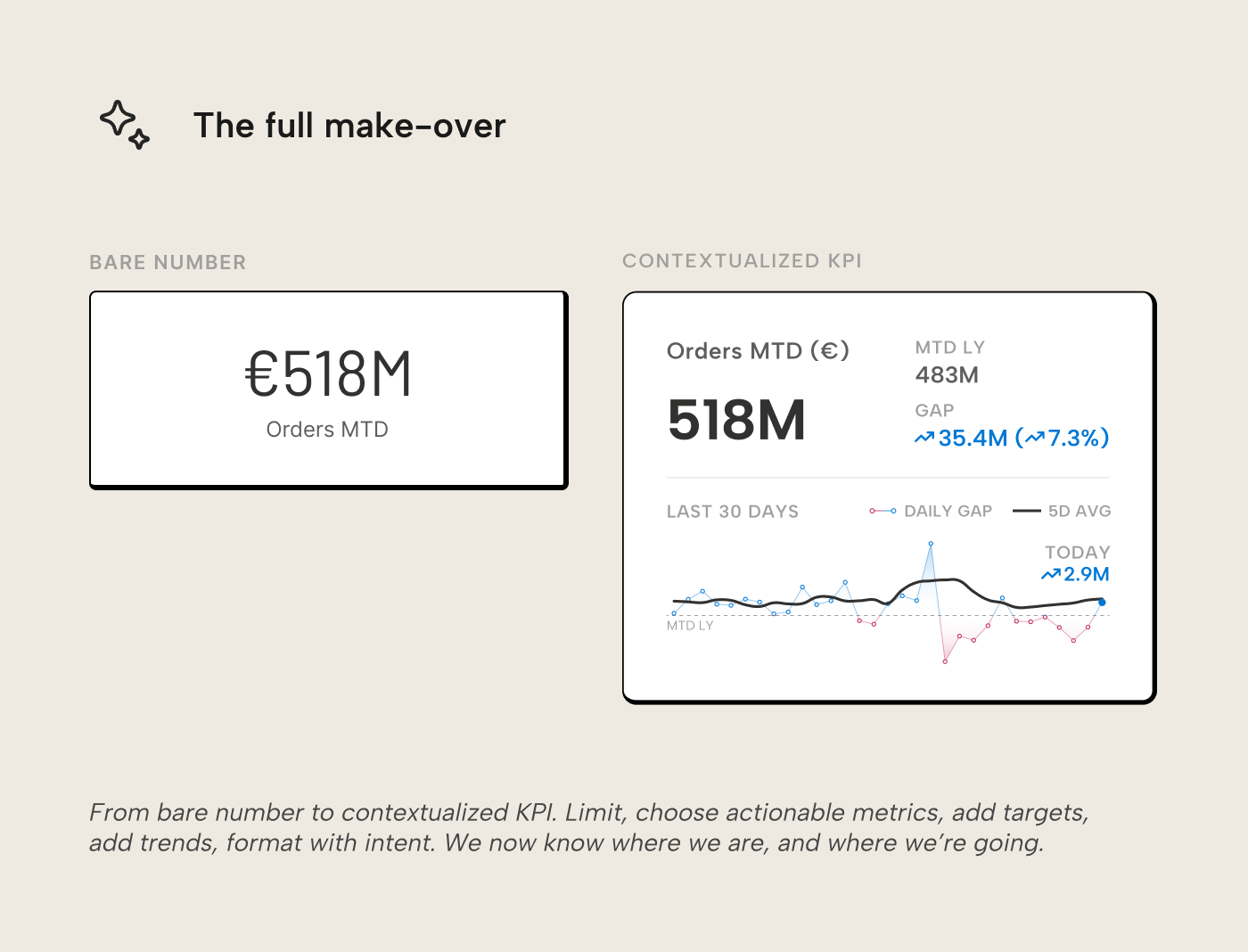
The full make-over
In five steps we go from a bare number to a contextualized KPI: limit the number of KPIs, choose actionable metrics, add targets for comparison, add trends, and finally format with intent:
The “518M” that started as a number devoid of meaning now tells the reader whether performance is good or bad, whether it’s improving or declining, and whether it warrants attention at a glance. The number is the same, but the surrounding context gives it meaning. There’s no guessing whether 518M is good or bad, or whether it’s heading in the right direction. The KPI answers those questions before they’re asked.
Which visuals to use in Power BI
There's multiple visuals that you can use to make cards and KPIs. Choosing which one is a matter of preference, but there's also some trade-offs to consider.
Recommended: the built-in KPI visual
The native KPI visual with line chart is underrated. It shows value, target, and trend in a compact form with support for conditional formatting... all make-over steps, out-of-the-box (more-or-less). For many use cases, that’s more than sufficient.
Recommended: certified custom visuals
AppSource has several dedicated KPI visuals from certified publishers, purpose-built for targets, trends, and conditional formatting. They’re worth evaluating before building something custom.
Recommended: Deneb
For teams that want more control, Deneb provides grammar-of-graphics flexibility inside Power BI. You define the visual as a declarative Vega or Vega-Lite specification (readable, theme-able, and modifiable) rather than SVG string concatenation in DAX. It retains full interactivity and is expressive enough to build any KPI layout shown in this article. There is a learning curve (although it's certainly flattened by AI), but the investment pays off when consistently re-used across reports. Another possible alternative is the HTML content visual, which is by the same author as Deneb.
Honestly, if you need something custom, we recommend a Vega/Vega-Lite approach with Deneb. This is something that we think is worth further investing in right now, especially since it's made easier with AI and coding agents. There are clear signs in the market from multiple vendors that Vega is one possible future of BI reports and dashboards!
Flexible but costly: SVG-based KPI cards
In Power BI you can create DAX measures that define a data-driven specification for an SVG (scalable vector graphic) image. This is basically a custom visual in DAX and it’s becoming a very popular approach in the Power BI community. That’s understandable; they’re highly flexible. As we noted in the tables article, SVG-based microvisuals can go further than Power BI’s built-in sparklines. The same applies to KPI cards: an SVG measure can combine value, target, gap, and trend into a single visual.
The cost is maintenance. SVG DAX is string concatenation... brittle to edit, invisible to accessibility tools, unresponsive to theme changes, and hard for another developer or AI agent to modify without understanding the full structure. For a KPI card that might need to be updated when targets shift, formatting changes, or new metrics are added, that overhead adds up. If you do plan on using SVGs, though, make sure that you use the community libraries from DaxLib with DAX functions.
Whether the trade-off is worth it depends on your situation. For a polished executive report maintained by one person, it can work well. For reports maintained by a team over months or years, the aforementioned alternatives are easier to live with. Unlike Vega/Vega-Lite, we actually recommend that you invest less in these SVG-based approaches, moving forward; it simply is too fragile, and it doesn't scale.
What about the new card visual?
The new card visual (GA since November 2025) natively supports some essential KPI formatting options: multi-card layouts, reference labels for comparisons, and conditional formatting based on filter context. For a value with a target and gap, it works. However, this visual comes with a costly "click tax"; it takes dozens- sometimes hundreds- of clicks to get a bespoke card to be formatted "just right". This isn't a very effective use of your time, especially with assistive AI tools and coding agents (which struggle to manipulate brittle PBIR metadata, even when using skills and MCP servers).
Furthermore, the new card visual has no native sparkline or trend line support. Getting a trend into the card means an SVG workaround (and its overhead) or a separate visual next to the card, often formatted to look like it's not actually a separate visual. You might be thus better to just repurpose a native line, area, or bar chart with a conditional title and subtitle that show the number, something we can show you in a follow-up tutorial article, if there's interest (let us know in the comments below, if so).
For further reading
- Data Visualization Best Practices for Power BI reports (tabulareditor.com). This is the foundation of the series and introduces the "start with the question" principle KPIs should survive.
- How dashboard design helps you make better semantic models (tabulareditor.com). The semantic model that serves the data for your KPIs.
- Introducing the 3-30-300 rule for better reports (SQLBI). KPIs should be scannable in 3 seconds; read this to know why.
- Deneb: Declarative Visualization in Power BI (Deneb). The free, certified Vega/Vega-Lite engine recommended in this article for building maintainable custom KPI cards without brittle SVG DAX.
In conclusion
A KPI card must earn its place on a canvas. If it can answer "is this good or bad, and is it getting better or worse?" without the reader having to think, that's a good sign. Context helps the reader think less: a target, a trend, and formatting that pulls the eye to where it should be. When it comes to building them in Power BI, go for designs that are maintainable rather than the most visually impressive option.
Build KPI visuals on measures you can trust in Tabular Editor 3.
Give Tabular Editor a spin