Key takeaways
- Scatterplots show how two metrics relate: They answer "where do these two metrics relate, and which entities stand out?", so use a different visual when the task is lookup or ranking.
- Choose the right grain: Plotting raw transactions turns a scatterplot into fog; plotting the right business entity gives each point a name the reader can investigate.
- Reference lines make a decision map: Average lines are a start, but business thresholds and quadrants are stronger when each region implies a different action.
- Color, size, and labels cost attention: Each should map to a status the reader acts on; two encodings is comfortable, three is the ceiling, four is a second chart.
Scatterplots are in a weird place in Power BI reports. They’re incredibly good at their core business: showing how two metrics relate across many things, like products, customers, or suppliers.
But they can miss the landing in a few ways. Sometimes the relationship itself matters but the chart asks the reader to do too much inference: “Why should I care about a product’s Gross Margin % vs. Shipping Weight?” Other times, the reader can’t tell what the dots actually are. A reader asking “What does one dot represent?” is the clearest tell, sometimes followed by “Can’t this be a table instead of these dots?”
Knowing when to use a scatterplot is what makes it land. They make sense when the question is about how two metrics relate across many named things, and the name matters. A product dot can be investigated; a transaction dot is often just one record among thousands. This is where scatterplots differ from a generic cloud of points: the reader should be able to see a relationship, and be able to keep track of the points that caught their eye.
Kurt has already written about the different scatterplot types and how they help you find detail in reports over at SQLBI. In this article, we’ll look at the design decisions involved in building better scatterplots so they earn their place before someone asks whether this should just be a table.
The simple scatterplot
The starting point is intentionally plain but already makes the two most important design choices, whether you think about them or not: the axis pair and the grain. The axis pair decides what relationship the reader is supposed to see. The grain decides what one dot means.
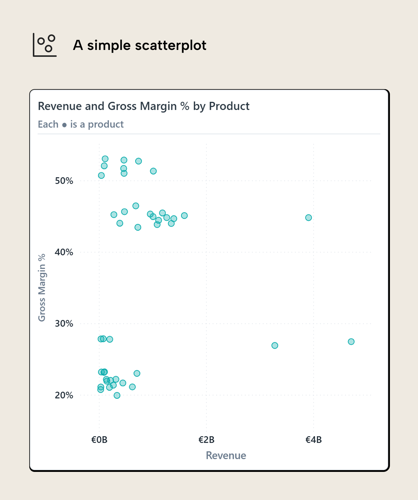
For the running question, the axis pair is Revenue and Gross Margin %. We are looking for products that matter commercially and have margin pressure. Revenue on the X-axis tells us which matter; Gross Margin % on the Y-axis shows which are under pressure. A product far to the right has a lot of revenue behind it. A product low on the chart has weak margin percent. A product in the bottom-right is where the question starts to become interesting; are these important products in trouble?
The second choice is grain. Here, one dot is one product. That gives the reader something to keep in mind and investigate. If the same chart plotted invoice lines, it would have more dots but less meaning. The reader would be looking at overplotted individual transactions, many of which are only interesting because they happened to exist. The cloud would get denser and the question muddier. Going too coarse causes the opposite problem. If the dots are product categories, there may only be a handful of them. The chart becomes easier to read, but it loses the thing that makes a scatterplot useful: seeing which specific item is unusual.
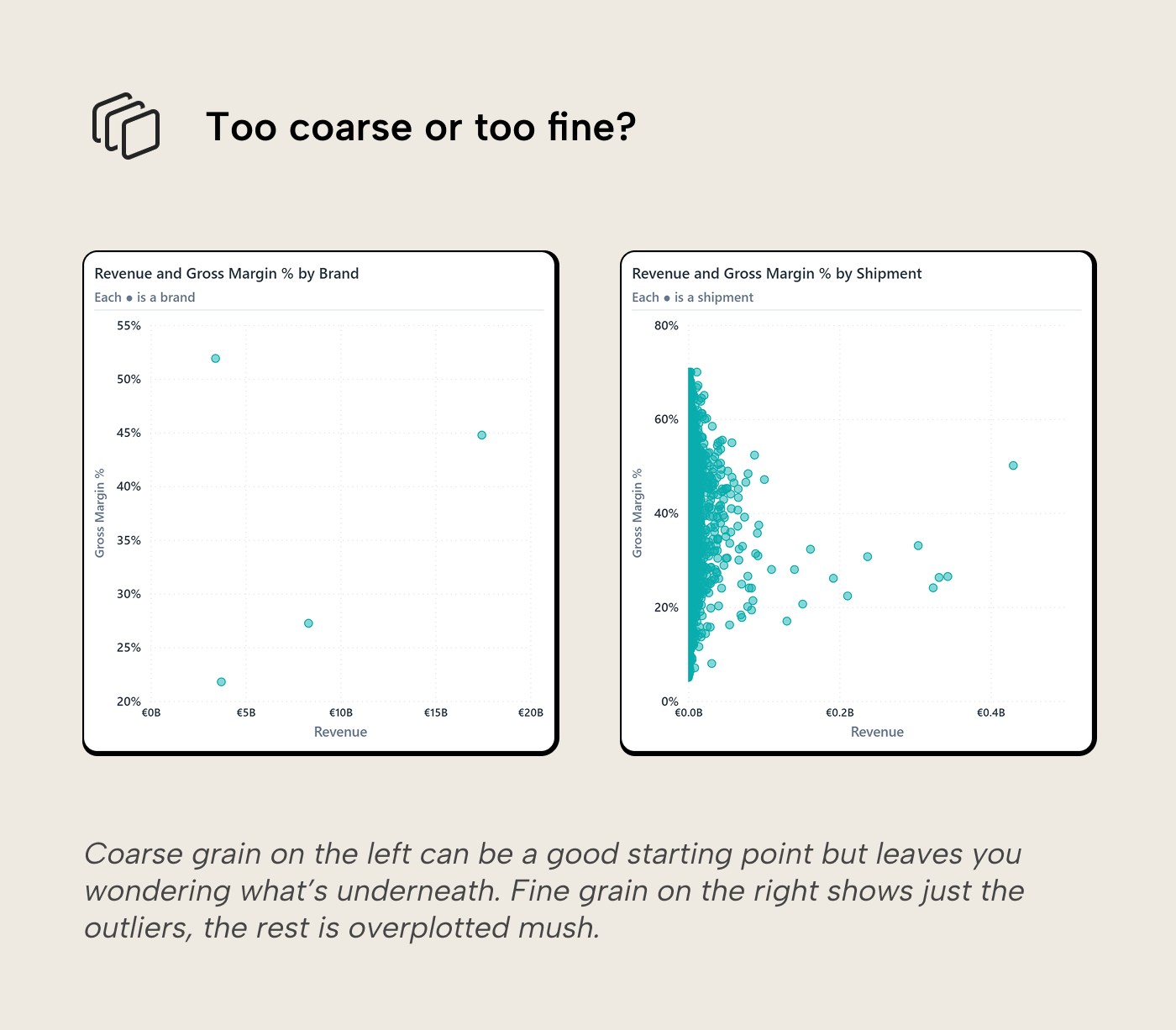
Scale is a second order decision here. A linear axis is the right default when the absolute difference matters. A log scale can help when one point is so large that everything else gets crushed into a corner, but that changes the reading: the reader is now comparing proportional differences and most people don’t do that often. If you use one, label the axis explicitly so readers don’t read proportional differences as linear ones.
Another caution applies to the shape of the visual; it can change how the relationship feels. We don’t compute correlation from the dots but use visual shortcuts, including the overall shape and density of the point cloud. A very wide scatterplot or tall scatterplot can change the visual cues readers rely on.
Reference lines split the plane
The simple scatterplot already has the right raw ingredients, but it still asks the reader to decide what counts as high and low. Reference lines make that decision visible. In the next version, one line marks the 75th percentile of product revenue, roughly the top quarter, a proxy for “commercially important” when no business target exists, and the other marks the overall gross margin reference.
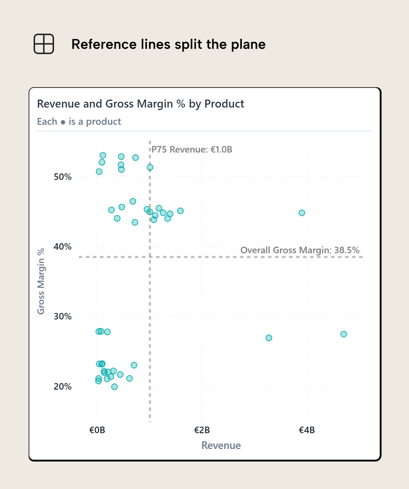
The exact values matter less than what the lines mean. The vertical line says: products to the right are commercially important enough to deserve extra attention. The horizontal line says: products below it are under margin pressure. Put the two together and the bottom-right area becomes the part of the chart that needs the first look.
Averages, medians, percentiles and overall reference measures are fine starting points, mostly because they are easy to explain. Business thresholds are better when they exist. A target margin, budget number, service level, minimum order volume, or policy threshold carries more meaning than “above average” because it already has an action attached to it. The reader should not have to infer why crossing the line matters.
This is where a scatterplot starts behaving like a decision map. The quadrants are not magic but just the result of two thresholds crossing. They become useful when each region suggests a different posture. High revenue and healthy margin might mean “protect these products”. High revenue and weak margin might mean “investigate whether these are in trouble”. Low revenue and weak margin might mean deprioritize, unless there is a strategic reason to keep the product around.
The caution is that the line can become too persuasive. A product just below the margin line isn't fundamentally different from a product just above it. The line is a useful boundary for reading the chart, not a law of nature. If near-boundary cases matter, the visual or the text should say so instead of letting the quadrant label do all the work.
Power BI now supports shaded areas for reference lines, added in the March 2025 reference-line enhancements. That can help if the shaded side of the line has a clear meaning. Keep it light, though: the shade should explain the threshold, not become the visual’s loudest mark.
Color earns its place
Once the reference lines are in place, color is the next obvious temptation. The chart already has a decision structure, so it feels natural to make that structure visible. The risk is that color quickly becomes a second chart layered on top of the first one. The reader is already reading position, distance, density, and outliers; every extra hue asks for another bit of attention.
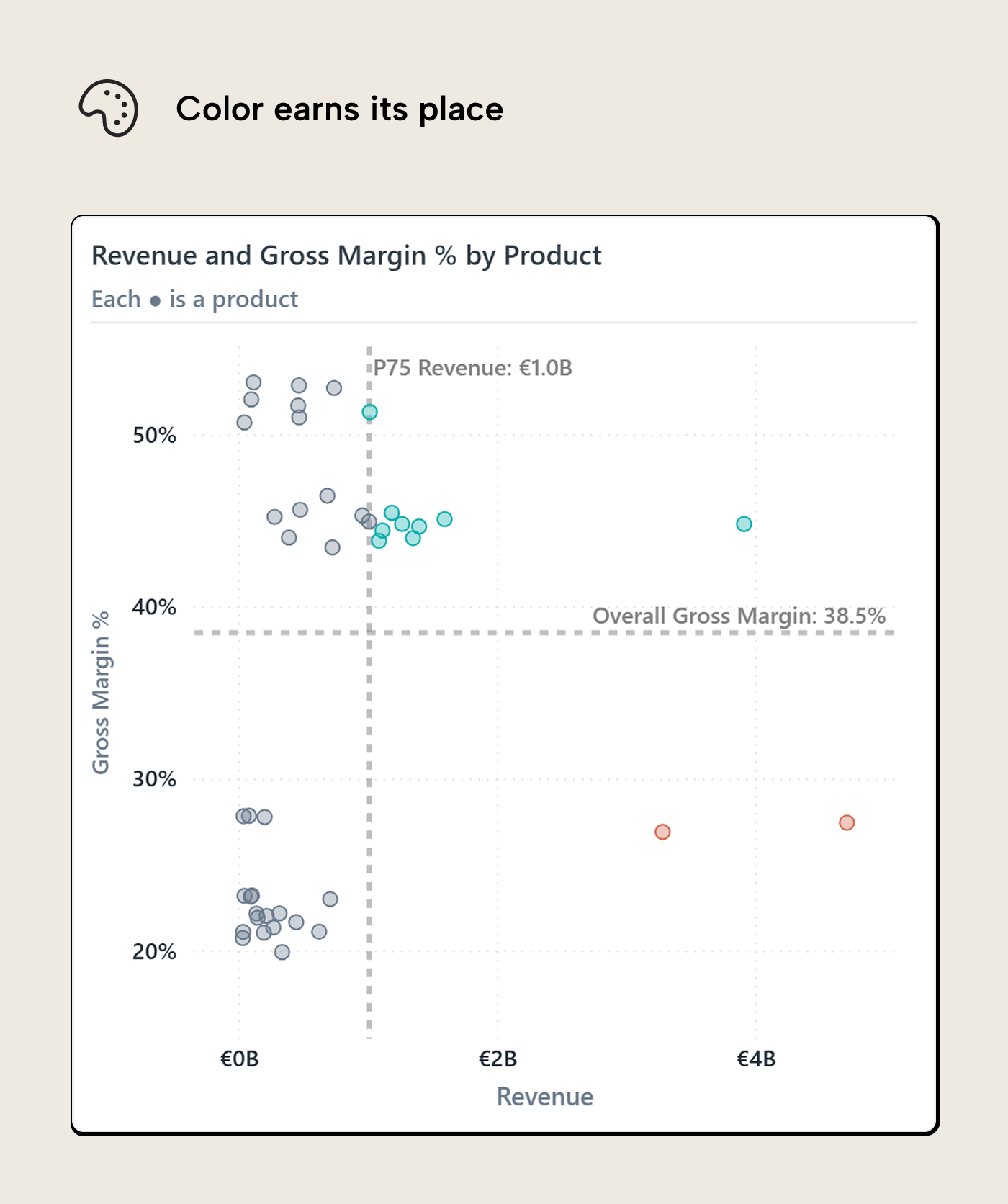
In this version, color carries the decision status. Products in the high-revenue, low-margin area get the warning color. Products with high revenue and healthy margin get a different treatment. Everything else stays neutral.
Color has a narrow job here, which is why it works. The reader can understand the point of the chart before decoding a full category legend. The color answers a simple question: which dots deserve a different posture? If a product is orange, investigate. If a product is teal, protect. If it’s grey, it can stay in the background unless something else about it stands out.
The reference lines and color complement each other by allowing precise comparison against a threshold (distance to reference line) and by explaining why dots are a different color despite being just pixels apart (one crossed the threshold, the other didn’t).
NOTE
Encoding decision colors in rules or DAX measures doesn't give you a useful native legend. In a native scatterplot, Power BI gives you a legend when color comes from a categorical field, and a gradient legend when color comes from a continuous color scale. Rule-based or field-value decision colors are different: they can color the points, but they do not give you a useful native legend for what those colors mean. Microsoft notes that a legend controls series colors and can override conditional formatting options. A workaround shared by Gustaw Dudek: a disconnected legend table replaces the conditional-formatting rule. Its bucket field goes in the Legend well, and the X/Y measures return values only for the bucket each product belongs to. Each bucket becomes a categorical series, which is what Power BI needs to render a native legend.
This is the same reason to be careful with coloring by product category, supplier, country, or brand by default. Those fields may be useful, but they change the reading task. Instead of first seeing the relationship between revenue and margin, the reader starts sorting colors in their head. That can be useful when segment mix is the actual question, but it should be a deliberate choice rather than the default because the field happens to be marginally relevant; encoding it as color carries a cognitive cost.
One exception is worth keeping in mind. If the scatterplot suggests one pattern and you suspect a segment is doing the work, coloring by segment can be a quick diagnostic. Think of it as the visual version of the Simpson’s paradox warning: the combined view can point one way while the groups underneath point somewhere else. In that case, color earns its keep by testing whether the relationship survives being split apart.
For the main report view, though, decision color is usually cleaner. It keeps the scatterplot focused on the relationship and uses color only where it changes what the reader should do next.
Size, labels, and the encoding budget
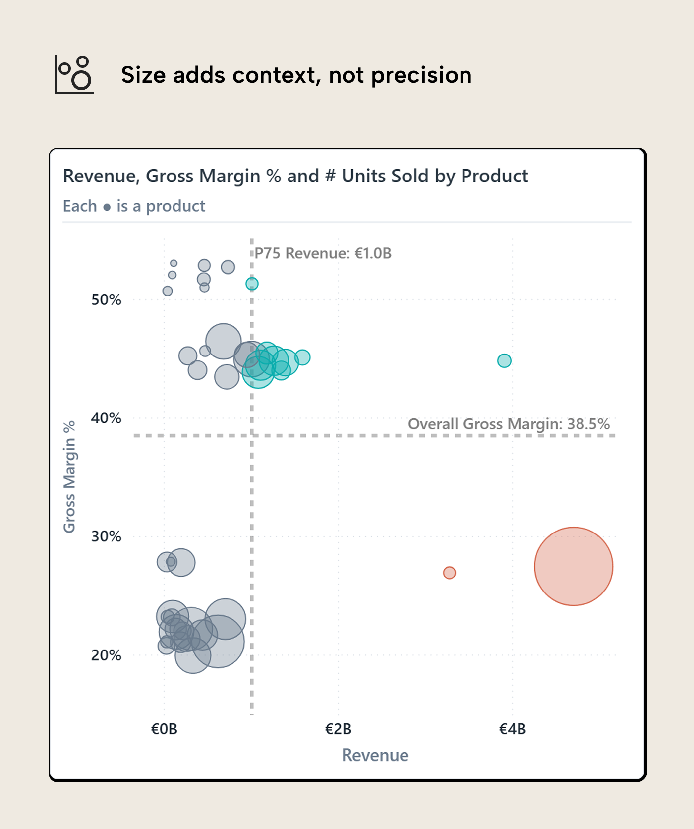
Size is where scatterplots often get too ambitious. Power BI makes it easy to add a measure to the Size field well, and sometimes that is useful. The problem is that marker size looks precise while being awkward to read precisely. People can usually tell small from medium from large, but asking them to estimate whether one circle represents 1.8x or 2.3x another circle is a different matter. Symbol size discrimination in scatterplots is perceptual work, not lookup.
NOTE
Power BI’s native scatter chart ranges don’t always respect full marker size, and it can seem like a part of the markers were clipped off. DAX measures to dynamically format axes min/max can nudge the ranges, at the cost of some model pollution.
In this version, size is used for units sold. Revenue is already on the X-axis, so using Revenue again as marker size would make the high-revenue products dominate twice. A double encoding can be defensible when materiality is the whole message. In this chart, it would mostly shout over the margin question.
Units sold gives the reader a different piece of context. Look at the small dot at the bottom-right: high revenue and small size. That combination flags a high unit price, where small quantity swings move both revenue and margin. Size doesn’t ask the reader to calculate that. It makes the question worth checking.
A low-margin product with high revenue and low unit count is a different business problem from a low-margin product moving in high volume. The dot should not ask the reader to calculate that difference, but it can make the case worth checking.
The practical rule is to treat size as ordinal (i.e. small, medium, large, dominant) unless the exact value is printed somewhere else. That is about the level of precision most readers can use from a bubble. If the size measure carries the main insight, it probably deserves an axis, a table, or a separate visual. A size encoding works better as a supporting context.
Labels have a similar problem, with less forgiveness. A label is useful when it names the product the reader already wants to inspect. Labels are painful when every dot gets one because the chart turns into a pile of competing text. Native Power BI labels tend to push you toward all-on or all-off behavior, which is why hover, selection, or a companion table often does the job better. If a few products must be named on the canvas, the selection should be narrow enough that the labels still feel like annotations rather than confetti.
Opacity and borders sit in the same encoding budget. Lower opacity helps dense areas remain readable, but it can make individual points feel less important. Borders can bring the dots back, but heavy borders recreate the clutter you were trying to reduce. Marker shape is even more expensive. Circles are boring in the right way for dense scatterplots; triangles, diamonds, and other shapes should usually mean something specific or stay out.
Trend lines belong in this conversation even though they are analytical overlays rather than point-level encodings. They change what the reader notices. A trend line can help when the question is about the direction of the relationship, but it can also pull attention away from the exceptions. Research suggests that trend lines make trends seem stronger and can soften the influence of some outliers. That helps if the trend is the point. It helps less if the report page is trying to find the products that break the pattern.
This is the broader encoding budget: position does the heavy lifting, reference lines define the decision space, color marks status, size adds context, and labels identify exceptions. Once a scatterplot needs more than that, the issue is probably not restraint; the page is asking one visual to answer too many questions.
When the question changes, the axis pair changes
The scatterplot we have been building answers one question: which products combine commercial importance with margin pressure? That question gives us Revenue on X and Gross Margin % on Y. If the question changes, the axis pair should change with it.
For year-on-year performance, the relationship is different. Now the question is whether current revenue is above or below prior-year revenue for the same product. That gives current-year revenue on one axis and prior-year revenue on the other.
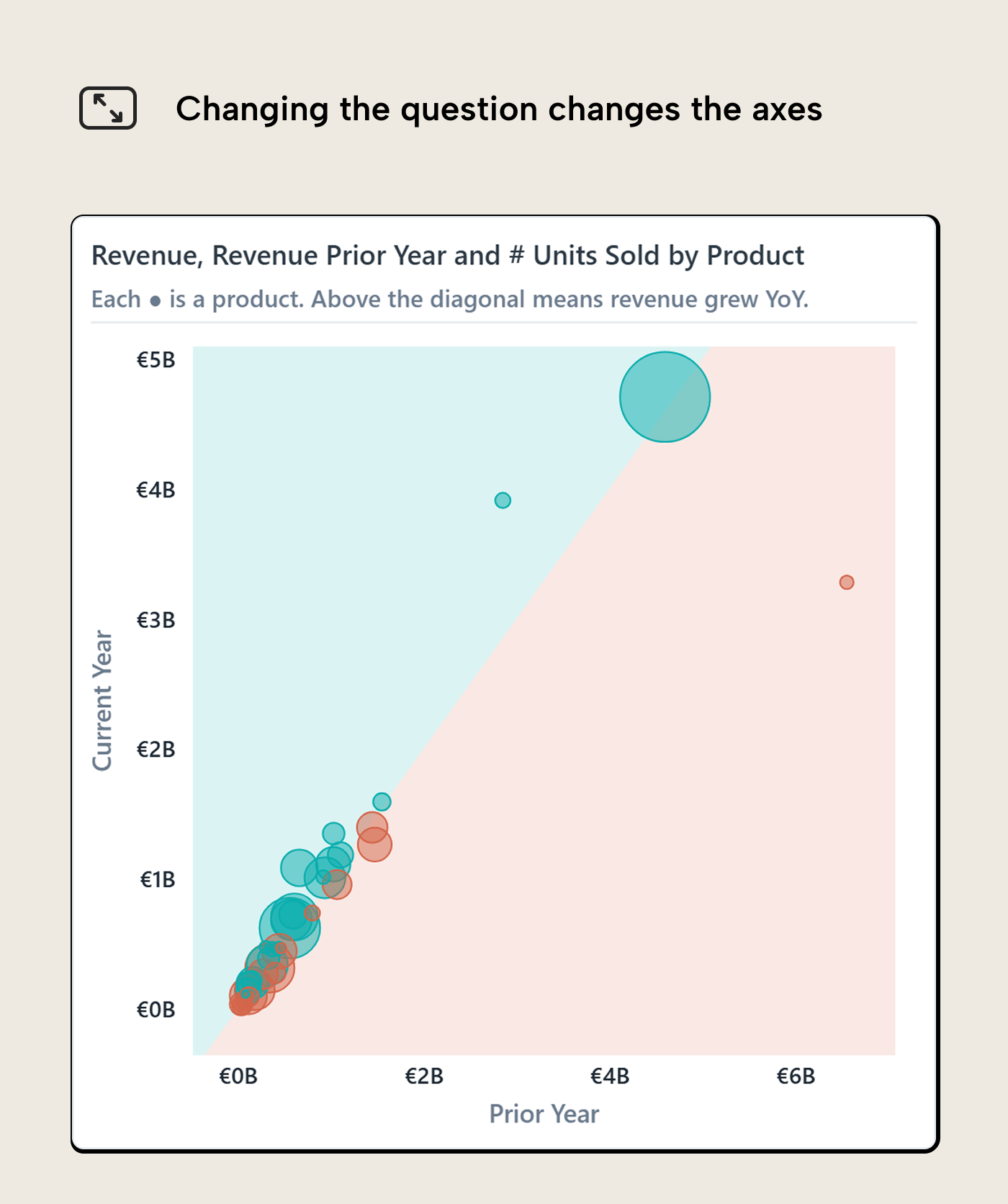
The nice thing about this version is that the diagonal comparison is intuitive once the axes are named. Products on one side of the divide grew; products on the other side declined. The distance from the divide gives a rough sense of how far they moved. A product far from the line deserves more attention than one almost sitting on it, even if both technically fall into the same side of the comparison.
This is where Power BI’s symmetry shading can help. Microsoft describes it as a scatter-chart feature that shades the background symmetrically based on the axis boundaries, showing which axis measure a point favors. For current-year revenue versus prior-year revenue, the two axes share the same unit and roughly the same meaning, so the shaded regions have a clear interpretation: above or below last year.
That is different from the reference-line shading earlier in the article. Reference-line shading says “this side of a threshold matters.” Symmetry shading says “this side of a like-for-like comparison matters.” Both split the plot area, but they are answering different questions. Mixing them up gives the chart a false sense of precision.
WARNING
Symmetry shading is only as sensible as the axis pair. Revenue versus prior-year revenue works because both measures are currency on a comparable scale. Revenue versus Gross Margin % is a different beast. The shading may still render, but the comparison has no clean business meaning because dollars and percentages are being treated as if they can divide the plane symmetrically. If the shading looks odd, suspect the axes before suspecting the data.
This is the axis-pair lesson from the first section again, just from another angle. A scatterplot doesn't become reusable because the dots are the same products. It becomes reusable when the relationship still matches the question the reader is trying to answer.
The grain changes the follow-up
The same pattern also holds when the entity changes. The year-on-year scatterplot above uses products as the grain, but the visual can be switched to customers without changing the basic logic. The axes still compare current-year revenue to prior-year revenue. The shading still separates growth from decline. The difference is what one dot represents.
In the customer version, each dot is a sold-to customer rather than a product.
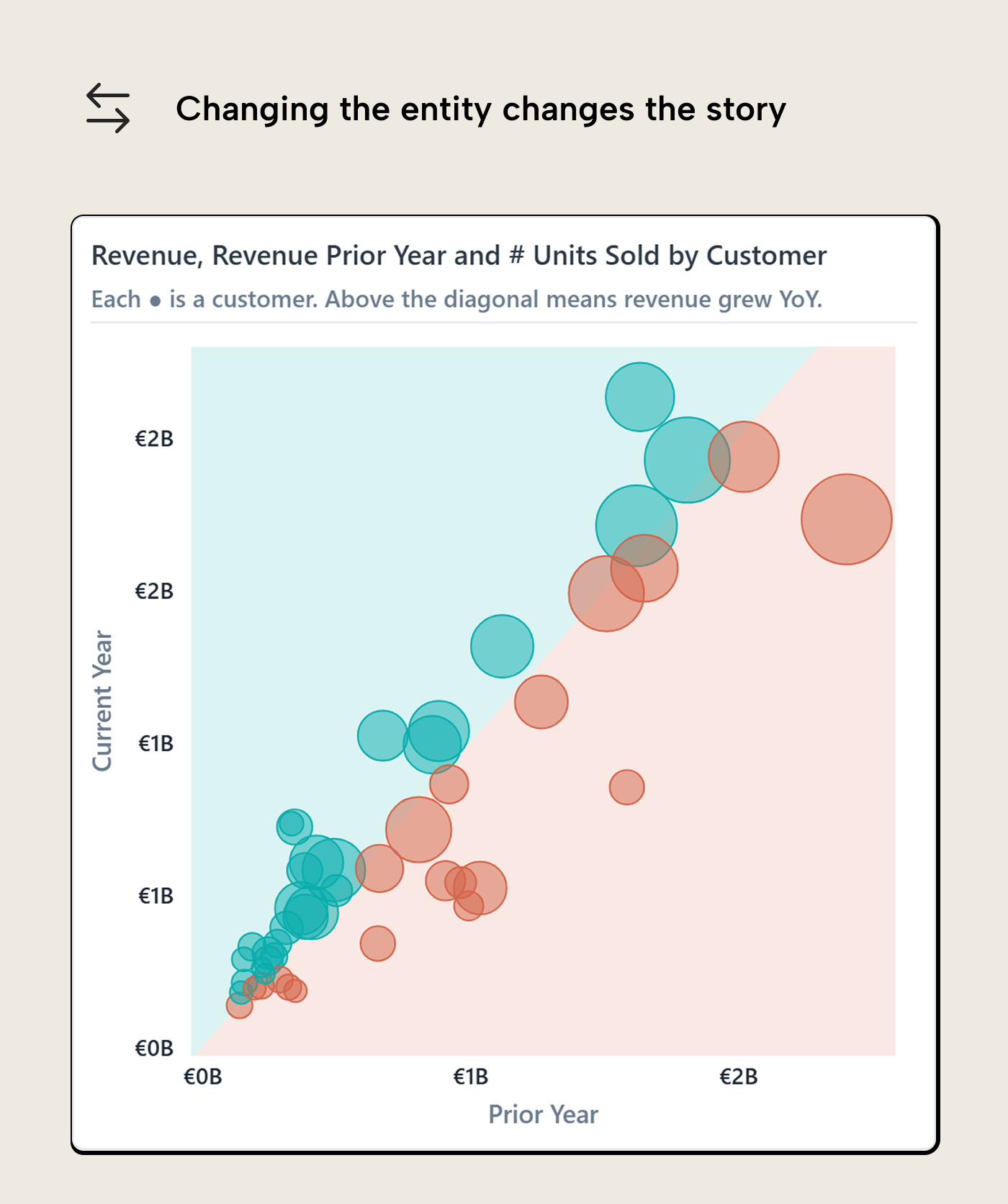
That sounds like a small change, but it changes the work the reader can do. A declining product sends you toward product management, pricing, procurement, or positioning. A declining customer sends you toward account management, churn risk, service issues, or contract changes. The chart pattern is the same; the follow-up path is not.
This is why grain deserves its own attention instead of being treated as a field-well detail. A scatterplot is useful when the dot has a business owner somewhere behind it. Product, customer, supplier, station, store, sales rep; each can work if the reader knows what a dot means and what kind of investigation should follow.
This is also where Kurt’s detail-finding angle comes back in. A current-year versus prior-year scatter is close to volcano-plot territory because the reader is looking for meaningful movement, not just a static relationship. The design choices here do not replace that workflow. They make the starting visual less vague before the reader starts clicking, filtering, and drilling into the outliers.
When native falls short
The native scatter chart gets you quite far: x and y measures, size, color, reference lines, symmetry shading, tooltips, and decent basic formatting. That is enough for most report pages. The point where most start looking beyond native is usually interaction, not visual polish.
The main issue is cross-filtering: if the reader clicks a product category, customer segment, or region elsewhere on the page, the native scatterplot filters down to the selected population. That’s standard Power BI behavior, but awkward for a scatterplot because the cloud is part of the meaning. The reader often needs to see the selected points in context, with the rest of the population still faintly visible (i.e. cross-highlighted).
Here Deneb becomes interesting. With the right interaction setting and Vega or Vega-Lite spec logic, a Deneb version can treat the page selection as a highlight instead of a hard filter: keep all dots, fade the unselected ones, and let the selected group stay visible against the full population. The scatterplot remains a scatterplot after interaction, instead of turning into a smaller chart that forgot what “normal” looked like. The same logic applies to labels and legends. Deneb can give you more control than the native visual, but that control comes from writing the behavior into a Vega-Lite spec that you now own, rather than flipping another formatting switch.
NOTE
DAX can return blanks or values to nudge which labels get rendered, but that is still only a nudge; the native visual decides which labels it can actually place. Vega-Lite supports text marks as labels and filtering ranked items, so a spec can label only the top outliers or the products crossing a threshold. Selected-point labels are possible too, but in Deneb they depend on the selection or highlight state being available to the spec. Legends have more room as well, because Vega-Lite can generate and customize legends for encoded fields. That still works best when the status exists as a field or scale in the spec, not as a loose pile of conditional colors.
R and Python visuals sit further out on the same spectrum. They can trade in interactivity for statistical features like confidence ellipses, kernel density contours, regression bands, or model diagnostics. They render static images so their interactivity is one-way: clicking a data point doesn’t cross-filter the page, but the visual still re-renders when filters or selections elsewhere change. For a normal Power BI report page, that’s the exception. Native first, Deneb when interaction or labeling needs more control, R or Python when the statistical method is the point.
For further reading
- Data Visualization Best Practices for Power BI reports (tabulareditor.com). The series foundation for starting from the reader’s question before choosing a chart type or encoding.
- Interactive data visualization in Power BI reports (tabulareditor.com). The natural follow-up: what cross-filtering, drill-through, and tooltips should do after the reader clicks a scatterplot dot.
- Using scatterplots to find details in reports (SQLBI). Covers the detail-finding workflow around scatterplots, including cross-filtering, volcano plots, and Pareto-style highlighting.
In conclusion
Scatterplots earn their place when the reader can answer three questions quickly: what relationship am I looking at, what does one dot represent, and which dots deserve attention? The axis pair handles the relationship. The grain handles the dot. Reference lines, color, size, labels, and interaction only belong when they help the reader decide what to inspect next.
If the chart cannot survive those questions, it probably should be a bar chart, table, line chart, or a different page altogether. If it can, the scatterplot gives you the relationship, the exceptions, and the business entity behind each exception in one view.
Build scatterplots on cleaner measures and relationships in Tabular Editor 3.
Give Tabular Editor a spin