Key takeaways
- Line charts are the time-series default: They're intuitive and easy to build, but formatting choices have a big impact on how they're read.
- Default axis settings can mislead: They can exaggerate small movements or flatten large ones, so the first step is understanding what the Y axis actually says.
- A single blended line hides detail: One line can mask stable subgroups or opposing trends that cancel out, so it rarely tells the full story.
- Context helps until it doesn't: Each extra layer earns its place only if it answers a question the reader is already asking.
Line charts plot a metric along an ordered axis. Usually that axis is time, which is why they’re the first thing most people reach for when the X axis is a date. They show direction, speed and rhythm in a way that tables and bar charts don’t. That ordering is the key requirement: for unordered categories like regions or product types, connecting the points implies a sequence that isn’t there, and a bar chart is the clearer choice.
Power BI makes line charts easy to build: pick a date column, pick a measure, maybe split by a category, and you are done. The result is technically correct, but maybe not as clear as it could be. This article walks through the most common ways a line chart falls short and how to fix them.
Formatting matters
Formatting choices shape how a line chart reads, and the axis is the first place to look.
Axis scaling
The Y axis can determine whether the same trend looks volatile or comfortably fluctuating. If the range of values is narrow, then when the axis starts at the lowest value in the trend and ends at the highest value, minor variations can become wild swings. If the magnitude of values is large, then when it starts at 0, a true seasonal trend can appear as a flat line.
You build a line chart of margin % over time and a stakeholder sees a roller coaster. Sharp peaks and sudden drops; their instinct is alarm. “What’s going on with our margins?” But look at the axis: the range is 36% to 40%. The chart is showing the shape of a 4pp (percentage point) band, which may well be worth investigating. The question is whether the visual is helping that conversation or getting in the way of it.
Now set the axis to 0 to 100%. The same data looks almost flat. The 4pp band is still there, but it’s compressed into a narrow sliver of a much larger range. The shape is gone and so is the signal.
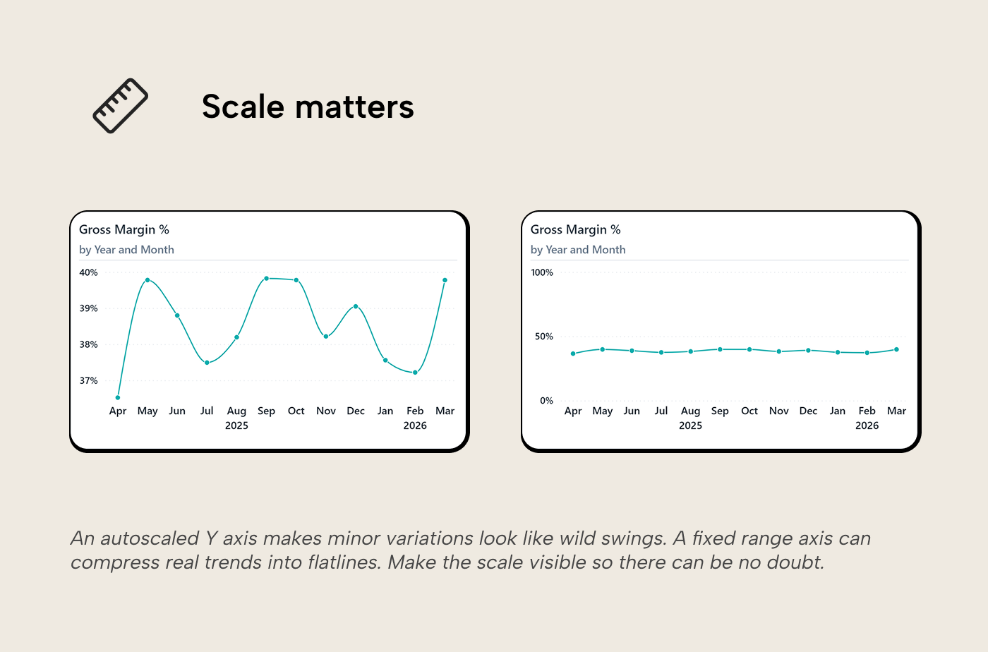
Which is more useful? For bar charts, a zero-based axis is non-negotiable: bar height encodes magnitude, and truncating it distorts the comparison. Line charts are different. Lines encode position and slope, so the axis range should show the shape of the trend. A zero-based axis only helps when the full range is meaningful, like a completion percentage that genuinely moves between 0% and 100%. For a metric like gross margin, which realistically lives in a specific range for your industry or product, showing the full 0 to 100% range flattens the signal just as badly as zero-basing a revenue chart.
The principle behind the choice: the axis should make meaningful differences look meaningful and trivial ones look trivial. In practice, when you don’t know what your reader will consider meaningful, a safe default for lines is to set the range so the data occupies most of the chart height and to make sure the axis labels are clearly visible so the reader can judge the scale themselves.
Dual axes
Dual Y axes on a line chart invite the reader to compare two lines that aren’t comparable; you should consider whether you want them to do that. With revenue on the left, margin % on the right, and both lines crossing in the middle, the reader infers a relationship between the two (“revenue went up while margin went down!”). But the crossing point is an artifact of the axis scales; change the range on either axis and the lines cross somewhere else, or don’t cross at all. Nir Smilga’s overview of dual-axis pitfalls covers this well.
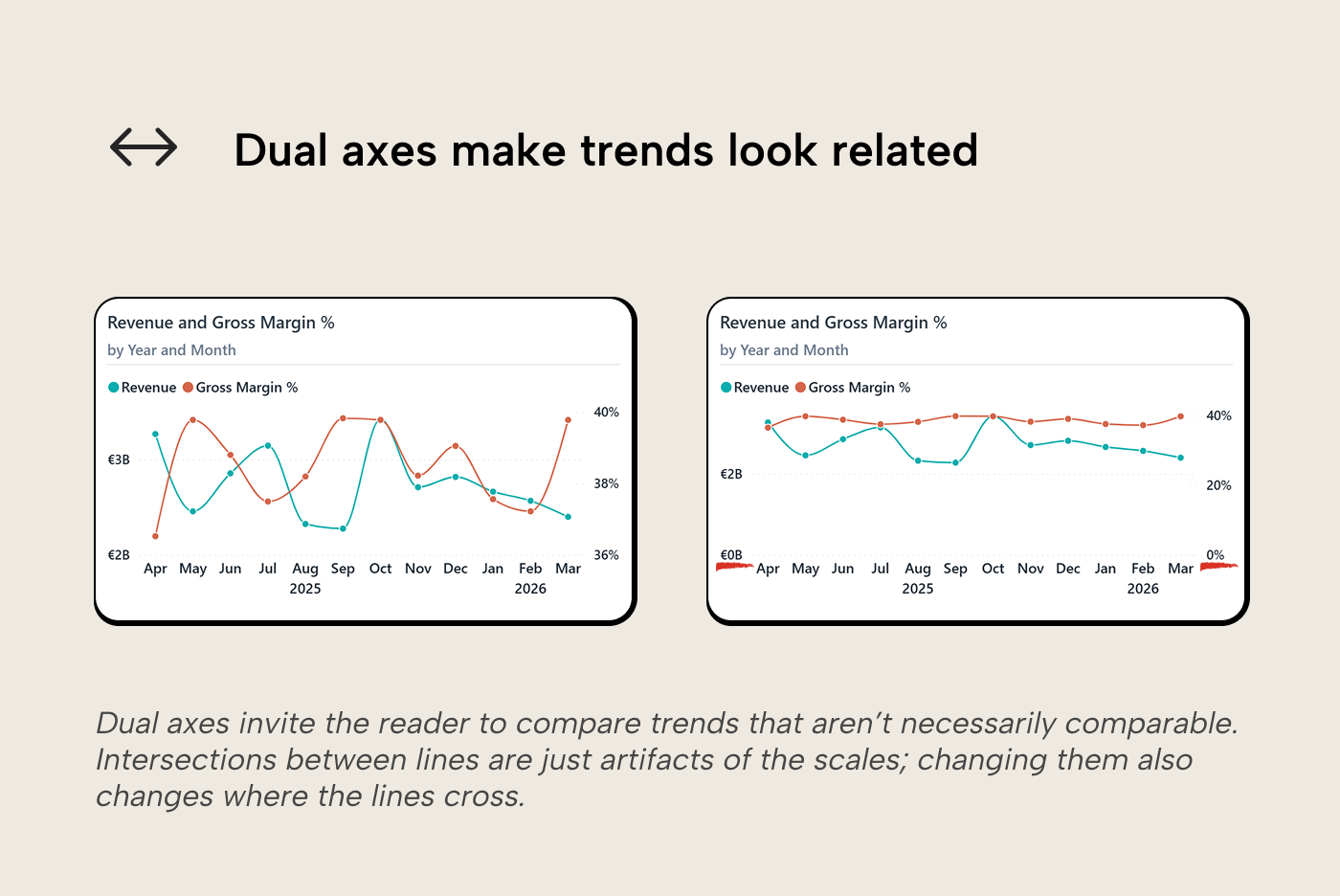
A better alternative is to vertically align charts with a shared X axis so each measure gets its own unambiguous scale, or normalize both measures to a common unit (e.g. % change from baseline) so they can share one axis honestly. One catch on normalization, though: if one of the measures is already a percentage, a % change from baseline means a percentage of a percentage; a 4pp move from 40% to 44% reads as “+10%”, which is easy to misread.
Line interpolation
Power BI gives you three top-level interpolation modes: linear (straight segments), smooth (a curve, with Monotone and Cardinal variants), and stepped (hold the value until it changes). Each makes a distinct claim about the data. A straight segment says the points are ordered and related. A curve implies a smooth, continuous path between observations, something the data may or may not support.
For aggregated data like monthly or quarterly figures, the sharp corners of a linear interpolation are artifacts of the aggregation granularity rather than meaningful signal, and the eye has to work harder to track the trend through them. The smooth option eases those angles, but the variant matters. Cardinal smoothing can overshoot between points, producing peaks and valleys that aren’t in the data. Power BI’s smooth option offers both; of the two, monotone is the safer choice, since it passes through every plotted data point without overshooting. Kerry Kolosko puts it well: every visual property in a chart encodes something, so make sure the shape of the connection is encoding what you intend.
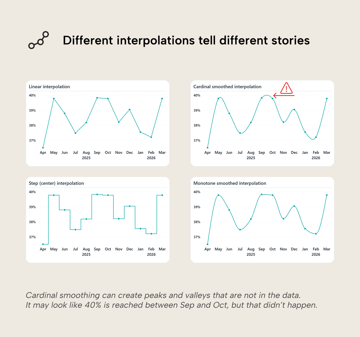
Stepped lines are the right call for metrics that genuinely hold until they change: a posted price, a policy threshold, a contract rate. If you’re using a smooth curve, leaving data point markers visible helps; the reader can then see where the observations actually sit, separate from the interpolated path between them.
At very low point counts (say, three annual figures), a line implies a trajectory that isn't really there. Columns are then the better fit for the same reasoning that makes bars better than lines for discrete categories. The visual should match what the data actually is.
Multi-series and the mix effect
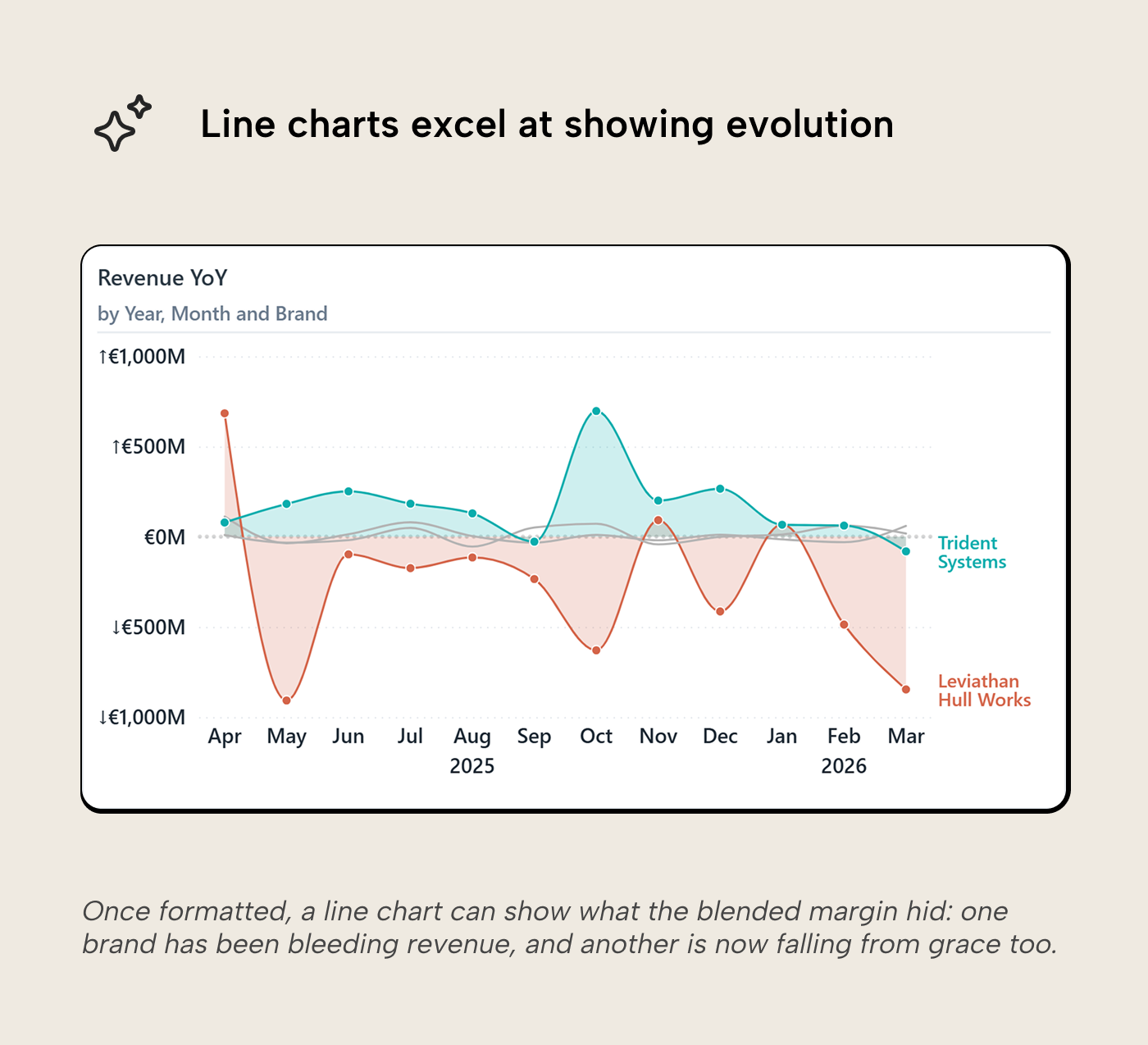
The blended margin moves between 36.5% and 39.8%. That 3.3pp swing could mean the business is unstable, or it could mean something else. Blended metrics compress everything into one number. If different product lines operate at different margin levels, the blended line’s movement may reflect shifts in the revenue mix rather than any actual change in performance.
Adding Brand to the Legend well makes this visible. Four lines appear at distinct, well-separated levels:
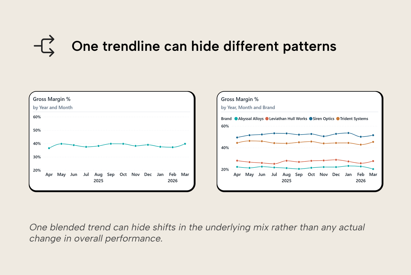
All four brands are stable, with monthly swings of 3 to 4 percentage points each. But they operate at very different levels, going from 22% all the way up to 52%. The blended line sits somewhere in the middle and moves when the revenue share between these bands shifts. When the largest brand has a strong month, it pulls the blend toward its 45% level. When the second largest brand, with a lower margin, has a big month, it pulls the blend down toward 27%. Picture the cleanest version of this: if every brand’s margin were perfectly flat and only the revenue mix shifted month to month, the blended line would still bounce. The individual brands aren’t changing much but the blend is. That’s the mix effect; what looked like instability was a composition of different underlying trends.
The reverse can also happen. A flat blended line can hide sub-groups moving in opposite directions, one growing and one shrinking, cancelling each other out. The blend looks calm while the underlying business is shifting.
When does multi-series help? When you suspect a blended metric is hiding sub-group behavior. Multi-series hurts when the sub-groups are too numerous or overlap so heavily that the extra lines create more visual noise than signal. Four well-separated brands work. Twelve overlapping stations do not. Multi-series isn’t the only way to go from blend to detail. Drill-down and drill-through do it interactively, see our blog about interactive data visualization.
Too many series
The brand breakdown works because four series can be understood. Try the same approach with many series and the chart becomes hard to read. Too many lines crossing, a legend that takes up half the visual, colors too similar to distinguish.
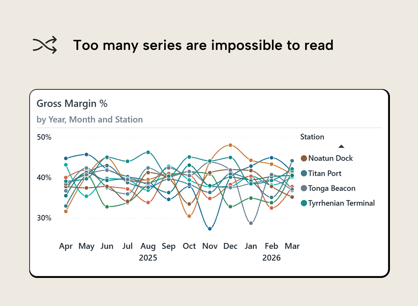
Somewhere around five or six series, the eye loses the ability to track individual lines reliably. One way to handle this is visual hierarchy: give the one series that matters a strong color, and push everything else to light gray at reduced opacity. The gray lines still provide context (the reader can see the range of the rest) while the colored line carries the message.
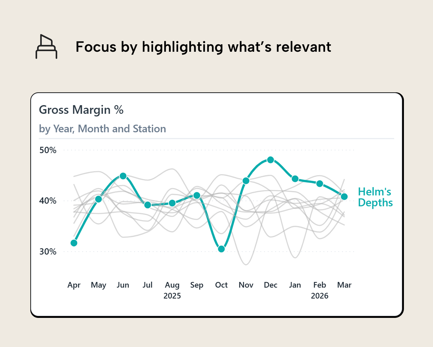
The highlight-and-gray tactic is a narrative move. It fits best in presentations, briefings and embedded visuals where you (the author) already know which series is the point. In a general self-service report, highlighting a series for the reader may be presumptuous and grow outdated as trends change.
In Power BI you can do this by manually setting series colors in the format pane: pick the station you want to feature, set its color, set the rest to a light gray. For something dynamic, where the highlighted series changes based on a slicer selection, the format pane doesn’t expose conditional formatting for line colors. The underlying PBIR visual definition lets you bind a DAX measure (returning a hex string for the selected series, another for the rest) to the line color property, though this relies on an undocumented property and may not survive future updates. Our article on hidden secrets in Power BI report metadata explains how. Deneb is another option when you need more control over color encoding.
Using small multiples is another way out. Instead of one chart with twelve lines, you get twelve small charts, each showing one station’s line on the same axis scale. The reader can scan across all twelve panels and compare shapes, levels, and anomalies without tracking a spaghetti of overlapping colors.
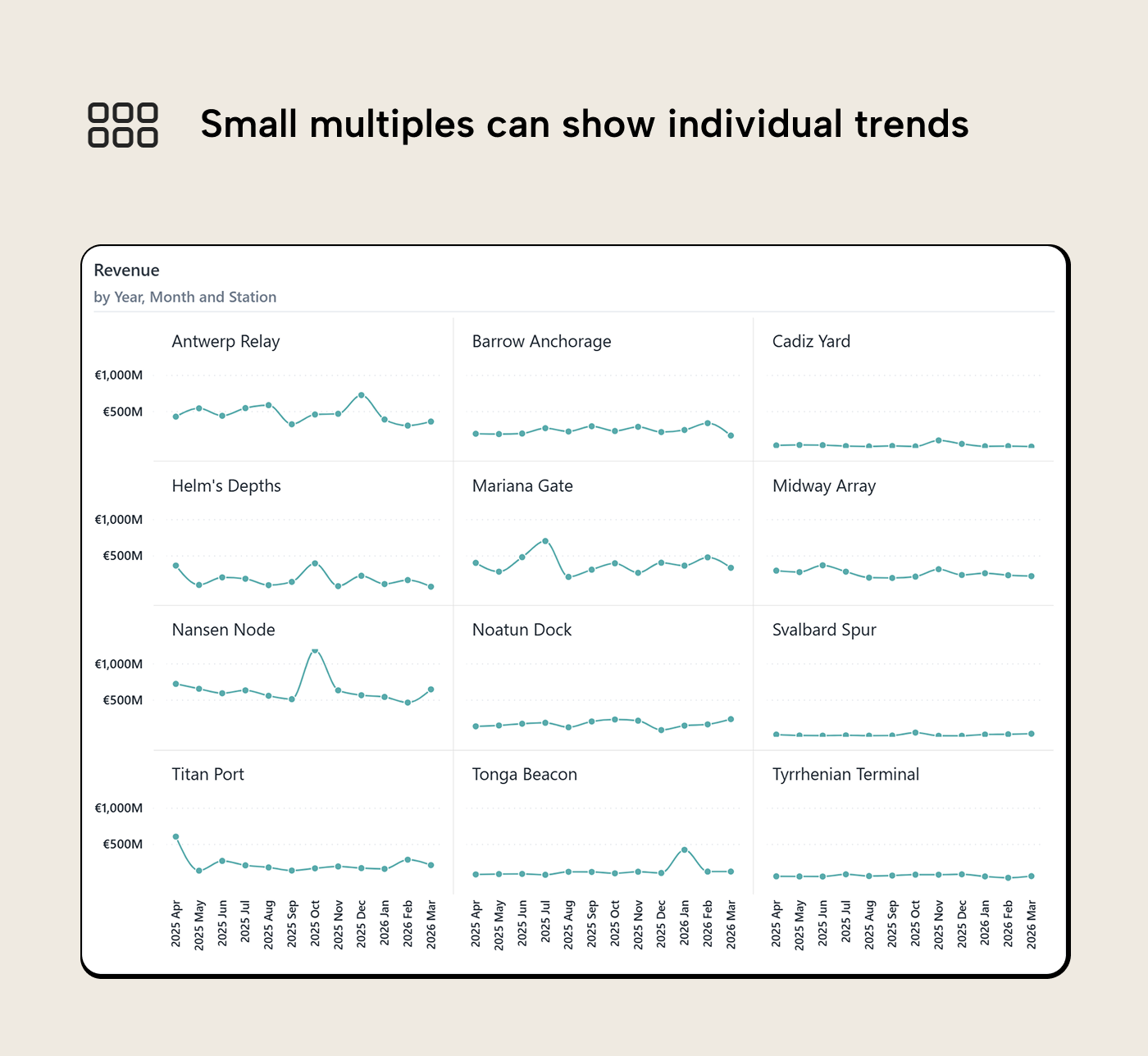
Power BI’s small multiples feature handles this natively. Set the same axis range across all panels and keep the charts compact; the value is in the grid, not in any single panel. The trade-off is that some single-chart features then stop working (e.g. X axis labels get concatenated rather than wrapped or stepped).
Adding context
Once the main trend is legible, extra context can help answer the next question without forcing the reader into another visual.
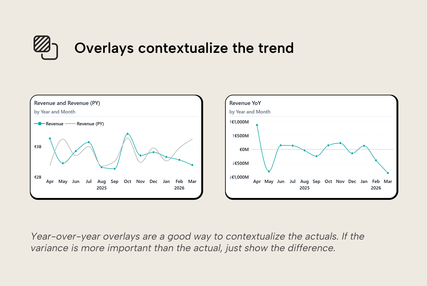
Year-over-year overlays
To show how a measure has changed compared to a prior period, you can plot both on the same axis with an emphasis on the current year, and prior year for reference. The gap between the two lines is the year-over-year variance, and the reader can see it without needing a separate chart. If the variance itself is the signal and the absolute levels matter less, it can be even simpler: plot just the variance as a single line (or bar) around a zero baseline. The one line can answer the question “are we growing or shrinking?” directly. Every chart has an ink budget; every drop of ink (= pixel in this modern age) you don't plot is one that can't distract from the core message.
Trend lines and reference lines
The formatting pane also offers reference lines (constant thresholds, and dynamic lines for averages, min/max, median, and percentile), trend lines (a statistical trend fitted to the data points), and advanced features like forecasting and anomaly detection. These are alternatives to a YoY overlay that answer different questions: “what’s the general direction?” or “how does this compare to the average?” Take care not to overdo it though: one additional trend or reference line can add a frame of reference but three recreate the clutter problem.
Note that anything beyond a single-series line chart switches most of these off; when you put a field in the Legend well or enable small multiples, trend lines, forecasting, and anomaly detection are all disabled. Only reference lines are compatible with multiple series.
Beyond the time axis
Everything so far assumes a date on the X axis. That covers most line charts in the wild, but not all of them.
Cyclical data
Time-series line charts assume a linear axis: left to right, earlier to later. But some temporal data is inherently cyclical: months of the year, days of the week, hours of the day. On a line chart, January and December sit at opposite ends of the axis even though they’re adjacent in the cycle. Any seasonal pattern that wraps around gets flattened into a zigzag.
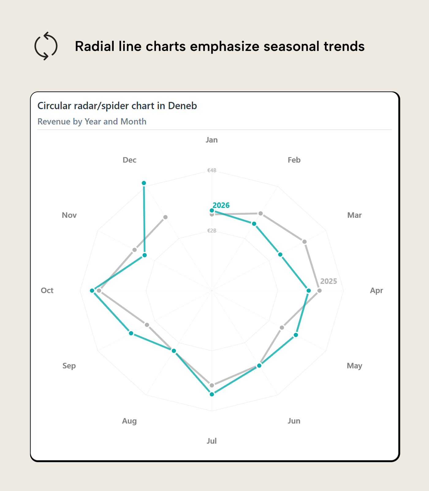
Wrapping the axis into a circle puts December and January next to each other. Seasonal patterns that cross the year-end, invisible on a linear axis, can show up clearly in the closed loop. It’s a niche tool: comparing values between spokes is harder than along a shared baseline, but when the question is “is there a seasonal pattern?” rather than “what’s the trend?”, the closed loop makes it visible.
Ranked and ordered axes
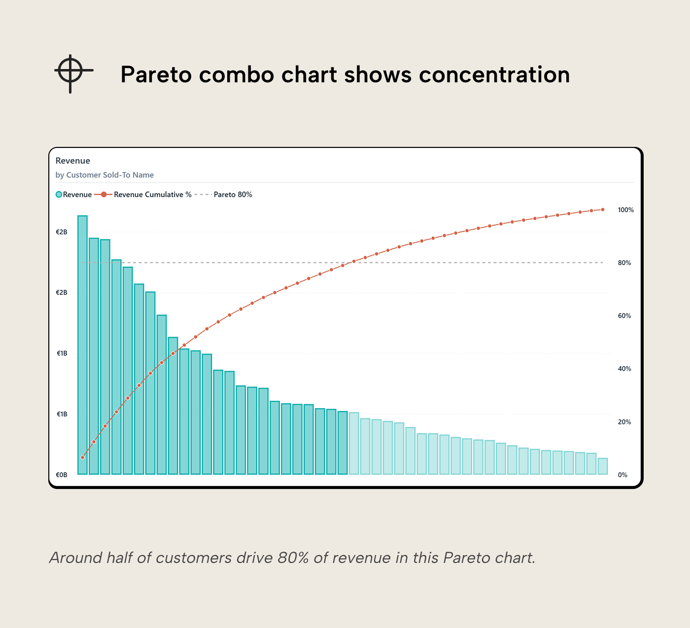
Line charts also work on non-temporal axes, as long as the axis has a meaningful order. A Pareto chart plots values as bars on a ranked categorical axis with a cumulative percentage line; e.g. customers sorted by revenue, products by margin. The slope of the line tells you about concentration. If it's steep early and flat late, it means a few items dominate. In contrast, a gradual slope means the distribution is more even. Pareto is one of the few cases where dual axes make sense; the bar scale and the cumulative-% scale encode categorically different things and aren't meant to be read at their crossing point.
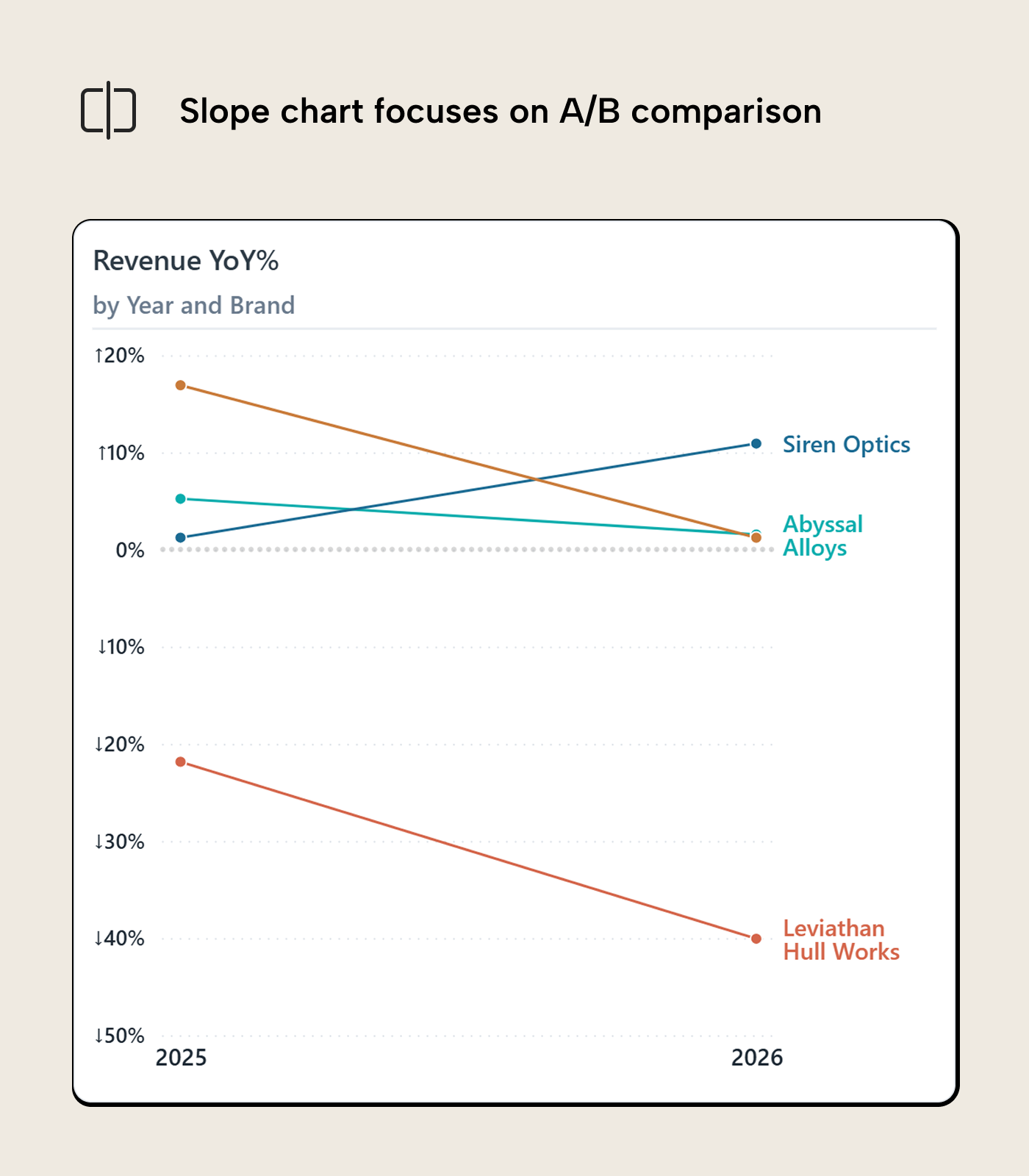
Slope charts
A slope chart is a line chart with only two points on the X axis: a before and an after. Each line connects a category’s value at "before" to its value at "after". The slope and direction of each line show which category gained, which lost, and by how much. Slope charts are most effective when the question is about change between two specific periods and not the full trajectory in between.
Putting it together
The makeover we just went through lets the chart answer more questions: while the original margin looked active, it added brands together and hid their movement and magnitude underneath. Adding a prior-year comparison made the decline for one brand visible and showed that another started a similar decline.
For further reading
- Data Visualization Best Practices for Power BI reports (tabulareditor.com). The series foundation, including the “start with the question” principle and when to choose a line chart over other types.
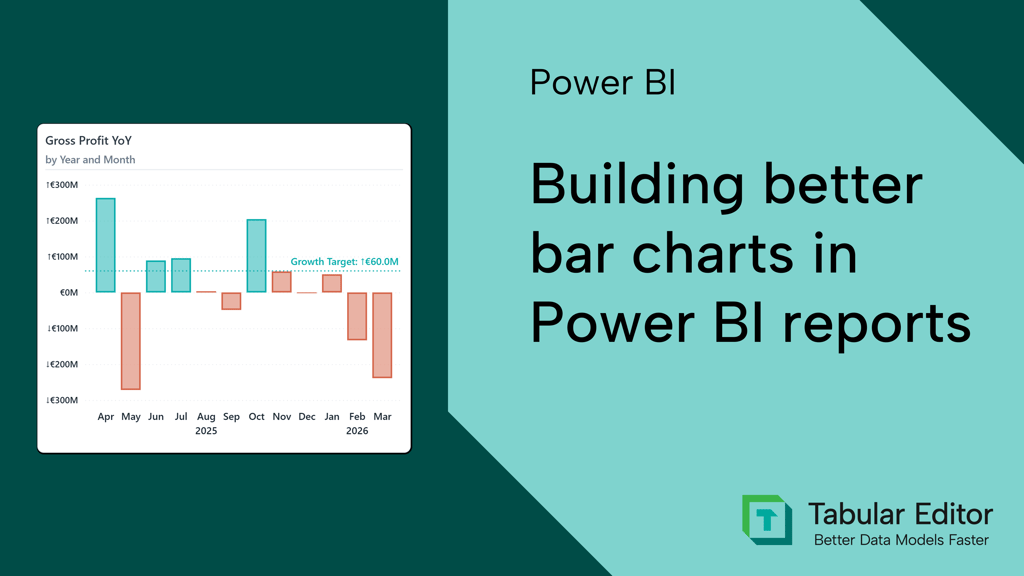
- Building better bar charts in Power BI reports (tabulareditor.com). The sister article for when the question is about ranking rather than direction, helping decide when a bar chart is the cleaner choice over a line.
- Storytelling with Data (storytellingwithdata.com). Cole Nussbaumer Knaflic’s resource on data communication; the declutter principles apply directly to managing multi-series line chart noise.
In conclusion
Line charts are easy to trust at face value; they're familiar. They're also easy to overcomplicate because there are more dials you can turn up (but often shouldn't): more axes, more series, etc. Building good line charts is about questioning what they're showing and why, and perhaps also about restraint in adding more just because you can.
Support clearer trend charts with better measures from Tabular Editor 3.
Give Tabular Editor a spin